Colour in Use: Black
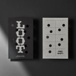
Loot by Seachange
Where have all the simple playful ideas gone? You know the ones, a bit of wit, spun into a multitude of playful expressions across a number of different touch-points? Design craft has gotten so good over the last few years, but I miss the smile-in-the-mind stuff. Paul Belford’s New Chapter, Seachange’s Think Packaging and Mucho’s Art Walk. They’re not strategic...
NN North Sea Jazz Festival by Studio Dumbar/DEPT
After seeing Collins’ work for the San Francisco Symphony – a pioneering typographic and digital experiment with Swiss foundry Dinamo – I thought it would be some time before I’d be surprised by another visual identity in the music space. Sure, there’s an abundance of styles and artists to be inspired by within an art that has evolved in tandem...
San Francisco Symphony by Collins
Formed in 1911, while San Francisco was rapidly rebuilding after the devastating earthquake of 1906, the San Francisco Symphony (SFS) has been serving audiences in the Bay Area and beyond for 111 years. In 2018, Esa-Pekka Salonen – a Finnish conductor and composer – was announced as the incoming musical director, with his tenure to start during the fall season...
Autex Acoustics by Marx Design
With manufacturing and sales teams throughout Australia, UK and the USA, Autex has grown to become the market leader in interior acoustic products in New Zealand, and the go to choice for leading architects aspiring to reduce the amount of atmospheric noise within cutting-edge residential and commercial spaces. Their products are innovative, produced in a variety of forms and colours,...
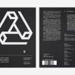
LogoArchive Issue 5
The technical limitations of the mid-century—the need for a steady hand and a precise mind for mechanical reproduction—demanded that an exceptional level of care and creativity be given over to shape and space, association and perception. These considerations created a rich corporate and consumer form language and range of graphic techniques. These have been partly marginalised, usurped by modern print...
LogoArchive Issue 4
The first issue of LogoArchive was conceived, designed and sent to the printers within a day. It was inspired by a panel discussion that took place the day before at Somerset House as part of the exhibition Print! Tearing It Up. Following a successful launches of the first, second, third and Extra Issue, LogoArchive returns with its fourth release. This is...
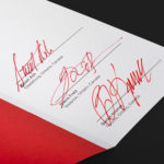
LogoArchive ExtraSpecial Issue – Canada Modern (Signed)
Following its third release, LogoArchive mixed things up with an Extra Issue in collaboration with Canada Modern. Designed and edited by Blair Thomson, and documenting the forms and colour of Canada’s modernist symbols, this issue was distinguished from the series by its Colorplan Bright Red and full-colour gatefold Chrolomux insert dedicated to the work of Gottschalk+Ash for outdoor advertising company Claude Neon....
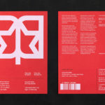
LogoArchive Extra Issue – Canada Modern
The first issue of LogoArchive was conceived, designed and sent to the printers within a day. It was inspired by a panel discussion that took place the day before at Somerset House as part of the exhibition Print! Tearing It Up. Following the successful launch of three issues, LogoArchive returns with a very special Extra Issue in collaboration with Canada Modern,...
LogoArchive Issue 3
The first issue of LogoArchive in print was conceived, designed and sent to the printers (for quotation) within a day. It was inspired by a panel discussion that took place the day before at Somerset House as part of the exhibition Print! Tearing It Up. Following a successful launch of the first and second issues, LogoArchive returns with its third release...
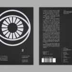
LogoArchive Issue 2
LogoArchive Issue 1 was conceived, designed and sent to the printers for quotation within a day. It was inspired by a panel discussion that took place the day before at Somerset House as part of the exhibition Print! Tearing It Up. In the momentum of its design and production (undertaken by WithPrint) LogoArchive seeks an immediate connection between the agency...
LogoArchive Issue 1
This first edition of LogoArchive in print was conceived, designed and sent to the printers for quotation within a day. It was inspired by a panel discussion that took place the day before at Somerset House as part of the exhibition Print! Tearing It Up. Today’s zine format and the revival of the independent publishing spirit of the past is a...
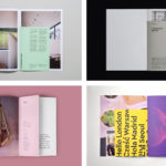
BP&O Collections — Inserts
A continually updated gallery of graphic identity design work, reviewed and published on BP&O, that feature an insert component. Where inserts have traditionally sat loosely within newspapers and magazines, quite separate from content and often adverts, the examples here are bound in and characterised by a proportional difference, either smaller than the cover, punctuating content in size, colour and content,...