Black
Forward Majority by Order
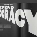
The balance of power in the US isn’t decided in Washington. It’s decided in state capitols where Republicans have gained overwhelming control, asserting systematic bias on voting rights and election processes. Through policies of suppression and gerrymandering, certain priorities and populations are often neglected in election results. Forward Majority is a political action committee on a mission to accelerate Democratic...
Autex Acoustics by Marx Design
With manufacturing and sales teams throughout Australia, UK and the USA, Autex has grown to become the market leader in interior acoustic products in New Zealand, and the go to choice for leading architects aspiring to reduce the amount of atmospheric noise within cutting-edge residential and commercial spaces. Their products are innovative, produced in a variety of forms and colours,...
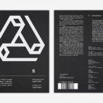
LogoArchive Issue 5
The technical limitations of the mid-century—the need for a steady hand and a precise mind for mechanical reproduction—demanded that an exceptional level of care and creativity be given over to shape and space, association and perception. These considerations created a rich corporate and consumer form language and range of graphic techniques. These have been partly marginalised, usurped by modern print...
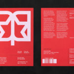
LogoArchive Issue 4
The first issue of LogoArchive was conceived, designed and sent to the printers within a day. It was inspired by a panel discussion that took place the day before at Somerset House as part of the exhibition Print! Tearing It Up. Following a successful launches of the first, second, third and Extra Issue, LogoArchive returns with its fourth release. This is...
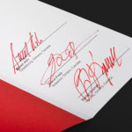
LogoArchive ExtraSpecial Issue – Canada Modern (Signed)
Following its third release, LogoArchive mixed things up with an Extra Issue in collaboration with Canada Modern. Designed and edited by Blair Thomson, and documenting the forms and colour of Canada’s modernist symbols, this issue was distinguished from the series by its Colorplan Bright Red and full-colour gatefold Chrolomux insert dedicated to the work of Gottschalk+Ash for outdoor advertising company Claude Neon....
LogoArchive Extra Issue – Canada Modern
The first issue of LogoArchive was conceived, designed and sent to the printers within a day. It was inspired by a panel discussion that took place the day before at Somerset House as part of the exhibition Print! Tearing It Up. Following the successful launch of three issues, LogoArchive returns with a very special Extra Issue in collaboration with Canada Modern,...
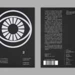
LogoArchive Issue 2
LogoArchive Issue 1 was conceived, designed and sent to the printers for quotation within a day. It was inspired by a panel discussion that took place the day before at Somerset House as part of the exhibition Print! Tearing It Up. In the momentum of its design and production (undertaken by WithPrint) LogoArchive seeks an immediate connection between the agency...
LogoArchive Issue 1
This first edition of LogoArchive in print was conceived, designed and sent to the printers for quotation within a day. It was inspired by a panel discussion that took place the day before at Somerset House as part of the exhibition Print! Tearing It Up. Today’s zine format and the revival of the independent publishing spirit of the past is a...
Exploratorium After Dark by Collins
Exploratorium is a “public learning laboratory” and San Francisco based museum that enables visitors to question and make sense of the world around them through hands-on exhibits that touch upon science, art and human perception. These include a pitch-black dome, fog bridge, large-scale kaleidoscope, light displays and array of image bending mirrors. Every Thursday the museum hosts After Dark, an...
Allsorts Black & White Edition by Bond
Bond continue to work with Scandinavian confectionery brand Cloetta, owner of liquorish brand Allsorts, on the packaging for their Allsorts Black & White edition. The packaging for Allsorts’ originals range looked to bring the distinctive shapes and colours of the liquorice to the forefront using geometric forms and bright colour, enhanced by the black background of a simple card box. It was an approach rightly described...
Social Enterprise UK by Paul Belford Ltd.
Social Enterprise UK is an organisation that represents those that use the power of business to bring about social and environmental change. With the intention of dramatising the organisation’s investment in, and contribution to, developing a fairer society, London-based graphic design studio Paul Belford Ltd. created a logo that draws an equals symbol from an S, links a number of sub-brands and differentiates these through colour....
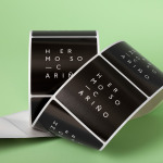
Hermoso Cariño by La Tortillería
Hermoso Cariño, a name taken from the title of a Mexican love song, is a gift shop with unique line of products. These are described as Mexican in the least expected way, leaning more towards the contemporary, but not forgetting tradition, and crafted by a new generation of designers. This is expressed throughout Hermoso Cariño’s brand identity, created by La Tortillería, through a mix of type,...