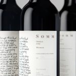
Niche Wine Co. — Somm by Frost
Somm is a limited edition Australian Shiraz from Niche Wine Co., a winery that embraces an innovative dry farming process that yields fewer yet higher quality grapes with an intensity of flavour and colour. With a desire to convey an established, old vineyard feel, and a sense of heritage and sophistication, Niche Wine Co. worked with Sydney-based studio Frost to develop a name and wine...

Filmore by Freytag Anderson
Filmore is a unisex skincare range and everyday routine. It is produced in Scotland for the national and international market using effective natural ingredients and Scottish water. Glasgow-based studio Freytag Anderson worked with Filmore on brand identity and packaging design. Referencing the International Code of Signals (ICS) and informed by their client’s love of Scandinavian design, the studio created a minimal graphic...

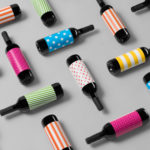
Brewdog’s Lone Wolf by B&B Studio
Lone Wolf—a whisky, gin and vodka range—marks Brewdog’s entry into the craft spirits market. These are produced by Brewdog’s distillery in Scotland, the only one to make base spirit from grain under one roof, a roof specially modified to accommodate a 19m high 60-plate rectification column to get the purest results possible. The range features a brand identity and packaging design created...
Artek Helsinki by Tsto
Artek is a Finnish furniture and product design business and retailer with a flagship store in Helsinki. It was founded in 1935 by architect Alvar Aalto and wife Aino Aalto, the arts promoter Maire Gullichsen and art historian Nils-Gustav Hahl. Artek grew alongside and shared many of the qualities of the 20th century modernist movement, blending art and technology, and making the...
Electric Ink by Robot Food
With the rise in the popularity of tattoos and the lack of credible long-term care products, Leeds-based design studio Robot Food formulated, branded and packaged Electric Ink, a tattoo care range for the mainstream market. The range includes a serum that enhances colour, an oil that delivers a freshly-inked look, and a daily moisturiser. Each feature distinctive packaging design that draws on...

Modern by Dwell Magazine by Collins
Modern by Dwell Magazine is a new range of home decor products, tablewear and furnishings for those who want to create a welcoming space with a modern aesthetic. It is a collaborative project between design and architecture magazine Dwell, designers Chris Deam and Nick Dine of Deam+Dine, and the American retailer Target. The range features over 120 products. From chairs, tables and glassware to kitchen utensils,...
Suomen Jäätelö by Werklig
Suomen Jäätelö is a super-premium ice cream brand currently available in five flavours and a sorbet. These include Milk, Pistachio, Vanilla and Chocolate made from Finncattle milk, a Rhubarb sorbet and Spruce created in collaboration with iconic furniture maker Artek. Although ice cream is internationally ubiquitous, Suomen Jäätelö is described as having a distinctively Finnish character. This is expressed throughout its packaging design, developed by...
Helvetimart by Anagrama, Mexico
Helvetimart is a supermarket in the Swiss city of Lausanne. It offers a broad range of groceries and high-quality Swiss specialities sourced from across the country. The supermarket also holds daily tastings and workshops, has an informed staff and a tablet-based service that gives shoppers access to information on the Swiss cantons and their products. Drawing on regional flags and antique architecture, Mexican graphic design...
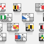
Vi Novell 2016 by Atipus
Vi Novell 2016 is a young wine from Catalonia with an intense ruby colour and a fresh and fruity flavour profile. It is the seventh in an ongoing series, and is dedicated to the party; the open-air dance, the joy and celebration of the beginning of the season, the first sip of wine, shared with friends, and the continued enjoyment of a long tradition...
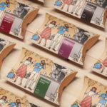
Talor&Jørgen Coffee by Bielke & Yang
Talor&Jørgen is a Norwegian speciality coffee roastery and coffee subscription service delivering small boxes of freshly roasted beans, sourced from across the globe, to subscribers based on their drinking habits rather than to a schedule. Product naming focuses on bringing to the forefront flavour notes rather than bean provenance, variety and preparation (although this is online and on pack) with the intention of making speciality coffee...
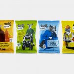
The London Popcorn Co. by B&B Studio
The London Crisp Co., a hand cooked British crisp brand available in local pubs throughout the capital, has expanded to include popcorn. Local graphic design studio and packaging specialists B&B Studio returned to the project that they help establish the visual language for. This time, introducing anthropomorphised animals inspired by what the studio describe as modern London tribes, and include yummy mummies, Hoxton...
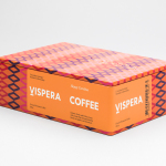
Víspera Coffee by Stockholm Design Lab
Víspera is premium coffee brand that intends to bring together the best of two worlds, a blend of 100% Arabica coffee beans sourced from the high altitude plantations of Colombia and a Swedish eye for quality and craftsmanship in its roasting. This meeting is visually articulated through type contrast, colour and pattern across Víspera’s packaging, developed by Stockholm Design Lab....