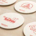
Melt by Can I Play
Melt is a Australian takeaway and restaurant franchise with a philosophy that looks to honour the 200 year old Napoli history of pizza making and its origins as a fast and nutritious meal by mixing high quality ingredients and recipe authenticity with the speed, price-point and openness that today’s consumers have come to expect. These values are also reflected through an absence of oil, fat or sugar...
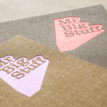
Mr Big Stuff by Can I Play
Mr Big Stuff is a Melbourne-based Southern American soul food restaurant and cocktail bar with a unique and distinctive interior designed by Technē Architecture and influenced by the music and film culture of the 1970’s and 80’s. The restaurant features an exposed concrete floor, timber and acoustic foam walls, neon signage and utilitarian furniture, as well as interior graphics and a brand identity treatment...
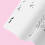
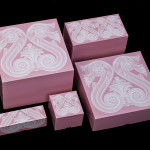
Korshags by Kurppa Hosk
Korshags is a family-owned seafood company located in Falkenberg on the Swedish west coast. Previously named Falkenbergs Lax (Falkenberg’s Salmon), Korshags has grown from a small local company specialising in smoked salmon, into an international player with a variety of products. With this in mind the company commissioned Stockholm-based Kurppa Hosk to establish a new name and brand identity that would better position...
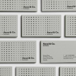
Ascui & Co. Architects by Grosz Co. Lab
Ascui & Co. Architects is an Melbourne-based studio with a rich history, depth of experience and a vision they describe as being a true perspective rather than one founded on intuition. Their projects are considered smart and environmentally sustainable, unexpected yet grounded by purpose, and range from residential additions to multimillion-dollar commercial developments. Anchored in the concept of Process & Possibility — a maxim that refers...
Café Royal by Pentagram
Once recognised as having the greatest wine cellar in the world and understood to have introduced French gourmet food to London, Café Royal, located on Regent Street, has been described as being the place for the avante garde to meet and dine for over a century. This year, to coincide with its reopening and reposition as a luxury five-star hotel...
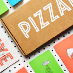
PizzaLuxe by The Touch Agency
PizzaLuxe began in 2011 as a single restaurant located on London’s Brick Lane hand making good-value, freshly baked pizzas using locally sourced, ‘deluxe’ ingredients. To coincide with an expansion into the Stratford’s Westfield Centre, the brand approached Edinburgh-based design studio The Touch Agency in 2013 to develop a new visual identity that would communicate their core values within a more ‘polished’ environment. In 2014, The Touch Agency continued...
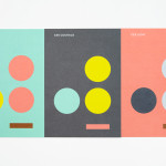
Coalition for Engaged Education by Blok
The Coalition for Engaged Education, formerly New Visions Foundation, is an LA based organisation, led by Dr Paul Cummins, that helps vulnerable children and young adults to realise their potential through an approach to education that respects and inspires them. CEE recently worked with design studio Blok to develop a new visual identity that would mark the organisation’s new national ambitions....
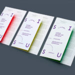
Interior Architecture Symposium by AKU
SISU was a symposium that took place in the summer of 2014 in the city of Tallinn. Organised by The Estonian Society of Interior Architects it was a place were recognised theoreticians and practitioners from Europe, Australia and Estonia met to discuss Dynamics of Theory and Practice within the field of interior architecture. The symposium’s identity, designed by AKU, leverages many...
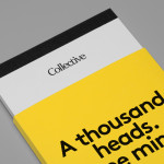
Collective by Hey
Collective is a new Istanbul based agency that is described loosely by Hey, the design studio behind its brand identity, as producing content, communication and design work. Its has an ideology, like the name suggests, based around a collaborative approach, developing projects with an extended network of people with a variety of skills. Hey recently created an visual identity treatment for...
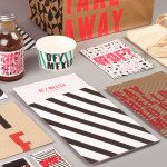
DF / Mexico by BuroCreative
DF / Mexico is the latest restaurant concept from the creators of Mexican market food experience Wahaca. Located on London’s Hanbury St. the restaurant combines an informal diner-style setting with Mexican fast-food and modern American influences. Its brand identity, a broad combination of print, signage, environmental graphics and website design by BuroCreative, is built around a simple mix of condensed type,...
Yksi elämä by Tsto
Yksi elämä is a Finnish project set-up with the intention of encouraging people to become more interested in their own well-being and to improve public health care on both a professional and organisational level, as well as society in general. The project is a collaborative endeavour between the Brain Association, Diabetes Association and Heart Association of Finland. Design studio Tsto were asked...
Ridley by RE:
Ridley is a pioneer of digital architectural services and operates as a central hub from which builders, developers and architects can collaborate. Originally established, and continuing to operate as an architectural documentation specialist, Ridley, from its premises in Australia and the Philippines, has also grown to become a leader in Virtual Design Construction. This is a practice that involves attaching live...