
Nourcy by lg2boutique
Nourcy is a delicatessen that has been creating fresh, home-made and original products for thirty years from its location in Quebec City. While providing a contemporary dining environment Nourcy also offers catering services and lunch boxes to customers who have come to expect restaurant-quality at work and at home. In conjunction with a new menu of pastries, an expanded chocolate selection, exclusive gourmet delicacies and the development of a...
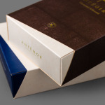
Antéoise by UMA
Antéoise is a creme dacquoise range from Anténor, a Japanese patisserie established in 1966 that creates French style cakes, cookies, tarts and variety of other confectionery. Antéoise’s brand identity and packaging treatment, developed by Osaka based graphic design studio UMA, draws on the range’s flagship positioning, high quality ingredients and the craft employed in its creation, the heritage and experience of Anténor, the streets of Kobe, and the...
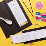
Tanoshii Ramen Bar by Mast
Ramen is a Japanese meat broth and wheat-noodle soup that originated in China and is now embraced internationally. While many enjoy instant versions, the best is said to be prepared over days and is the product, and some would say the art form, of a creative and experienced chef. These are the values of Tanoshii. As the first dedicated ramen bar...
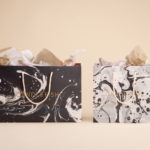
Candlefish by Fuzzco
Candlefish is a Charleston, South Carolina, store that stocks a carefully curated collection of scented candles from an assortment of brands including Rewined and Produce, and also plays host to a variety of workshops. The store takes its name from the Eulachon, better known as the Candlefish. After drying, and due to its high oil content, the Candlefish burns much like a candle and...
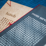
Chavez by Föda
Chavez is a contemporary Mexican restaurant located within the Radisson hotel, Austin, Texas. The restaurant has a Southwestern menu created by chef Shawn Cirkiel and inspired by his memories of family road trips taken to the Mexican coast and the cuisine he experienced there. These memories also informed the development of a warmly lit, wood and fabric furnished interior design by Michael Hsu Office...
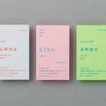
Laji Hair & Make by UMA
Laji is a hair and make-up studio located in the city of Osaka, Japan, with a distinctive interior design developed by dot architects. It features chipboard dividers and mirror frames, pegboard panels, strip lighting, exposed concrete ceilings, brick walls and utilities, concrete cast with wood surface texture, red stained floors as well as custom furniture created by Ryohei Yoshiyuki. It is a...
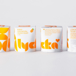
Lycka by BVD
Lycka is a 100% natural hand filled frozen yoghurt brand from Germany that donates 11 cents from each sale to Welthungerhilfe, a humanitarian aid project tackling issues such as world hunger, land grabbing in Cambodia and displacement across Syria and Iraq, amongst many other issues. Lycka’s brand identity and packaging, a mix of bright geometric forms which appears to draw some of...
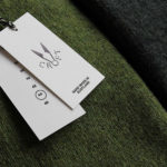
Croft Knitwear by Commission
Croft is a contemporary men’s knitwear brand that specialises in high quality cashmere and soft wool garments. These are available exclusively through online retailer Superdemin. Each garment is hand knitted on Scotland’s Shetland Islands by crofters, a name given to those using traditional batch production processes within small communities unique to the Highlands. Alongside a new logo, London-based design studio Commission worked with photographer Luke Evans to...
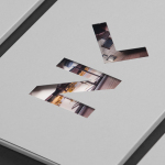
Luka Žanić Photography by Studio8585
Luka Žanić is a Croatian interior and architectural photographer who works with clients worldwide. He approaches each project individually, gathering information about objects, spaces and their purpose before beginning a shoot. His brand identity, designed by Studio8585 and which included stationery, poster and portfolio folder, takes advantage of a typographically challenging set of characters in the form of a monogram and uses this...
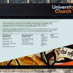
University Church by Spy
Located at the heart of Oxford, University Church of St Mary the Virgin, abbreviated to University Church, has been a site of worship and debate for over 700 years and is the “spiritual home” of the oldest university in Britain. The church recently received a grant from the Heritage Lottery Fund to raise awareness of the historical nature of the site...

Theatre Royal Plymouth by Spy
Theatre Royal Plymouth (TRP) is the largest and best attended regional producing theatre in the UK and leading promoter of theatre in the South West. It runs a diverse programme of performances, activities and events, and has a 1300 seat auditorium capable of delivering West End musicals, opera and ballet, as well as a smaller 175 seat theatre for experimental productions. The building,...
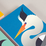
The Stow Brothers by Build
The Stow Brothers is an estate agent working within the area of Walthamstow, a place where urban London meets the Epping Forest, and is described by the estate agent as a rapidly expanding community of like-minded people looking for a place with a strong sense of community, plenty of culture, good food and a decent pint. UK-based graphic design studio Build worked with The...