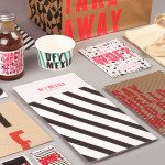
DF / Mexico by BuroCreative
DF / Mexico is the latest restaurant concept from the creators of Mexican market food experience Wahaca. Located on London’s Hanbury St. the restaurant combines an informal diner-style setting with Mexican fast-food and modern American influences. Its brand identity, a broad combination of print, signage, environmental graphics and website design by BuroCreative, is built around a simple mix of condensed type,...

Yksi elämä by Tsto
Yksi elämä is a Finnish project set-up with the intention of encouraging people to become more interested in their own well-being and to improve public health care on both a professional and organisational level, as well as society in general. The project is a collaborative endeavour between the Brain Association, Diabetes Association and Heart Association of Finland. Design studio Tsto were asked...
Ridley by RE:
Ridley is a pioneer of digital architectural services and operates as a central hub from which builders, developers and architects can collaborate. Originally established, and continuing to operate as an architectural documentation specialist, Ridley, from its premises in Australia and the Philippines, has also grown to become a leader in Virtual Design Construction. This is a practice that involves attaching live...

Loot by Savvy
Loot is a surf and lifestyle store retailing distinctive products for a modern and global consumer and offers an alternative to the more commercial items from retailers typically found in its touristic location in the Mexican city of Zihuatanejo. Loot’s brand identity, designed by Savvy, draws its character and distinction from Zihuatanejo’s past as a hotspot for pirates, and visualised as...
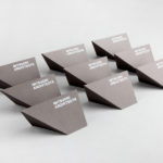
Mitsuori Architects by Hunt &Co.
Mitsuori Architects is an architectural design studio that creates high quality structures and spaces that merge aesthetic beauty with careful planning and thoughtful detailing. Their large scale project experience is combined with the flexibility of a smaller practice allowing them to provide big clients with a personalised service. Mitsuori’s visual identity, designed by Melbourne based Hunt & Co. and informed by a name that translates from Japanese as...

SSU by Snask
The Swedish Social Democratic Youth League, abbreviated to SSU, is a branch of the Swedish Social Democratic Party, associated with the Swedish Trade Union Confederation, and one of the largest youth leagues in the country with a membership of over 10,000. In response to an upcoming general election, which took place on September 14th, the SSU looked to readdress its visual identity which had...
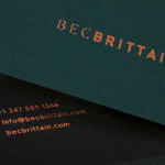
Bec Brittain by Lotta Nieminen
Bec Brittain is a New York based lighting and product designer who is driven by a “love for luxurious materials, intuitive forms and forward-thinking technology.” Working with her small team from a studio in Brooklyn, Bec Brittain creates products that explore and experiment with new production techniques and materials that push the boundaries of American-made centrepiece lighting design. Each piece is created and inspected by Bec and produced using a...
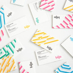
Biju Bubble Tea by ico
Biju is bubble tea brand and cafe located in London’s Soho district that looked to bring and translate a product and experience well-established in South East Asia to the UK in a way that would appeal to a modern discerning market. This was achieved by focusing on fresh, natural and high quality ingredients, a simple menu with an emphasis on taste, a focus on the social aspects...
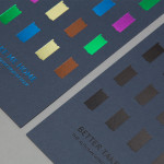
Folk by IYA Studio
Folk is a British contemporary menswear, womenswear and footwear brand, founded in 2001, with stores across London, one in Amsterdam and collections that are stocked internationally. Folk describes its pieces as simple everyday wear with subtle, innovative and playful detailing with a focus on custom fabrics and unique trims. These values are reflected throughout its brand identity, created by IYA Studio over the...
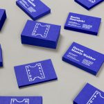
Taidehalli by Tsto
Taidehalli is an art gallery, also know as Helsinki Kunsthalle, with a significant 86-year history. It is set within the walls of a distinctive building created by Jarl Eklund and Hilding Ekelund, and during its lengthy residency has secured its place as a key space within Finland for the exhibition of contemporary artworks. Taidehalli’s new brand identity, recently redesigned by Helsinki and New York based design...
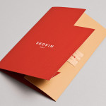
Skovin by Heydays
Skovin is Norwegian, high-end, solid wood floor specialist that combines ancient craftsmanship with modern technologies. By mixing a wood veneer business card and a traditional name drawn from the old word Skøyen, the area in Oslo where the company was founded, with geometric shapes and die cuts, panels of flat colour and sans-serif typography, Skovin’s identity, designed by Heydays, intends to...
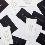
Shaun Ford & Co. by Savvy
Shaun Ford & Co. is a Canadian bespoke furniture an interiors business that creates tailored environments for the sophisticated, style conscious consumer, and whose work revolves around a timeless approach to space. Each piece of furniture is designed with careful consideration given to the years that it will have to coexist within a particular environment and with the intention that each acquires further...