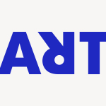
ArtRabbit by Bond
ArtRabbit is a global platform for the promotion, discovery and appreciation of contemporary art, connecting thousands of art spaces, exhibitions and events to artists, art professionals, collectors, students and anyone interested in art. Bond’s London-based studio worked with the team at ArtRabbit to create a new wordmark and brand language that could be used both in print and online....
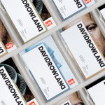
David Rowland by ico Design
David Rowland is an award-winning and straight-talking London-based photographer who has been capturing images for leading brands and agencies for over two decades. With a desire to remind existing and potential clients of his expertise and technical know-how David worked with graphic design studio and client ico Design to develop a new brand identity and supporting collateral. This included, alongside a new logotype, business...
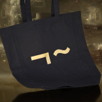
Linden Staub by Bibliothèque
Linden Stuab is a UK-based model agency challenging industry conventions with their mantra ‘Empowering Women’, and by acting as a mother agency to all of their models. The name Linden Staub, derived from the maiden names of the two founding partner’s mothers, is an expression of this, and alongside the agency’s strong human-focus, was the basis for their new brand identity, created...
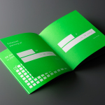
Rattis Books by The Counter Press
Rattis Books is a new London-based independent publisher that celebrates the convergence of traditional and modern print processes and has a firm belief that the book is an art object. To help convey this, the publisher worked with design studio, private press and typography workshop The Counter Press to create their brand identity, and the design for their first book Tiro, a collection of football writings....
Paco Rabanne by Zak Group
Paco Rabanne is Spanish designer and French fashion label established in 1966 with a catalogue of ready-to-wear garments, shoes, fragrances and accessories. Rather than an interest in the past, Paco Rabanne, who originally trained as an architect, has created strong silhouettes from new materials, and often rejected the spirit and art of the time. Paco Rabanne’s creative director Julien Dossena worked...
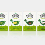
Higher Living by B&B Studio
Higher Living is a British company who have been blending teas, herbs and spices for over 45 years using only 100% natural and organic ingredients. Continuing their collaboration with Higher Living, which began back in 2010, London-based graphic design studio B&B Studio worked with the company, following a recent expansion of the range, to help redefine its packaging and brand identity with the intention...
Elements by dn&co.
Elements is the latest spout and handle range from Brooklyn-based boutique brassware business The Watermark Collection. It features 15 metal finishes, 3 handle designs and 19 hand-crafted covers. These make up a potential quarter of a million possible combinations. The modularity, materiality and variety of Elements is drawn on and expressed through a visual identity created by British design studio dn&co,...
Learig by The District
Learig is a UK-based commercial and residential property developer managing projects end to end, from planning to design to build, and the financial considerations that link each of these stages. This end to end management, and Learig’s three tiers of expertise, is visually articulated by its new brand identity, designed by The District, through a logo of three stacked blogs which extend out...
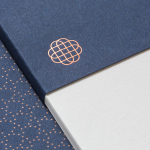
Hedeker Wealth & Law by Socio Design
Hedeker Wealth and Law is an American independent business group dedicated to helping people protect, preserve and grow their wealth through services based around four key areas of expertise—investment, management, financial planning and tax advice. This complete and holistic combination marks Hedeker out from what is a crowded market of individual businesses providing fewer services. To better express their experience and breadth of service, and...
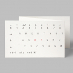
Designers’ Friend by Paul Belford Ltd
Designers’ Friend is a UK web development company working with designers and design studios to deliver fast sites that look exactly as they were designed. The company commissioned London-based graphic design studio, past client and collaborator Paul Belford Ltd., to deliver a brand identity concept that would work in print and online. The studio’s concept is described as a dramatisation of the line ‘we write code’ and visualised,...
Social Enterprise UK by Paul Belford Ltd.
Social Enterprise UK is an organisation that represents those that use the power of business to bring about social and environmental change. With the intention of dramatising the organisation’s investment in, and contribution to, developing a fairer society, London-based graphic design studio Paul Belford Ltd. created a logo that draws an equals symbol from an S, links a number of sub-brands and differentiates these through colour....
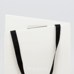
Wadha by Two Times Elliott
Wadha is a Islamic fashion brand for women, established in 2010 in the city of Doha, Qatar, by Wadha Al Hajri. Garments by Wadha are characterised by unique fabrics and cuts, contemporary, clean and slightly irregular shapes, and single colour. This aesthetic is reflected throughout Wadha’s brand identity, designed by British graphic design studio Two Times Elliott, not only in typographic form and...