From Europe
Tangent GC Organic Soap by Carl Nas Associates
Tangent GC began as a Scandinavian organic garment and shoe care company developing products that intended to increase the life of clothing and footwear, and entered the organic skincare market in 2016. The concern given to the longevity of skin becomes an understandable extension of that original intention. Carl Nas Associates, who have been working with Tangent GC on their packaging treatments for...

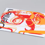
Ekta: 160 Faces by Lundgren+Lindqvist
160 Faces is a new publication from Swedish artist Daniel Götesson working under the name Ekta, designed by Lundgren+Lindqvist and distributed under the studio’s publishing arm ll’Editions. The book collates 160 drawings made by the artist in 2019, and sequenced, rather than in logical pairs and with a curated rhythm, but by using an algorithm developed by the studio. Applied...
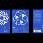
LogoArchive Issue 7
LogoArchive Issue 1 was conceived, designed and sent to print in a day. It was inspired by a panel discussion at Somerset House as part of the exhibition Print! Now on to its seventh numbered release (and the tenth in the series), LogoArchive continues to reconfigure itself with each new issue with the intention of surprising and delighting. This issue...
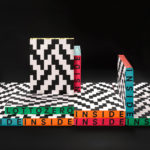
Inside Lottozero by Studio Mut
Inside Lottozero was an exhibition of international artists that covered a wide-range of artistic disciplines. It was conceived by Arianna and Tessa Moroder and curated by Alessandra Tempesti. The exhibition took place at Lottozero / textile laboratories in Toscana, Italy and ran until November 20th, 2016. Under the concept of “Non-stop Fruition”, the exhibition opened with a 12 hour overnight event in...

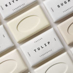
Tangent GC Organic Detergents by Carl Nas Associates
Tangent GC began as a Scandinavian organic garment and shoe care company developing products that intended to increase the life of clothing and footwear, and entered the organic skincare market in 2016. The longevity of skin being an understandable extension of that original intention. The company’s graphic identity, a typographical system designed by Essen International under the creative direction of Carl Nas, established...
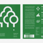
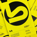
LogoArchive Issue 6
LogoArchive was conceived, designed and sent to print in a day. It was inspired by a panel discussion at Somerset House as part of the exhibition Print! Now on to its sixth numbered release, LogoArchive continues to reconfigure itself with each new issue with the intention of surprising and delighting, particularly at a moment of intentional difficulty. This issue, launched...
Queremos Sonreír by Mucho
Queremos Sonreír – Activar la Cultura Local (We want to smile – Activating local culture) brings together the voices of a variety of cultural agents–from citizen collectives and activists to artists and managers of cultural programmes–who are generating actions that intend to stimulate local culture, empower citizens, develop learning processes and further critical thinking. Through these voices the book explores questions around citizen...
LogoArchive ExtraIssue – Past & Present
The distinctive smaller format of LogoArchive–a zine on mid-century symbols that channels the independent spirit of niche publishing–has created a space for experimentation and collaboration with those who also share a similar interest in symbols and corporate identity programmes of the past. BankerWessel is one such studio. Their brand identity work brings the spirit of mid-century form language into the...
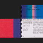
Albert Oehlen Book by Zak Group
Albert Oehlen is a German contemporary artist. Working with canvas, he brings together a bricolage of figurative, collaged, abstract and computer-generated elements, with a particular focus on process and self-imposed parameters such as limited colour palettes. His work, as described by the Serpentine Galleries, currently running a Oehlen solo exhibition till February 2020, engages with the history of painting through Expressionist brushwork, Surrealist...
LogoArchive ExtraIssue – Letters As Symbols
LogoArchive in print was conceived, designed and sent to print in a day. It was inspired by a panel discussion at Somerset House as part of the exhibition Print! Now on to its seventh release, LogoArchive continues to reconfigure itself with each new issue with the intention of surprising, graphically and materially, within the context of archival. The distinctive smaller...
Inn Situ by Studio Mut
Inn Situ is part of the cultural programme of BTV Bank and series of three events; a exhibition, a concert and panel discussion. This takes place two to three times a year in the Austrian city of Innsbruck. The events are distinctive in their approach, a Russian doll of nested narratives, with each layer responding to the next. Practically speaking,...

Maria Sole Ferragamo by Lundgren+Lindqvist
Maria Sole Ferragamo is one-of-a-kind jewellery designer using up-cycled premium leather; remnants of the Italian fashion industry. She has a degree in architecture at Politecnico, Milan and another in jewellery design from Central Saint Martins, London. This intersection of fashion and architecture can be seen throughout the designer’s collection and has gone on to inform the design of her visual identity...