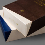
Antéoise by UMA
Antéoise is a creme dacquoise range from Anténor, a Japanese patisserie established in 1966 that creates French style cakes, cookies, tarts and variety of other confectionery. Antéoise’s brand identity and packaging treatment, developed by Osaka based graphic design studio UMA, draws on the range’s flagship positioning, high quality ingredients and the craft employed in its creation, the heritage and experience of Anténor, the streets of Kobe, and the...
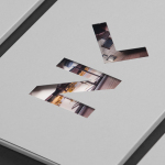
Luka Žanić Photography by Studio8585
Luka Žanić is a Croatian interior and architectural photographer who works with clients worldwide. He approaches each project individually, gathering information about objects, spaces and their purpose before beginning a shoot. His brand identity, designed by Studio8585 and which included stationery, poster and portfolio folder, takes advantage of a typographically challenging set of characters in the form of a monogram and uses this...
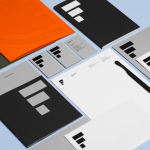
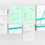
Estampaciones Fuerte by Hey, Spain
Estampaciones Fuerte is a Spanish cold metal stamping and pressing business with over forty years experience producing a variety of components for the automotive, domestic appliance and construction industries, as well as providing welding, finishing, threading and set assembling services. This year Hey worked with Estampaciones Fuerte to develop a new contemporary brand identity that would better reflect their industrial experience and professionalism....
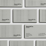
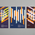
Ascui & Co. Architects by Grosz Co. Lab
Ascui & Co. Architects is an Melbourne-based studio with a rich history, depth of experience and a vision they describe as being a true perspective rather than one founded on intuition. Their projects are considered smart and environmentally sustainable, unexpected yet grounded by purpose, and range from residential additions to multimillion-dollar commercial developments. Anchored in the concept of Process & Possibility — a maxim that refers...
Reachin’ by Karoshi
Reachin’ is a regular charity event established in 2012 to engage with a younger demographic and raise awareness and funds for Myeloma UK, an organisation dedicated to finding a cure for Myeloma, a rare cancer of the bone marrow. Money made from each event is complemented by the online sale of branded t-shirts, vests and tote bags. Designed by Karoshi, Reachin’s brand...
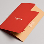
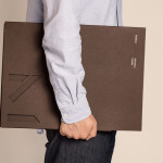
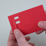
Skovin by Heydays
Skovin is Norwegian, high-end, solid wood floor specialist that combines ancient craftsmanship with modern technologies. By mixing a wood veneer business card and a traditional name drawn from the old word Skøyen, the area in Oslo where the company was founded, with geometric shapes and die cuts, panels of flat colour and sans-serif typography, Skovin’s identity, designed by Heydays, intends to...
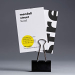
Mendeli Street Hotel by Koniak
Mendeli Street is a city-beach hotel, designed by BK Architects, that celebrates the modern spirit of Tel-Aviv. Design studio Koniak developed a brand identity for the hotel, which included a logotype, stationery set, key cards, door-hangers and website, that reflect its contemporary qualities and the bright sunny climate of its location....
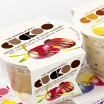
Cuckoo Muesli by B&B Studio
Cuckoo is a ‘modern’ wheat-free bircher muesli range that blends oats, yoghurt and fruit. Individual flavours include ‘Choco Sour Cherry with a smooth layer of Madagascan Vanilla’, Mango & Coconut with a tropical twist of Lime and Ginger’ and ‘Elderflower & Cranberry with a Blueberry & Blackcurrant compote’. London-based design agency B&B Studio, inspired by Swiss graphic posters, developed a new...
Mellbye by Heydays
Mellbye is a Norwegian architecture firm founded in 1954 with a “mindset anchored in modernism”. Design studio Heydays created a new brand identity for the firm based around a geometric M symbol built from the initials of their two main services, architecture and interiors. Executed as a combination of blind deboss and die cut detail across a earthy and urban...
Fieldwork by Fieldwork & Hey
Fieldwork is a Manchester based digital design and branding agency who specialise in “crafting engaging experiences across digital, web and brand”. Their visual identity, a utilitarian mix of stencil cut logo-mark, a bright yet economical single colour palette, weighty boards and sticker detail, is now complemented by the launch of their self-initied print and digital project A Guide To Making Things, illustrated by Hey....
Frederik Laux Photography by LSDK
Frederik Laux is an award winning German portrait, fashion, lifestyle and editorial photographer with a client list that includes Alliance and Mercedes-benz. His new visual identity, developed by Stuttgart based design agency LSDK, takes a competently spaced but generic condensed, sans-serif logotype and executes it as a redacted three-line mark die cut by hand across a print solution that mixes...
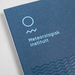
Meteorologisk Institutt by Neue
Meteorologisk Institutt provides meteorological data to Norway’s military, civil services and the general public with the intention of safe guarding life, property and the environment. Design agency Neue developed a new visual identity solution for the institute that mixes geometric shapes, material and print choices and the humanistic and environmental detail of photography to achieve communicative and aesthetic contrast and capture the data drawn from...