Editorial Design

LogoArchive Ukraine
In 2020 LogoArchive started to roll out a research programme, inviting international designers to use the platform to share the works of their countries, with a special interest in those who have been previously under-represented. This included nations in the Middle East, East Asia and Eastern Europe. Since then, the LogoArchive Instagram accounts have continually surprised and delighted. One of...
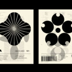
LogoArchive – Akogare 憧れ by Hugh Miller
LogoArchive returns with its fourth collaborative Extra Issue and first bi-lingual release, documenting the forms of Japanese logo design. Through the distinctive smaller format of the bound booklet LogoArchive seeks to surprise and delight with each new issue, introducing new collaborators to offer unexpected interpretations of the ubiquitous logo book. For this Extra Issue, Hugh Miller orchestrates graphic impact and...

OMA NY Monograph by Studio Lin
The Office for Metropolitan Architecture (OMA) is an international architectural practice operating within the traditional boundaries of architecture and urbanism. It was founded in 1975 in Rotterdam by architects Rem Koolhaas and Elia Zenghelis and alongside Madelon Vriesendorp and Zoe Zenghelis. OMA now has seven offices. This year saw the launch of OMA New York’s self-published monograph, designed by Studio Lin, that takes a look...

Ekta: 160 Faces by Lundgren+Lindqvist
160 Faces is a new publication from Swedish artist Daniel Götesson working under the name Ekta, designed by Lundgren+Lindqvist and distributed under the studio’s publishing arm ll’Editions. The book collates 160 drawings made by the artist in 2019, and sequenced, rather than in logical pairs and with a curated rhythm, but by using an algorithm developed by the studio. Applied...

White Rabbit Collection by Toko
The White Rabbit Collection is a contemporary arts publication showcasing the work of 99 artists drawn from the White Rabbit, a contemporary art museum, gallery and archive in Sydney. The museum has become one of the world’s most significant collections of Chinese contemporary art, with over 2000 works from 700 artists. Through this new publication, designed by Australia design studio Toko...
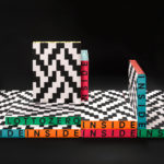
Inside Lottozero by Studio Mut
Inside Lottozero was an exhibition of international artists that covered a wide-range of artistic disciplines. It was conceived by Arianna and Tessa Moroder and curated by Alessandra Tempesti. The exhibition took place at Lottozero / textile laboratories in Toscana, Italy and ran until November 20th, 2016. Under the concept of “Non-stop Fruition”, the exhibition opened with a 12 hour overnight event in...
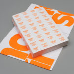
Queremos Sonreír by Mucho
Queremos Sonreír – Activar la Cultura Local (We want to smile – Activating local culture) brings together the voices of a variety of cultural agents–from citizen collectives and activists to artists and managers of cultural programmes–who are generating actions that intend to stimulate local culture, empower citizens, develop learning processes and further critical thinking. Through these voices the book explores questions around citizen...
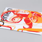
Albert Oehlen Book by Zak Group
Albert Oehlen is a German contemporary artist. Working with canvas, he brings together a bricolage of figurative, collaged, abstract and computer-generated elements, with a particular focus on process and self-imposed parameters such as limited colour palettes. His work, as described by the Serpentine Galleries, currently running a Oehlen solo exhibition till February 2020, engages with the history of painting through Expressionist brushwork, Surrealist...

Origen México by Blok
Origen México is a encyclopaedic collection of cultural reference points from Mexico, and an expression of love for its land and identity, edited by Ámbar Editores and Paola Gonzalez Vargas. Written in Spanish it covers things such as, Barro negro pottery; the black clay pottery of Oaxaca, Barrancas del Cobre; the six canyons in the Sierra Madre Occidental and individuals such...
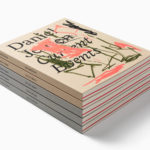
Daniel Jensen: Current Events by Bedow
Daniel Jensen is a Swedish artist whose work moves between paintings, sculptures and drawings and explores themes such as society and pop-culture, film, literature and nature. His latest book, designed by Bedow, features artworks that are figurative and abstract, unrelated and absent a narrative. With such compelling and intense imagery of colour and dynamic shape, Bedow developed a format that...

LogoArchive Issue 5
The technical limitations of the mid-century—the need for a steady hand and a precise mind for mechanical reproduction—demanded that an exceptional level of care and creativity be given over to shape and space, association and perception. These considerations created a rich corporate and consumer form language and range of graphic techniques. These have been partly marginalised, usurped by modern print...
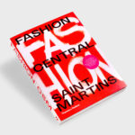
Fashion Central Saint Martins by Praline
Fashion Central Saint Martins documents and celebrates what has become one of the most influential fashion courses in the world. It is a collaboration between publisher Thames & Hudson and Central Saint Martins, and co-authored by Programme Director of Fashion Hywel Davies and Cally Blackman, lecturer in Fashion History and Theory. The Central Saint Martins Fashion Course has a legacy...