
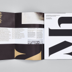
Taidehalli by Tsto
Taidehalli is an art gallery, also know as Helsinki Kunsthalle, with a significant 86-year history. It is set within the walls of a distinctive building created by Jarl Eklund and Hilding Ekelund, and during its lengthy residency has secured its place as a key space within Finland for the exhibition of contemporary artworks. Taidehalli’s new brand identity, recently redesigned by Helsinki and New York based design...
Mauritshuis by Studio Dumbar
Mauritshuis is an art museum and state-owned building constructed in the 17th century and located in The Hague. The building is described as being a fine example of Dutch Classicist architecture. It was formerly the residence of count John Maurice of Nassau and has been home to the Royal Picture Gallery since 1822. Today, it houses a plethora of Golden...
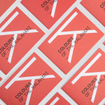
Colours Of The Kalahari by Believe In
Believe In recently published images of their print and brand identity work created for the Mall Galleries’ exhibition Colours Of The Kalahari, the first major display and sale of southern African Bushman art ever to be held in London. The exhibition represents the latest generation of contemporary San artists from an unbroken line that stretches back 20,000 years, and includes 150...
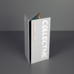
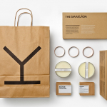
Collective Gallery by Graphical House
Collective is a contemporary visual arts organisation founded in 1984 to help new and emerging artists exhibit their work in Scotland’s capital city Edinburgh. The organisation delivers a diverse programme of new exhibitions and commissions, and is described as being “fundamental to the cultural vitality of the country”. Following a move to The City Observatory, Glasgow based design studio Graphical House worked with...
Saxa by Graphical House
Saxa is an independent on-line dealer, publisher and commissioner of original and editioned works from international artists with differing perspectives and cultures, taking a curatorial and collaborative approach to make these available to collectors, galleries, institutions and the general public. Saxa’s visual identity, created by UK-based design agency Graphical House and inspired by crystalline structures, conveys the idea of buyer and artist networks through the coalescing and...
Sifang Art Museum by Foreign Policy
Sifang Art Museum is a gallery and creative space located in the Pukou region of Nanjing, China dedicated to art, architecture and international collaboration. Their visual identity, a bilingual logo-type set across a collateral of unusual trapezoidal cut detail and monochromatic colour palette—developed by Singapore-based creative and strategic design agency Foreign Policy—draws together the themes of architectural space, the dimensionality created by light and shadow,...
Spritmuseum by Stockholm Design Lab
Spritmuseum (formerly Vin & Sprithistoriska Museet) is a Stockholm based art gallery, museum, tasting room, meeting-place, bar, restaurant and open-air café with a unique spirit theme. Its new identity, developed by multidisciplinary design agency Stockholm Design Lab, is based around a bold word-mark constructed from a typeface now synonymous with the Absolut brand (and Swedish design) and pairs it with a simple but iconic four stroke...