BP&O Voices
Paul Belford on Ads:
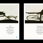
VW Corrado press & poster
A guest article from Paul Belford on BMP DDB’s press and poster for the VW Corrado (1990). BP&O Voices presents the opinions of industry experts on a wide range of topics....
BP&O Voices
Paul Belford on Ads:
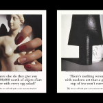
V&A print campaign
A guest article from Paul Belford on Saatchi & Saatchi’s print campaign for the V&A (1988). BP&O Voices presents the opinions of industry experts on a wide range of topics....
BP&O Voices
Paul Belford on Ads:
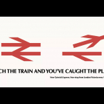
British Rail poster
A guest article from Paul Belford on Hedger Mitchel Stark’s poster for British Rail (1984). BP&O Voices presents the opinions of industry experts on a wide range of topics....
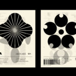
LogoArchive – Akogare 憧れ by Hugh Miller
LogoArchive returns with its fourth collaborative Extra Issue and first bi-lingual release, documenting the forms of Japanese logo design. Through the distinctive smaller format of the bound booklet LogoArchive seeks to surprise and delight with each new issue, introducing new collaborators to offer unexpected interpretations of the ubiquitous logo book. For this Extra Issue, Hugh Miller orchestrates graphic impact and...
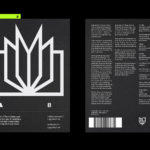
LogoArchive Issue 8
Inspired by a panel discussion that took place at London’s Somerset House in 2018 as part of the exhibition Print! the first issue of LogoArchive was conceived, designed and sent to print the following day. Channeling the independent spirit of niche publishing the LogoArchive zine series seeks to surprise and delight within the context and practice of mid-century logo archival...
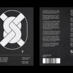
LogoArchive Issue 7
LogoArchive Issue 1 was conceived, designed and sent to print in a day. It was inspired by a panel discussion at Somerset House as part of the exhibition Print! Now on to its seventh numbered release (and the tenth in the series), LogoArchive continues to reconfigure itself with each new issue with the intention of surprising and delighting. This issue...
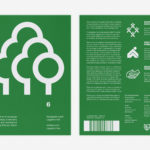
LogoArchive Issue 6
LogoArchive was conceived, designed and sent to print in a day. It was inspired by a panel discussion at Somerset House as part of the exhibition Print! Now on to its sixth numbered release, LogoArchive continues to reconfigure itself with each new issue with the intention of surprising and delighting, particularly at a moment of intentional difficulty. This issue, launched...
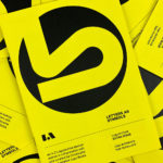
LogoArchive ExtraIssue – Letters As Symbols
LogoArchive in print was conceived, designed and sent to print in a day. It was inspired by a panel discussion at Somerset House as part of the exhibition Print! Now on to its seventh release, LogoArchive continues to reconfigure itself with each new issue with the intention of surprising, graphically and materially, within the context of archival. The distinctive smaller...
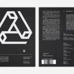
LogoArchive Issue 5
The technical limitations of the mid-century—the need for a steady hand and a precise mind for mechanical reproduction—demanded that an exceptional level of care and creativity be given over to shape and space, association and perception. These considerations created a rich corporate and consumer form language and range of graphic techniques. These have been partly marginalised, usurped by modern print...
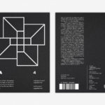
LogoArchive Issue 4
The first issue of LogoArchive was conceived, designed and sent to the printers within a day. It was inspired by a panel discussion that took place the day before at Somerset House as part of the exhibition Print! Tearing It Up. Following a successful launches of the first, second, third and Extra Issue, LogoArchive returns with its fourth release. This is...
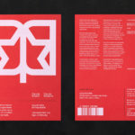
LogoArchive Extra Issue – Canada Modern
The first issue of LogoArchive was conceived, designed and sent to the printers within a day. It was inspired by a panel discussion that took place the day before at Somerset House as part of the exhibition Print! Tearing It Up. Following the successful launch of three issues, LogoArchive returns with a very special Extra Issue in collaboration with Canada Modern,...
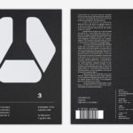
LogoArchive Issue 3
The first issue of LogoArchive in print was conceived, designed and sent to the printers (for quotation) within a day. It was inspired by a panel discussion that took place the day before at Somerset House as part of the exhibition Print! Tearing It Up. Following a successful launch of the first and second issues, LogoArchive returns with its third release...