The Best Graphic Design Work of 2018
WeWork by Gretel
Founded in 2010 and headquartered in New York, WeWork began as a workspace provider and has grown to offer a broader infrastructure of community management and support, event programming and virtual network management for small and large businesses, entrepreneurs and freelancers. With significant and rapid growth WeWork worked with Gretel to align its visual identity with its purpose. “Framework”, a graphic route that...

Aurlands by Heydays
Aurlands is the oldest running workshop for handcrafted shoes in Norway. It was founded in 1907 by shoemaker Nils G. Tveranger who, following time in America training as a shoemaker, went on to create the world’s first Penny Loafer in 1926. This, subsequently, became an enduring unisex fashion icon across Europe and America. Aurlands continues to build on this legacy,...
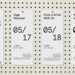
A’18 by Pentagram
AIA Conference on Architecture is an annual three-day event that explores what is new and now in architecture and design. In 2018 this took place between June 21st and 23rd at Manhattan’s Javits Center, a pioneering modernist space frame structure designed by architect James Ingo Freed. The event is made up of workshops, seminars and city tours across the five boroughs of New...
Strandgut – Vasas Flora Och Fauna by Bedow
Vasas Flora Och Fauna is a Finnish indie pop-group and trio of musicians. Their new album Strandgut is made up from eleven songs taken from the band’s first two albums, which were then re-recorded in German. This was released on both LP and CD by the record label Startracks. Swedish design studio Bedow worked with Vasas Flora Och Fauna to create...
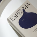
Espelma by Commission
Espelma is a clean-burning natural wax candle company. They have an online store and have hosted pop-ups in London and New York. Each candle comes in a refillable glass vessel, designed by Espelma founders Clara and Claudia, and handmade on the Italian island of Murano. Espelma is distinguished by its mix of glass craft, distinctive colour and form, the clean-burning nature...

Heyday by Collins
Heyday is a range of 150 moderately-priced high-quality own-brand consumer tech products from American retailer Target and their first foray into the electronics and tech accessories sector. The range includes battery packs and chargers, cables, covers and wireless speakers amongst many other products. These share a form language that balances an everyday simplicity, robustness and utility with novelty and cheerfulness by...
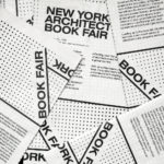
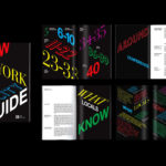
New York Architecture Book Fair by Pentagram
Storefront for Art and Architecture is an independent not-for-profit art and architecture organisation, located in New York’s Soho, dedicated to advancing architecture, art and design. To further this remit the organisation developed the New York Architecture Book Fair, an event and platform that brings together authors, designers, publishers, critics and readers to consider, through a programme of discussion, installation and pop-ups,...
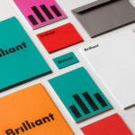
Brilliant by The Studio
Swedish employee engagement consultancy Netsurvey and Bright, experts in customer surveys, have been merged and rebranded as Brilliant by The Studio. This merger and rebranding intended to create a new platform capable of encapsulating the skills and corporate cultures of both companies and develop a visual expression that people from each could identify with and stand behind. In the same spirit as The Studio’s...

Outline by Studio South
Outline is a six lot freehold property development opportunity from Fearon Hay Architects located on Kings Road on the border of Mount Eden and Mount Roskill in a culturally and historically rich neighbourhood in Auckland. Each lot is 95m2 with the capacity to build four levels and include a roof living space totalling 300m2 of floor area. Studio South worked with Fearon Hay...
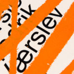
Fredrik Værslev As I Imagine Him by Zak Group
Fredrik Værslev as I Imagine Him is an exhibition of work by Norwegian contemporary artist Fredrik Værslev produced over the last decade. The exhibition runs from September 2018 to January 2019 at Astrup Fearnley Museet in Oslo. Through a focus on process, modes of abstraction and representation, motions between the painterly and the architectural and in the use of untraditional tools...
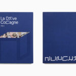
Nunchi by Bedow
Nunchi is an Italian startup and the vision of Cedric Naudon, a self-confessed gastronome. This follows his ambitious project to create an entirely new creative neighbourhood of restaurants, fashion boutiques and design stores in Le Marais, Paris. Nunchi intends to frame and connect all of Cedric Naudon’s gastronomic projects. The first of which is a reimagining of Edouard Nignon’s classic cookbook L’Heptameron des Gourmets,...
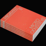
Migrant Journal No.5 by Offshore Studio
Migrant Journal is a six-part exploration of migration in all its forms. It covers, as you might expect, the current and pressing political and socio-cultural implications of the mass migration of people, yet also delves deeper into the more abstract movement of ideas, power and information around the globe. Migrant Journal, in its breadth but a continuity of theme, intends...