Home and Garden
New York Botanical Garden by Wolff Olins
It must be something of a dream project when an agency gets commissioned to work on those big-name cultural clients – museums, art galleries, orchestras, theatre companies, et al. You’d expect such projects to be a departure from the constraints and stakeholder-limitations of corporate clients; and perhaps a chance to be more creative than usual, thanks to the nature of...
Omlet by Ragged Edge
We’re undeniably in an age of pet care 2.0: the post-fur-baby era, where people are finally beginning to see their animals’ needs and wants as independent to their own (i.e. dried pigs ears over vegan dog treats, eschewing leads for cats, and so on). These shifts in how we think about what it means to have and look after animals...

Parkette by Kinoto
Cute, bright, and striking; there’s very little not to love about this identity for Parkette. Based in Hamilton, Canada, Parkette is billed as a boutique shop ‘dedicated to kids and the kids at heart’, selling crafts kits, clothes, accessories, books, homeware, toys, and ‘other treasures’. The name is taken from a term many locals in Hamilton use to describe a...

Great Wrap by A Friend Of Mine
Cling-wrap, cling-film, stretch-wrap, Saran-wrap or food-wrap. Wherever you’re from and whatever you may call the ubiquitous, sticky, transparent stuff, it’s been keeping food fresh since 1949, when the first branded form of cling-wrap made from polyvinyl chloride (PVC) appeared on the market. Once held up as a mould-thwarting modern marvel, the material is now widely derided as an environmental menace....
Mill by Manual
There’s a lot to be said for the Instagram-worthiness of, say, a faux-futuristic beauty brand identity that’s all gloopy, metallic, kinetic typography, ‘terminal green’, and unabashedly Gen Z-baiting ‘y2k’ art direction. It’s easy to assume that projects that allow designers the creative freedom for unabashed experimentation – playing fast and loose with legibility and lofty conceptual thinking – are the...

The Wool Pot by Seachange Studio
More plants, less plastic. A noble mission. Over the last decade, revelation has followed revelation with regards to the environmental impact of what seemed like the most innocuous of objects. Now it’s the turn of the humble flower pot. Yep, that. Stacked and sitting empty in the shed, or at the bottom of the garden. It turns out that these...

Tangent GC Organic Detergents by Carl Nas Associates
Tangent GC began as a Scandinavian organic garment and shoe care company developing products that intended to increase the life of clothing and footwear, and entered the organic skincare market in 2016. The longevity of skin being an understandable extension of that original intention. The company’s graphic identity, a typographical system designed by Essen International under the creative direction of Carl Nas, established...

Salbini by Studio Brave
Salbini, formerly Fesal, is an online retailer of premium European furniture and appliances based in southern Italy and shipping internationally. It deals in both one-off purchases and tailoring for large commercial projects, offering both local and global brands. Fesal comissioned Studio Brave to rename and refresh its brand and overhaul its online store. While the project features revisions to type...

Christopher Hall Somata Collection by Two Times Elliott
Christopher Hall is an internationally renowned furniture and interior designer from New Zealand with studios in London and Istanbul, with a third due to open in Barcelona soon. His interiors and bespoke furniture collections are characterised by a sensitive integration of the classical and the contemporary, a material refinement and sculptural elegance. Somata, his latest collection of 32 handcrafted pieces, is an...

Garden 13, Graanmarkt 13 by Base
Graanmarkt 13 is a restaurant, high-end concept store and apartment in Antwerp. It is described by Base, the studio behind its graphic identity, as a special house, a crossover place full of surprises. This was articulated through a story that positioned Graanmarkt 13 as a haven for people in search of objects and experiences with soul and meaning. Garden 13...
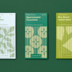
Piccolo by Here Design
Piccolo is an Italian seed brand with a particular favour for those that are ideal for urban growers, people with small balcony gardens or working with limited space. It is a brand with character, with product naming that includes Slim Jim Aubergine and Spacemaster Cucumber expressing the space-smart dwarf varieties of the range. Piccolo worked with UK-based studio Here Design to develop a...
Smithey Ironware Company by Stitch
Smithey is an ironworks producing kitchenware from its location in Charleston, South Carolina. Smithey’s first product, a 10 inch skillet, features a smooth, non-stick cooking surface, created using a handcrafted method of finishing and polishing. This process was developed in response to the rough, coarse and sandpaper-like finish that proliferates the ironware market, which creates an uneven surface temperature, makes it...