
Superkül by Blok
Superkül is an Canadian architectural firm with a portfolio that is described as having an understated boldness, subtlety and spacial richness, and a process that intends to find the essence of each project and remain true to this throughout design and development. Superkül has won many awards and is considered one of Canada’s most progressive architecture firms. To celebrate their first...
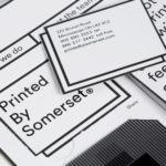
Printed by Somerset by Leo Burnett
Somerset is described as being Canada’s top printer, known for its precision, attention to detail and ability to pull off complex jobs. Alongside reproduction services, Somerset, a family-run business, also provides extensive print finishing services. Inspired by this, the stacked paper of the press, and with the intention of engaging a new generation of designers, Toronto based studio Leo Burnett developed a new brand identity...

Verso Architecture+Interiors by Studio South
Verso is a small Auckland-based architecture and interiors business working within the residential and commercial sectors. Drawing on the oppositional nature of name and using a mix of simple typographical form, high-quality materials and print finish Studio South developed a new visual identity for Verso that is described as being both sophisticated and playful, whilst effectively working in some universal architectural principles. This links a variety of printed...
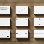
Emma Magnusson Arkitektur by Lundgren+Lindqvist
Emma Magnusson is an architect working from the Swedish city of Gothenburg primarily on private commissions and occasionally with larger corporate clients. These have included Benify and Warner Music. Scandinavian graphic design studio Lundgren+Lindqvist recently worked with Emma to craft a new visual identity. Drawing on some architectural staples such as space and materiality, and working in the systematic and the playful, Lundgren+Lindqvist’s identity work...
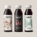
Hatch Cold Brew Coffee by Tung
Toronto-based Hatch is a coffee roaster producing ready-to-drink cold brew coffee from high quality natural ingredients using a craft-oriented twice-filtered manufacturing process and a unique bottling technology to seal in fresh flavour. Hatch intends to bring cold brew coffee from a niche but growing market into the mainstream and worked with Canadian graphic design studio Tung to help them achieve this through brand identity and packaging....
Tangent GC Soap by Carl Nas Associates
Tangent GC is a Scandinavian organic garment and shoe care company developing products that intend to ensure longevity. The company’s brand identity, a simple utilitarian typographical expression, designed by Essen International, delivered a sense of informational immediacy through the absence of superfluous stylistic detail and colour, dividing content in the arrangement, orientation and typesetting of Akkurat Mono. Venturing into organic personal skincare, Tangent GC worked with...
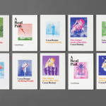
Casa Bonay by Mucho
Casa Bonay is a unique hotel destination in the neighbourhood of Eixample Dret, Barcelona, housed within a historic nineteenth century building with a neo-classical façade. Although the setting has a strong historical value, inside and out, the hotel experience makes a connection with the creative talent that populates the city today. This is achieved through collaboration with pioneering chefs, young designers, renowned furniture brands and...
Collect by Spin
Collect is an international art fair that will take place between the 2–6 of February 2017 at London’s Saatchi Gallery. Presented by the Crafts Council, Collect will give visitors the chance to see and buy museum-quality and contemporary ceramics, glass, jewellery, wood, metal and textiles created by established and emerging artists and makers represented by over thirty of the world’s best...
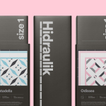
Hidraulik by Hey
Hidraulik is a Barcelona-based business producing floor mats, table mats and runners for contemporary spaces. These are inspired by cement panels hydraulically pressed, rather than fired, with a layer of coloured pigment. Hydraulic panels originated in the 1850’s and experienced a resurgence in the mid 20th century. At that time they would often feature brightly coloured and detailed patterns, and were popular during an era of...

Gretas by 25AH
Gretas is a café set within the Haymarket, a hotel located at the heart of Stockholm, Sweden. The building was formerly home to a famous department store that dates back to the early 20th century and was the place where actress Greta Garbo was discovered while working at one of the concessions. 25AH, the Scandinavian graphic design studio behind Haymarket’s own brand identity, as well as Paul’s, a restaurant also situated...

Paul’s at Haymarket by 25AH
Paul’s is a restaurant located in the Haymarket hotel which is situated at the heart of the Swedish capital of Stockholm. The restaurant is named after Paul U. Bergström, founder of a well-known department store that previously occupied the building, and features a distinctive period interior of bent wood chairs, white tiles, leather banquette seating, marble surfaces and art deco-inspired flourishes. This...
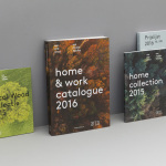
Arco by Raw Color
Arco is a family run contemporary furniture design and manufacturing company that currently rests in the hands of fourth generation family members, and has a respectable 110 year history. Arco has tables and chairs at the heart of its collection and specialises in woodwork, a reflection of its location in Winterswijk, an area of dense natural woodland in East Netherlands. Eindhoven-based graphic design studio Raw Color worked with Arco Creative...