Type Foundry: Lineto
Reveri by Mother
There’s no denying the proliferation of all things that the more curmudgeonly crowds might deem ‘woowoo’ over recent years. Crystals, gong baths, singing bowls, silent retreats, tarot et al were once firmly languishing on the fringes of society, and are now de rigeur among the Stoke Newington set and TikTok classes alike. This rise in self-help-led esotericism has run concurrently...
PAIST by Two Times Elliott
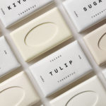
Toothpaste hasn’t historically needed to do a lot, design-wise: it’s a category based on functionality and efficacy, over trends and aesthetics – sensitive teeth, whitening processes, goth-adjacent charcoal formulas, weird little crystals, and so on and so forth. That function over form thing has meant that over the years, toothpaste packaging has become incredibly monotonous – usually a predominantly white,...
Tangent GC Organic Soap by Carl Nas Associates
Tangent GC began as a Scandinavian organic garment and shoe care company developing products that intended to increase the life of clothing and footwear, and entered the organic skincare market in 2016. The concern given to the longevity of skin becomes an understandable extension of that original intention. Carl Nas Associates, who have been working with Tangent GC on their packaging treatments for...

Tangent GC Organic Detergents by Carl Nas Associates
Tangent GC began as a Scandinavian organic garment and shoe care company developing products that intended to increase the life of clothing and footwear, and entered the organic skincare market in 2016. The longevity of skin being an understandable extension of that original intention. The company’s graphic identity, a typographical system designed by Essen International under the creative direction of Carl Nas, established...

TGC x Stenerhag by Carl Nas Associates
Tangent GC began as an organic garment and shoe care company developing products that intended to ensure longevity and entered the organic skincare market in 2016. Designed by Essen International TGC’s graphic identity, by way of a simple typographical expression, established a visual system of informational immediacy through the absence of superfluous stylistic detail and colour. This divided content and drew a...

Tangent GC Hand Cream by Carl Nas Associates
Tangent GC began as a Scandinavian organic garment and shoe care company developing products that intended to ensure longevity, and entered the organic skincare market in 2016. The company’s graphic identity, a simple typographical expression, designed by Essen International, delivered a sense of informational immediacy through the absence of superfluous stylistic detail and colour, yet divide content and drew out a distinction in...
Kristin Jarmund Architects by Snøhetta
Kristin Jarmund Architects is an oslo-based architectural studio with a design philosophy that is focused on using a simplicity of form and a clarity of purpose to address complex problems, while at the same time, allowing for a contextual and human sensitivity. Reduction, as well as the duality inherent to the studio’s work, was the founding principles of their new...
Corps Reviver & L’Heure du Cocktail by Spin
Corps Reviver is a French publisher and revivalist, redesigning and reprinting classic literary works, the first of which is L’Heure du Cocktail, The Cocktail Hour, written by journalists Marcel Requien and Lucien Farnoux-Reynaud and originally published in 1927. L’Heure du Cocktail, at the time, revolutionised the cocktail book, approaching the subject in a new way. This 2017 bilingual edition, presented in French and English,...

George + Powlett by Studio Brave
George + Powlett is a residential property development of 11 apartments, created by ICON Developments, and located in East Melbourne. ICON’s properties are described as having a precision and balance, and this continues through to their latest project, which was designed by acclaimed architectural practice Powell & Glenn. The development is set within an environment of what is described as a place of elegant contrasts. This can...
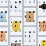
Label Lab by TM
Arconvert, a division of the Fedrigoni Group, will be hosting Label Lab, The Forum for Label and Packaging Innovation, on May 17th at Priory Church on St. John’s Square, London. The event will celebrate the aesthetics and craftsmanship of labelling and packaging design, and will showcase the materials of Fedrigoni’s labelling division Arconvert has to offer. The evening will also include talks by Pablo Martín...
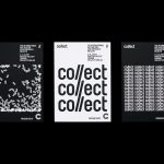
Collect by Spin
Collect is an international art fair that this year took place between the 2–6 of February at London’s Saatchi Gallery. Presented by the Crafts Council, Collect gave visitors the chance to see and buy museum-quality and contemporary ceramics, glass, jewellery, wood, metal and textiles created by established and emerging artists and makers represented by over thirty of the world’s best galleries. Collect’s...
Blå Bär by BVD
Blå Bär (Swedish for blueberries) sells a variety miscellaneous goods from Scandinavia from its store in Osaka, Japan. These include, but are not limited to, glass and kitchenware, soft furnishings, ornaments and jewellery. Many of these could be described as having something of a shared Scandinavian simplicity of form, lightness of colour, natural material quality and cheerful character in pattern...