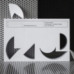
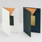
Roger Burkhard by Lundgren+Lindqvist
Roger Burkhard is a creative web development and interactive studio based in Bern, Switzerland, with a roster of clients throughout the creative industries. The studio worked with Scandinavian designers Lundgren+ Lindqvist on the development of a new brand identity. This included monogram, brand guidelines and website, as well as a stationery set that covered business card and promotional cards, letterhead,...
George + Powlett by Studio Brave
George + Powlett is a residential property development of 11 apartments, created by ICON Developments, and located in East Melbourne. ICON’s properties are described as having a precision and balance, and this continues through to their latest project, which was designed by acclaimed architectural practice Powell & Glenn. The development is set within an environment of what is described as a place of elegant contrasts. This can...
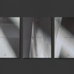
Hill Of Grace Restaurant by Band
Hill of Grace Restaurant was created by renowned Australian wine maker Henschke and is located at the historic Adelaide Oval. With the intention of elevating experience, Henschke worked with design studio Band to develop a new brand identity that would match the quality of its food and wine, and establish a stronger connection with the roots of the brand, the Henschke vineyard. This is explored...
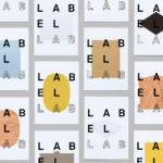
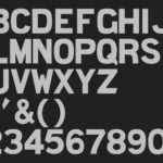
Label Lab by TM
Arconvert, a division of the Fedrigoni Group, will be hosting Label Lab, The Forum for Label and Packaging Innovation, on May 17th at Priory Church on St. John’s Square, London. The event will celebrate the aesthetics and craftsmanship of labelling and packaging design, and will showcase the materials of Fedrigoni’s labelling division Arconvert has to offer. The evening will also include talks by Pablo Martín...
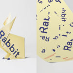
Sydlexia: Making Sense Of Dyslexia by BBDO Dubai
Sydney Dyslexia intends to challenge the misconception that dyslexia is a learning disability, and instead, move the conversation forward, to more appropriately address it as a learning difference. Sydlexia is an innovative and pioneering platform, created by Sydney Dyslexia, to help aid this change, and offers new techniques and training methods to help facilitate “dyslexia correction”. Dyslexia is the most common learning disorder....
Quad Cinema by Pentagram
Quad opened in 1972 and was New York’s first multi-screen cinema. Since then its four screens have been dedicated to playing a diverse programme of independent, classic and first-run films. To coincide with its contemporary state-of-the-art refurbishment, completed earlier this year, Quad’s new owner Charles S. Cohen and his independent film production and distribution company Cohen Media Group worked with Pentagram partner Paula Scher and her team on...
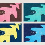
Rocket by Here Design
Rocket began in 2000 as a small family-run catering company, implementing other people’s plans, and has grown to become a multifaceted enterprise with its own ideas, creating culinary worlds in partnership with some of the country’s most prestigious institutions and brands. Rocket worked with London-based Here Design to express this bold new position throughout its brand identity, in logo design, and across its stationery, business cards, print...
Disrepute by Two Times Elliott
Disrepute is a members-only bar, located in London’s Soho, described by Two Times Elliott, the design studio behind its brand identity, as having a heritage of “establishment and scandal”. The bar features a rich interior design of high quality material detail that elegantly plays with shape, pattern and symmetry, solid colour and texture, the geometric and the organic. There is...

Hurly Burly by Midday
Hurly Burly brings the bold flavour and natural health benefits of naturally fermented foods to the United Kingdom. Its first range of products will be a variety of raw organic coleslaws. Flavours include Jalapeño & Oregano, Lemon & Ginger and Turmeric & Cumin. Name, brand identity and packaging design, developed by London-based design studio Midday, intends to bring to the forefront...
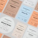
Summerhill Market by Blok
Summerhill Market is a family-run business, managed by the third generation, with premises on Toronto’s Summerhill Avenue and a smaller location—a floral boutique—on Mt. Pleasant Rd. The store has 200 employees, a butchers, bakery and deli, a BBQ in the summer and offers a variety of catering services. Summerhill Market is admired for its high quality products, and its ability—since 1954—to consistently redefine what...
Finland 100 by Kokoro & Moi
This year Finland celebrates its centenary and will mark the occasion with a broad programme of events created and supported by a wide range of stakeholders. Based around the theme of “Together”, and with the intention of creating a cohesive and useful system to unite events and initiatives from local councils and independent organisations and businesses, Scandinavian design studio Kokoro & Moi created “Finland’s Faces”, a brand...
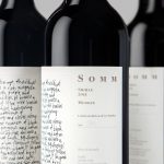
Niche Wine Co. — Somm by Frost
Somm is a limited edition Australian Shiraz from Niche Wine Co., a winery that embraces an innovative dry farming process that yields fewer yet higher quality grapes with an intensity of flavour and colour. With a desire to convey an established, old vineyard feel, and a sense of heritage and sophistication, Niche Wine Co. worked with Sydney-based studio Frost to develop a name and wine...