
Qoñi by Leo Burnett
Qoñi is a small artisan community in the Peruvian city of Puno creating hand knitted socks, scarves, gloves and shawls from alpaca fleece. With a desire to present itself as a modern fashion brand and with the intention of entering the international market, Qoñi worked with Toronto-based graphic design studio Leo Burnett to develop a new visual identity; from naming to wordmark, brand story to lookbook, and...
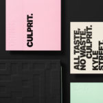
Culprit by Studio South
Culprit is a bar and restaurant located on Auckland’s Wyndham Street. It has a menu made from ingredients supplied by local New Zealand producers, growers and farmers, and is inspired founder’s Kyle Street & Jordan MacDonald’s travels across the United States and Europe. Culprit has a modern interior design in a converted loft space created by Kirsty Mitchell. This is characterised by large exposed beams and brick...

Penley Estate by Parallax Design
Penley Estate is a family run winery established in 1989 by Kym Tolley and located in the wine growing area of Coonawarra, Australia. It produces wines that are described as having discernible regional character and are made from fruit grown in Terra Rossa soil; a red clay type created by the weathering of limestone. Penley Estate, since its inception, has...

Verso Architecture+Interiors by Studio South
Verso is a small Auckland-based architecture and interiors business working within the residential and commercial sectors. Drawing on the oppositional nature of name and using a mix of simple typographical form, high-quality materials and print finish Studio South developed a new visual identity for Verso that is described as being both sophisticated and playful, whilst effectively working in some universal architectural principles. This links a variety of printed...
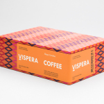
Víspera Coffee by Stockholm Design Lab
Víspera is premium coffee brand that intends to bring together the best of two worlds, a blend of 100% Arabica coffee beans sourced from the high altitude plantations of Colombia and a Swedish eye for quality and craftsmanship in its roasting. This meeting is visually articulated through type contrast, colour and pattern across Víspera’s packaging, developed by Stockholm Design Lab....

Roster Bar & Restaurant by Bond
Roster is a bar and restaurant on the corner of Pohjoisesplanadi and Unioninkatu in the Tori Quarters of Helsinki. It features an impressive interior made up of custom furniture with a vintage twist, raw and refined materials and hand-picked design objects. Although sophisticated in its design, Roster is a casual rather than formal dinning experience. The eclectic but cohesive style that proliferates interior, its high-quality food...
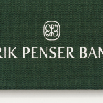
Erik Penser Bank Cookbook by Bedow
Erik Penser Bank provides its clients with independent financial advice and a high-level of personal service. While large banks do provide similar services, Erik Penser Bank is Sweden’s only dedicated private banking business. Professionalism, experience and an individualised service practice is expressed throughout the bank’s visual identity, created by Swedish studio Bedow, in the personable and less corporate association and aesthetic qualities of a new monogram. This then informs some...

Tilly Sveaas Jewellery by Bond
Tilly Sveaas is a London-based jewellery designer, and the designer behind Silver Service Jewellery. This year sees the launch of her first collection under her own name. This features a brand identity created by the London office of international design studio Bond, and included art direction, postcards, business cards and packaging. Through typographic form, colour, material, print finish and image, Bond’s...
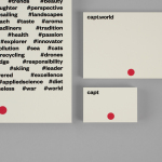
Capt by Bunch
Capt is a San Francisco-based start-up that connects creators wanting to monetize their videos with brands looking for new content and talent. The platform is made up of an app that allows creators to shoot, upload and license their videos, and a website that acts as a market place for buyers. This website also serves as a place to connect creatives with those...

Sardine by Here Design
Sardine is a restaurant, located on London’s Micawber Street, with a simple menu of rustic, Southern French and Mediterranean-inspired dishes cooked over a wood fire. It features an interior design of bent wood chairs, open kitchen, steel and light wood table tops and a brand identity created by Here Design. This adds a touch of a mediterranean colour to interior through menus and tile detail, while also linking other assets such...

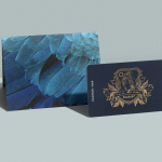
Hidden Characters by RE
Hidden Characters is the latest PR offering from international advertising agency network M&CSaatchi. It replaces/is an evolution of Bang PR, developed in response to the changing public relations landscape. With the advent of social media and the subsequent growth of non-traditional influencers and an increase in inauthentic product placement, Hidden Characters intends to make sure that their client’s reach is handled in an ethical and authentic...
Earls.67 by Glasfurd & Walker
Earls is a family-owned premium but casual restaurant chain with 66 locations throughout Canada and the United States and a thirty year history. The hospitality sector has seen a lot of change in this time. It continues to be highly competitive and often demands innovation and adaptability to remain relevant. With this in mind, Earls commissioned Canadian graphic design studio Glasfurd & Walker and interior...