
Jackalope Hotels by Fabio Ongarato Design
Jackalope Hotels is a luxury hospitality experience developed by Melbourne-based Louis Li, a hotelier described as having a penchant for the avant-garde. The first Jackalope Hotel is situated in the heart of the Mornington Peninsula, Victoria, Australia. It is unique in its location, surrounded by the hotel’s vineyard, in its architecture and interior by Carr Design, and in its visual...
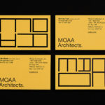
MOAA Architects by Inhouse
MOAA Architects was founded in 2010. It has an office in Hamilton, New Zealand, and a portfolio of new builds and renovations that span the residential, education, commercial and public sectors. Highlights include their work on St. Johns Church, a square plan rotated 9 degrees off the street grid, and Piako House, a renovation and extension of 1940s domestic planning to meet a 21st...

Raw Wine by The Counter Press
Raw Wine is an international two-day wine fair that takes place in the cities of LA, London, Berlin and New York. It was founded by Deborah Lambert and Isabelle Legeron MW, France’s only female master of wine, and provides an opportunity for growers, makers and buyers to get together. Raw Wine is also a celebration of the best organic, biodynamic and...

Gustav Almestål by Bedow
Gustav Almestål is a Swedish still life photographer who has built an extensive, high-profile and international client list that includes the likes of Electrolux, Wall Street Journal and Hermes. He now works from Stockholm, following several years in London, on projects that range from advertising and editorial to food and interiors. The design of Gustav Almestål’s visual identity, which rested in the hands of Swedish...
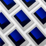
Edition by South
Edition is a new property development by LEP Construction. It will be located in Parnell, a suburb of Auckland, New Zealand, and made up of 18 luxury apartments designed by architects Monk Mackenzie with a eye for flexible space and changing natural light. Edition will make the most of a sloping site, feature three levels cantilevered above ground and create what are described as...

Sakki by Bond
Sakki is Finland’s national union of vocational students. It is made up of 15-20 year olds from a variety of nations, and offers support, tackles student issues, and engages in activism. Scandinavian graphic design studio Bond worked with the union to design and develop a mobile-first experience, and a visual identity made up of tilt-responsive iconography, a bright, simple and modern colour...
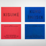
Kisumé by Fabio Ongarato Design
Kisumé is a Japanese restaurant located on Melbourne’s Flinders Lane. It is described by Fabio Ongarato Design, the studio behind its visual identity, as an unconventional, slightly twisted and artfully executed experience. The restaurant intends to immerse guests in an intriguing view of Japanese traditions, and fuses these with the owner’s obsession with beauty and sensuality. This is expressed by a “brutally sophisticated and...

The Broadview Hotel by Blok
The Broadview Hotel is located within one of Toronto’s most recognisable architectural landmarks. This was built in 1891 by a wealthy businessman who recognised the strategic importance of the East End as the city was expanding. It has been home to a business centre, acted as a political and social hub, and used as a hotel, boarding room and more recently, a...
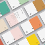
NAU by Toko
NAU is a new Australian furniture brand created by the premium designer furniture and lighting retailer Cult, and features work by futurist designer Gavin Harris and Adam Goodrum, a designer that believes an object justifies its existence through story and detail. Design by Toko worked with Cult to develop name, and create a logo and graphic identity for NAU that...
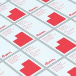
Maven by Design By Toko
Maven is described by Design By Toko, the Sydney-based design studio behind its recent rebranding, as a top-tier architecture recruitment agency operating worldwide. Drawing on the built environment and with the intention of expressing the agency’s prominence within the architecture industry Toko developed a brand identity of simplicity and impact through bold solid form and single colour that links business...
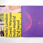
Campus by MultiAdaptor
Campus is Google’s network of co-working and event spaces for the many start-ups it has and continues to help fund. These are located in London, Madrid, Warsaw, São Paulo, Seoul, and Tel Aviv, with another to open in Berlin soon. The Campus community has over 80,000 members and collectively received over $537 million in funding which has created more than 11,000...

Institute by Commission Studio
Institute is a full service creative studio from New York working with clients to connect with people through creative direction, live experiences, concept development, content creation, production and post-production services. Institute’s work is described as being underpinned by thoughtful and meaningful creativity, and although their clients are often high profile, their presence is intentionally modest. London-based Commission Studio worked with Institute to develop...