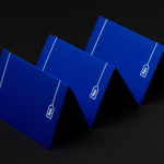
Run Mfg by Perky Bros
Run Mfg is an independent race design and production company, creating unique running events with a high-level of detail and creativity, founded by husband and wife team Nathan Barnhart and Elaine Lau working from their studio in Chicago. Nathan and Elaine commissioned graphic design studio Perky Bros to develop a brand identity that would link a variety of printed collateral,...
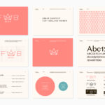
Fab Media by Bedow
Fab Media is one of Sweden’s leading media companies. It produces inspiring and entertaining content aimed at young women, and owns a variety of multi-media brands made up of websites, social media platforms and magazines. Fab Media’s specialisation, engaging exclusively women and the creation of modern cross-platform brand experiences, is expressed by their new visual identity, created by Stockholm-based graphic...
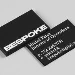
Bespoke by DIA
Bespoke is a New York-based boutique digital retouching company working within the fashion industry and moving into its tenth year of business. With a desire to appeal to an increasingly more commercial clientele while not undermining their roots Bespoke commissioned graphic design studio DIA to develop a new brand identity. With a strong favour for contrast; in colour, proportion and type, DIA establish a bold visual expression...
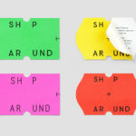
ShopAround by Design by Toko
ShopAround is described as a creative supermarket, however, in more conventional terms, began as an artist representation agency in 1998. It has grown, since then, to become a creative production agency specialising in contemporary illustration, graphic design, animation, motion graphics and interactive design. ShopAround co-ordinates a network of over 80 international freelance designers, and fosters new creative talent from its offices in New York, Amsterdam...
Superkül by Blok
Superkül is an Canadian architectural firm with a portfolio that is described as having an understated boldness, subtlety and spacial richness, and a process that intends to find the essence of each project and remain true to this throughout design and development. Superkül has won many awards and is considered one of Canada’s most progressive architecture firms. To celebrate their first...

Heritage: A User’s Manual by Bond
Heritage: A User’s Manual was an exhibition at Southbank Centre’s Archive Studio—a temporary space located within the foyer of the Royal Festival Hall—that took place between the 24th November – 13th December 2016. The exhibition was curated by MA Culture, Criticism and Curation students from London art school Central Saint Martins and “was founded on the belief that the heritage of a building is...

Lorod by Pentagram’s Natasha Jen
Lorod is an American fashion label that redefines timeless basics with modern, modular construction, distinctive fabrics and vintage-inspired chic. The designers at LOROD experiment with production methods to give each garment a quirky, personal and one-of-a-kind quality, and utilise new distribution tools to produce collections within the U.S. This intersection of the classic and contemporary, refined craftsmanship, a utilitarian functionality and quirky personality informed Lorod’s brand...
Konserthuset Stockholm by Kurppa Hosk
Konserthuset Stockholm is home to the internationally recognised Royal Stockholm Philharmonic Orchestra, and is described as one of Sweden’s most famous and important cultural institutions. Graphic design studio Kurppa Hosk worked with the institution to create a brand identity that would integrate the corporate aspect of venue, one of iconic status and significant cultural legacy, with the passion and dynamism of the...

On Rye by Pentagram
On Rye is a fast-casual sandwich shop, with a space in the US capital of Washington DC, inspired by the Jewish deli. It has a menu of unexpected recipes that dial down the salt and bumps up the veggies, uses natural and wholesome ingredients, and gives traditional dishes a modern twist. On Rye has an interior that brings a contemporary finesse to retrospective detailing and...
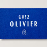
Chez Olivier by Swear Words
Chez Olivier is an authentic French bistro located in the centre of Greville St village, Melbourne, that intends to share its passion for French food, wine and culture with the community. It features an intimate European-style interior design of stained woods, classic furniture, photography and period advertising. It also has a unique bar of padlocks, inspired by Pont des Arts, engraved with messages of love...

Caldo Coffee by 25ah
Caldo Coffee is a café serving organic coffee and fresh salads, sandwiches and pastries from its location in the Scandic Continental, a hotel in the centre of Stockholm. It features a distinctive and modern interior design of light wood, tall shelves and a long wood panelled and marble topped counter. It also includes a large custom-built menu board, neon signage and a...
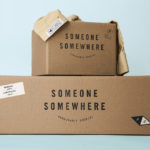
Someone Somewhere by Sociedad Anónima
Someone Somewhere is a clothing and accessories brand. Each of its products are designed and made in Mexico by small communities of textile artisans. The social and cultural contexts that are the foundation of brand are expressed by its new visual identity, created by Mexico City-based graphic design studio Sociedad Anonima, through naming and a graphic device that calls out maker and origin....