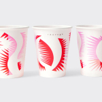
YO! by Paul Belford Ltd
London-based graphic design studio Paul Belford Ltd. worked with UK restaurant chain YO! Sushi, now Yo!, to rebrand, as it expands into the US, the Middle East and further into Europe. This included an updated logo together with an extensive 200 page brand book, presented in a bespoke Japanese bento box, that covered a variety of new assets. The brand book covers menus, packaging,...
Sauvage by Triboro
Sauvage is a Brooklyn-based cafe and cocktail bar from Joshua Boissy and Krystof Zizka, the duo behind Maison Premiere. It is described as being reflective of the staple establishments of New York and Paris, and has a menu of French-accented American dishes. This is also reflected throughout its interior design, a mix of mosaic flooring, brass rimmed circular tables, bent wood furniture,...
L’Observatoire International by Triboro
L’Observatoire International is a American lighting design studio co-founded in 1993 by Hervé Descottes. The studio is made up of architects, interior designers, engineers, artists and lighting designers working on a variety of projects, illuminating and accentuating both modern and classical architecture and spaces. These include retail premises and museums, airports, landscapes and concert halls. L’Observatoire International worked with New York-based design...

OpenView by Pentagram
OpenView is a Boston-based business dedicated to investing in and helping to grow what are described as expansion-stage companies that are working in the software development sector. OpenView has a unique hands-on approach, and worked with Pentagram’s Natasha Jen to express this through positioning, tone of voice and visual identity design. This included custom typography, stationery, business cards, website and...
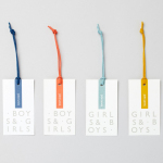
John Lewis Childrenswear by Charlie Smith Design
London-based studio Charlie Smith Design worked with British department store John Lewis to develop the visual identity system and packaging for their childrenswear department. The system needed to appeal to girls and boys aged from 2 to 14 (and presumably their parents), and connect a broad range of accessories and garments that included denim, swimwear, shoes and underwear. The result is as a...
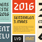
Sentralen by Metric Design
The former building of Norway’s first savings bank, which began as a social initiative to serve the working class people of Oslo, now houses Sentralen, a mixed-use cultural centre. Sentralen continues in the traditions of the bank, functioning as a hub for innovators concerned with and looking to address present day societal issues. The centre houses over 350 tenants working...
Collect by Spin
Collect is an international art fair that will take place between the 2–6 of February 2017 at London’s Saatchi Gallery. Presented by the Crafts Council, Collect will give visitors the chance to see and buy museum-quality and contemporary ceramics, glass, jewellery, wood, metal and textiles created by established and emerging artists and makers represented by over thirty of the world’s best...
Moi Helsinki by Bond
Moi Helsinki welcomes visitors to the Finnish city of Helsinki, and offers a place to relax after a long journey, with an extensive menu of beers and snacks from its location in the arrivals lobby at Helsinki-Vantaa Airport. The bar features an interior design of light wood and bright neon signage, alongside dark walls, furniture and tiles. Where there are...
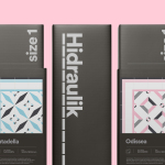
Hidraulik by Hey
Hidraulik is a Barcelona-based business producing floor mats, table mats and runners for contemporary spaces. These are inspired by cement panels hydraulically pressed, rather than fired, with a layer of coloured pigment. Hydraulic panels originated in the 1850’s and experienced a resurgence in the mid 20th century. At that time they would often feature brightly coloured and detailed patterns, and were popular during an era of...
Primary by DIA
Primary is a new co-working space in New York that introduces health and wellness into the workplace. This can be seen in the approach to interior design; a mix of wood, contemporary soft furnishings and greenery, experienced in the fusion of office space, business events and relaxation classes, and expressed throughout Primary’s brand identity, created by graphic design studio DIA. DIA were tasked...

London Design Biennale by Pentagram
London Design Biennale is the world’s first purely design-focused biennale from the team behind London Design Festival. It will take place between the 7th and 21st of September at Somerset House. The theme of this year’s event, Utopia by Design, will include entries from 37 countries. These intend to interrogate the history of the utopian idea, engage with some of...
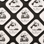
Francina Models by Mucho
Francina Models is a Barcelona-based fashion agency, led by Mireia Verdú, with over 30 years of experience. It was the first modeling agency in Spain to offer an acting and training academy and, over recent years, has began to diversify, committing itself to the discovery of new talent and the representation of a variety of fashion profiles and international models. With a desire to...