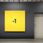
Pikseli by Werklig
Originally built in the 1980’s by wireless pioneer Digita Oy, Pikseli is a building, located in the Vallila district of Finland’s capital city Helsinki, that provides office space to companies working within the digital industries. Design agency Werklig, commissioned to develop a new visual identity for Pikseli to attract new tenants, created a solution that takes the tiny universal screen unit of a pixel and...
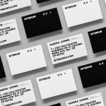
Interior XIII by Anagrama
Interior 13 is a distributor of Mexican and international auteur films and promoter of independent cinema. Design agency Anagrama were recently commissioned by Interior 13 to develop a new visual identity that would be “easily relatable to the cinematographic world” as well as being “functional in terms of online promotion.”...
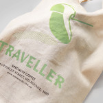
Traveller Espresso Bar by TCYK
Traveller is the Melbourne based espresso bar of speciality coffee roaster and cafe operator Seven Seeds. Design agency The Company You Keep (TCYK) recently worked with Seven Seeds to develop a new visual identity solution for the Traveller that reflects an interior architecture of details such as ‘moulded plywood, vinyl and soft curves’ inspired by ‘the golden age of caravanning’, through period typography,...
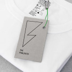
The Fableists by Freytag Anderson
The Fableists is a children’s clothing company that creates quality basics, predominantly unisex, designed to last with ‘punk rock flair’ and utilitarian, vintage clothing and work wear influence. Their products are underpinned by a sustainable brand philosophy that pays and treats their suppliers fairly, considers its impact on the environment and aims to educate buyers on the complete life cycle of their...
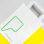
Partick Dental by Freytag Anderson
Design studio Freytag Anderson were recently commissioned by Glasgow based Partick Dental to create a “fresh and vibrant visual identity” for their local practices. The studio saw the opportunity to create a clear concept that would avoid the “usual clichés associated with the industry” and have an inclusivity that would strike a solid balance between minimal, contemporary, inviting and established, through a...
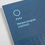
Meteorologisk Institutt by Neue
Meteorologisk Institutt provides meteorological data to Norway’s military, civil services and the general public with the intention of safe guarding life, property and the environment. Design agency Neue developed a new visual identity solution for the institute that mixes geometric shapes, material and print choices and the humanistic and environmental detail of photography to achieve communicative and aesthetic contrast and capture the data drawn from...
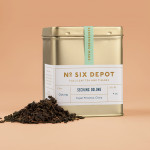
No. Six Depot by Perky Bros
“No. Six Depot is a family owned, small-batch coffee roaster and café nested in the beautiful Berkshires. Located in a historic train station on 6 Depot St, they serve teas, salts and coffee from small farms and roast on location. Their identity [designed by Perky Bros] juxtaposes a mix of unique rural and modern elements — drawing inspiration from their own backyard railroad...

University of the Arts Helsinki by Bond
“The Finnish Academy of Fine Arts, Sibelius Academy and Theatre Academy Helsinki merged in the beginning of 2013 into the University of the Arts Helsinki. Bond created the complete branding solution for the new university. The strategy for the identity was to create a distinctive set of logotypes based on a common design language, and to introduce an anchor symbol...
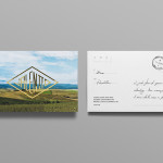
Valentto Olive Oil by Anagrama
Valentto is a Mexican cold-pressed virgin olive oil produced by Olivarera Italo-Mexicana – a Mexican Italian collaboration – created for commercial kitchen and restaurant use. Multidisciplinary design agency Anagrama recently developed a new brand identity and packaging solution for Valentto that juxtaposes the natural detail of Italian landscapes alongside the industrial utility of a square tin structural choice, described by Anagrama as being...
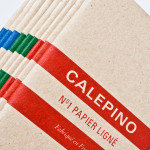
Calepino by Studio Birdsall
Calepino is a french manufacturer and brand of “traditional yet technical notebooks with an authentic vintage spirit” made from 100% recycled, locally sourced paper, covered with a cardboard from a factory with a heritage dating back to 1927 and assembled by hand. Calepino’s brand identity and print, recently designed by Florida based Studio Birdsall, juxtaposes the earthy craft textures of an...
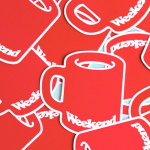
Weekend by RoAndCo
Inspired by ‘cartoonish film titles from the 1980’s’, design agency RoAndCo recently developed the brand identity for Dallas coffee shop Weekend, an extension of their retail store “which has become a relaxing everyday haunt for vacationers”. Based around a tightly spaced Cooper Black logotype, a “minimal and refined typographic system” and a striking but restrained red and white colour palette, Ro&Co created a solution...
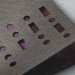
Club at South Place Hotel by This Is Colt
Club is an exclusive private members area hidden from the public within London’s South Place Hotel. Its visual identity, developed by This Is Colt and designed to establish a connection with the parent brand but with “a personality of its own”, is built around a logotype constructed from the same contemporary, condensed sans-serif characters of the hotel’s identity but is paired with a morse code...