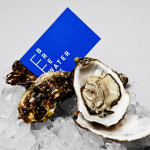
Breakwater by Lundgren+Lindqvist
Breakwater is a Swedish logistics company that services the marine cargo sector. Their visual identity and stationery, created by Gothemburg-based studio Lundgren+Lindqvist, brings together the themes of open sea, systems and cargo through the vertical and horizontal intersection of a geometric sans serif, simple grid-based layout, plenty of space and a vivid blue and icy white colour palette....

Brewer St by Designers Anonymous
Brewer St. is a new fair-trade coffee range developed by UK based hospitality brand Fuller’s to take advantage of continued coffee market growth and build on the day-time custom of their pubs, bars and hotels. London based graphic design studio Designers Anonymous, following their successful rebranding of Fuller’s flagship King’s Cross pub The Parcel Yard, developed a visual identity solution for the brand based around...
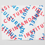
The Finnish Cultural Institute by Kokoro & Moi
The Finnish Cultural Institute for the Benelux (Fins Cultureel Instituut, Institut Culturel Finlandais) is a non-profit organisation that promotes Finnish arts and culture to the Benelux countries of the Netherlands, France and Belgium, with the intention of fostering collaborative opportunities for artists and organisations within the fields of music, literature, design, cinema and the performing and visual arts. The institute’s visual identity,...

Bernard Boutique by Bunch
Bernard Boutique is an award-winning fashion store with a thirty year history that mixes the latest collections from established brands such as Givenchy, Alexander McQueen and Stella McCartney with the work of new upcoming designers. The boutique’s new visual identity, recently developed by creative design agency Bunch and extended across signage, bags, boxes, tags and other in-store collateral, contrasts a bold and masculine...
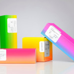
Bermellón by Anagrama
Bermellón is a Mexican confectionery shop that specialises in the premiumisation of traditional spicy treats typically sold on street markets. The shop’s identity and packaging, designed by Anagrama, fuses a bold and intense fluorescent colour palette with the fine detail and craft qualities of an adhesive label....
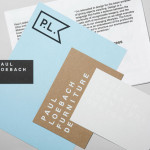
Paul Loebach by Studio Lin
Paul Loebach is a Brooklyn based three dimensional designer who specialises in product, furniture and emerging manufacturing technologies. His new identity, developed by Studio Lin, is a wonderful union of craft, structure, space and geometry that neatly reflects his use of both traditional materials and contemporary processes....
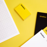
Kinetica by Face
Kinetica is an international industrial design studio located in Santa Catarina, Mexico, that specialises in non-standard architectural projects. Their new visual identity, created by ‘supermodernist’ design agency Face, utilises a bold black and yellow colour palette, a straightforward sans-serif logo-type, plenty of space and a grid based collateral layout to establish a restrained and contemporary interpretation of heavy industry infused with subtle architectural cues....
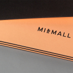
Mi&Mall by Atipo
Mi&Mall is an online shopping destination and resource that brings together and supports small to medium designer brands for people interested in fashion, trends and exclusive collections. Based around a simple logo-type, ampersand, a pale colour palette and a tactile print and material choice, Mi&Mall’s visual identity, created by Spanish multidisciplinary design studio Atipo, mixes high fashion and boutique craft...
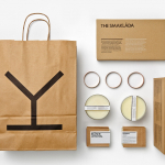
Spritmuseum by Stockholm Design Lab
Spritmuseum (formerly Vin & Sprithistoriska Museet) is a Stockholm based art gallery, museum, tasting room, meeting-place, bar, restaurant and open-air café with a unique spirit theme. Its new identity, developed by multidisciplinary design agency Stockholm Design Lab, is based around a bold word-mark constructed from a typeface now synonymous with the Absolut brand (and Swedish design) and pairs it with a simple but iconic four stroke...
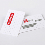
Modhouse by A Friend Of Mine
Modhouse is an Australian design and building firm that specialises in sustainability, modular construction techniques and interior design. The company’s new brand identity, created by holistic design studio A Friend Of Mine, visualises their specialist approach with a set of elemental and geometric containers, bold sans serif typography and a colour palette that juxtaposes bright creative colours with warm architectural greys....

Privacy International by Paul Belford Ltd.
Privacy International is a UK based non-profit organisation established in 1990 to monitor the security intrusions of governments and business, increase the awareness of data protection concerns and establish ‘new forms of privacy advocacy’ at an international level. Made up of computer professionals, academics, lawyers, journalists and human rights campaigners the organisation has worked on initiatives across fifty countries and is...
Etxe by Blok
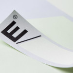
“Etxe is a small, innovative industrial design studio based in Mexico City. Their philosophy is to design to the very essence of a product. There is no room for extraneous elements; they believe that the beauty and artfulness of a product lies in its purest functionality. The identity itself is thus a distillation of their unique approach.” – Blok...