
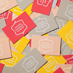
Hamptons House by Moffitt.Moffitt
Hamptons House is a Sydney based curator and retailer of furniture and homeware collections that celebrate the unexpected and draw influence from renowned New York holiday destination The Hamptons. Design studio Moffitt.Moffitt were recently engaged by the retailer to develop a new visual identity — which went on to include logo and logotype design, illustration, shopping bags, packaging, swing tags, stationery and membership key — that...

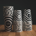
In Bed by Moffitt.Moffitt
In Bed is an online store that is a celebration of almost everything we love to do in bed. It has a generous yet tightly curated collection of homeware items that include handmade ceramic and wood saucers, bowls and mugs created by Japanese and American designers, as well as a range of high-quality linens. In Bed worked with Australian design studio Moffitt.Moffitt to...
Simone Handbag Museum by Charlie Smith Design
Simone Handbag Museum is dedicated to the history of handbags with ‘international significance’ and provides its visitors with a curated, contemporary and historical collection to explore over two floors at the centre of the South Korean city of Seoul. London based Charlie Smith Design were recently commissioned to develop a brand identity for the museum that would resonate with and unite its diverse collection across...
Mary Wong by Fork
Mary Wong is a fast-food chain, with locations throughout the Russian city of Rostov-on-Don, that prepares Chinese noodles with both Asian and American influences. Mary Wong’s brand identity, a combination of bilingual typography, logotype, black noodle boxes with bright spot coloured stickers, t-shirts, environmental design and signage developed by Moscow based studio Fork, was inspired by Tokyo and New York nightscapes and...
Coma by Mucho
Coma is an independent analysis, strategy and executive coaching business located in Spain. It provides support to individuals, businesses and institutions with the aim of fostering talent and leadership. Coma’s philosophy is focused on forward momentum and progress. This philosophy is expressed by the firm’s new brand identity, developed by global design studio Mucho, through illustrative paths that finish on a comma. These link...
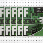
Flatpack Film Festival by Dot Dash
Flatpack is a film festival that sets up its projectors at interesting locations throughout the city of Birmingham during March and describes its events as a mixture of film, performance, contraption and surprises. Flatpack has been running annually for ten years whilst also developing year-round initiatives that include community archive projects, pedal-powered screenings, bespoke short film programmes, pub gigs and animation workshops. London...
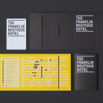
The Franklin Boutique Hotel by Band
The Franklin Boutique Hotel provides seven room accommodation at the heart of the city of Adelaide. Rooms feature interior detail such as white tiles, exposed utilities, chipboard panels, high quality finishes and original artwork from local artists, as well as modern conveniences that include en suite bathrooms, Nespresso machine, ipod dock radios, refrigerators and irons. Following a successful reinvention of the attached pub,...
Persillade by Clear Design
Persillade is a Melbourne cafe opposite Jolimont Station with a large double shop front and an interior of reclaimed wood and bottles, white tiles, steel, glass and classic furniture. Design studio Clear were commissioned by owners Aidan and Tanya Raftery to develop a graphic identity for the cafe that would bring some “much needed soul, texture and community to the very private...
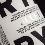
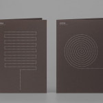
Kyrö Distillery Company by Werklig
Kyrö is a Finnish distillery, housed in a former dairy in the region of Isokyrö, that will yield a high quality 100% rye whisky in 2017 for national and international markets and currently batch produces a root variety for cocktails. Design studio Werklig was hired by the distillery to create their brand identity, which went on to include a logotype and custom typeface,...

Penson Group by She Was Only
Penson is an award-winning interior design firm that help businesses to achieve their “cultural and commercial ambitions” by replacing dull and inefficient spaces with those that are beautiful and intelligent. Penson’s new visual identity, developed by London based design studio She Was Only to coincide with the firm’s 10th anniversary, delivers what the studio describe as a “clean and confident solution”, consistently executed, that better...
G . F Smith by Made Thought
G . F Smith is an independent British paper merchant with a heritage dating back to 1885 and a loyal staff, some of whom have provided over 20 years of loyal service. Made Thought, the design studio behind the visual identity for G . F Smith’s distinctive Colorplan range, were recently commissioned to develop a new brand identity for the company that would better...

Taco República by Bielke&Yang
Taco República is described by Bielke&Yang, the design studio behind its visual identity, as Norway’s very first genuine taqueria. Wanting to avoid some of the Mexican restaurant clichés, Bielke&Yang juxtaposed classic typography and a guacamole based color scheme with a colourful and contemporary illustrative panel created by Uglylogo, which offers a humorous take on the “enthusiasm and craziness” of the local community prior...