
Amo Store by Studio SP–GD
Amo Store is a soon to launch Melbourne based men and women’s shoe boutique that will retail a curated collection of familiar brands and exclusive independent labels as well as clothing and accessories ranges to match. The store recently commissioned Studio SP-GD to develop a ‘simplistic’ brand identity that would effortlessly extend across a variety of formats....

Harry Watts by Birch
Harry Watts is a British photographer who takes a systematic approach to location and explores the relationship between people and objects. His work has been exhibited nationally and internationally and was selected by Italian Vogue for solo exhibitions in London and Madrid. Harry’s brand identity, developed by London based studio Birch, is representative of his unique process of removing excess information through...

Roberto Revilla London by Friends
Roberto Revilla, working with his wife Carolina, provides luxury yet accessible custom tailoring services nationally and internationally from his premises not far from London’s Saville Row. As well as tailoring, Roberto also retails a range of high quality accessories online. In response to a growing global client base and a desire to position the company alongside the “giants of luxury tailoring”...
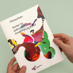
Vitenparken by Bielke&Yang
Vitenparken is a science centre committed to facilitating and improving the dialogue between the bioscience research community and the general public. The centre contains an exhibit hall, cafe, dairy museum and meeting facilities set within the Campus Ås grounds of the Norwegian University of Life Sciences. As well as the science centre these grounds are home to over a 1000 scientists, a university with...
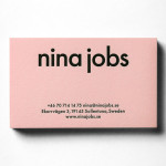
Nina Jobs by BVD
BVD have recently completed their brand identity work for Nina Jobs, a Swedish industrial designer working within the fields of art direction, product and furniture design for companies such as Ikea, Uniqlo and MoMa New York. Based around a responsive website that balances identity and content with large product images set against a white background, as well as a good...
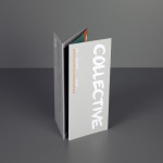
Collective Gallery by Graphical House
Collective is a contemporary visual arts organisation founded in 1984 to help new and emerging artists exhibit their work in Scotland’s capital city Edinburgh. The organisation delivers a diverse programme of new exhibitions and commissions, and is described as being “fundamental to the cultural vitality of the country”. Following a move to The City Observatory, Glasgow based design studio Graphical House worked with...

Numbered by Martín Azúa by P.A.R
Numbered is a range of handcrafted home-ware products and individual commissions, created by Basque product, space and graphic designer Martín Azúa, that explore the relationship between functionality, emotion and conceptual thinking, and blur the line between tradition and innovation. A limited and controlled production context, personalisation and a connection to the local environment bring further value to each object and influence their...

Elvine by Lundgren+Lindqvist
Elvine is Swedish fashion brand, known for their combination of “good design and smart functionality”, with over 700 retailers throughout Europe. In response to quick expansion and a move from ‘personal affair to hugely popular jacket maker’, Elvine commissioned design studio Lundgren+Lindqvist to develop a new brand identity that would better reflect a philosophy and product line created to address the...
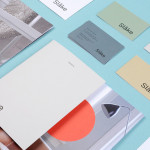
Slåke Møbelfabrikk by Ghost
Slåke is a small furniture manufacturer, located in Norway’s Hjelmeland, with a heritage that dates back to 1938. Although it produces a variety of contemporary pieces it is also known throughout Scandinavia for making jærstol, a traditional, high quality, wood and reed chair. As part of its 75th anniversary Slåke commissioned Ghost to develop a new brand identity—which went on to include...
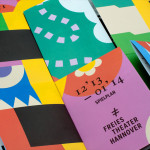
Freies Theater Hannover by Bureau Hardy Seiler
Freies Theater Hannover offers a diverse programme of classical and contemporary theatre, multimedia productions, musical experiments, modern dance and educational initiatives for both children and adults that take place across many of Hannover’s independent theatres. Bureau Hardy Seiler, working in collaboration with Created by Monkeys, was recently commissioned by the organisation to develop a new brand identity solution that would unite...
Hotel Cycle by UMA
U2 is a cyclist-friendly retail and hospitality destination, located in the Japanese city of Onomichi, made up of shops, bakeries, restaurants and hotels. Design studio UMA were recently commissioned to develop a visual identity for U2’s Hotel Cycle as part of a larger brand identity project that covered a variety of spaces, packaging and signage within the complex. UMA’S brand identity solution...
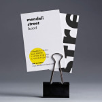
Mendeli Street Hotel by Koniak
Mendeli Street is a city-beach hotel, designed by BK Architects, that celebrates the modern spirit of Tel-Aviv. Design studio Koniak developed a brand identity for the hotel, which included a logotype, stationery set, key cards, door-hangers and website, that reflect its contemporary qualities and the bright sunny climate of its location....