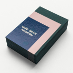
Gold—Smidt Assembly by Re-Public
Gold—Smidt Assembly is a Copenhagen-based pop-up art gallery that exhibits contemporary fine art across the globe, and offers a consultation service, collaborating with professional artists to curate sculptural pieces for commercial, public and residential spaces. Danish design studio Re-public worked with the gallery to develop a visual identity that would link a variety of assets that included signage, print communication and...
L’Observatoire International by Triboro
L’Observatoire International is a American lighting design studio co-founded in 1993 by Hervé Descottes. The studio is made up of architects, interior designers, engineers, artists and lighting designers working on a variety of projects, illuminating and accentuating both modern and classical architecture and spaces. These include retail premises and museums, airports, landscapes and concert halls. L’Observatoire International worked with New York-based design...
The International by Studio South
The International is a new apartment complex, located not far from Auckland’s Albert Park, with 88 luxury residencies. The building, a repurposed former office, is currently being transformed into an iconic structure with a contemporary exoskeleton of elongated beams. To promote the building and help sell apartments off-plan, the graphic designers at Studio South worked with the developer behind The International...
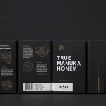
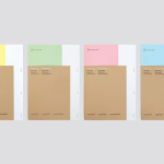
The True Honey Co. by Marx Design
The True Honey Company (TTHC) dedicates itself to the production of mānuka honey, a monofloral variety produced in Australia and New Zealand from the nectar of the mānuka tree. It has a unique colour and texture, and a high level of Dietary Methyglyoxal, an organic compound with antibacterial and antiviral properties. With a price range starting at 60.00AUD and rising to 230.00AUD per jar,...
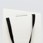
Wadha by Two Times Elliott
Wadha is a Islamic fashion brand for women, established in 2010 in the city of Doha, Qatar, by Wadha Al Hajri. Garments by Wadha are characterised by unique fabrics and cuts, contemporary, clean and slightly irregular shapes, and single colour. This aesthetic is reflected throughout Wadha’s brand identity, designed by British graphic design studio Two Times Elliott, not only in typographic form and...
Wenford Dries by ico Design
Wenford Dries is a new property development in the scenic area of North Cornwall. It will be made up of loft-style homes, artist studios, allotments and wild gardens, set on the site, and within the structure of, a former clay drying factory that dates back to the beginning of the 20th century. This is said to have been sensitively restored. The development is billed as...
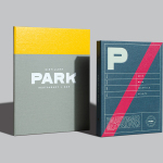
Park Restaurant & Distillery by Glasfurd & Walker
Park is a bar, restaurant and distillery located in the Canadian resort town of Banff, within the Banff National Park, and the province of Alberta. It is a region of diverse natural beauty which includes mountains, prairies, forests and desert badlands, and that attracts walkers, campers and skiers locally and internationally. The restaurant is a celebration of Banff’s alpine history and lifestyle. This runs...
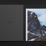
Maaemo by Bielke&Yang
Design studio Bielke&Yang have worked with Norwegian two Michelin starred restaurant Maaemo to develop a holistic brand identity solution informed by the philosophies and creative practices of its unique dining experience and culinary expertise. The studio’s brand identity design, which encompassed website, custom typography, colour, the tone and content of images, and the tactile finishes of welcome notes, magazines, business cards, folders...
FS Silas Launch Campaign by Believe In
FS Silas is a new sans-serif and slab-serif font family from British type foundry Fontsmith, each available in five weights and an italic. The family is described as having a squareness of rounded forms with dynamically angles terminals and slabs capable of offering contemporary brands the opportunity to employ different voices with one typographic system. Fontsmith worked with graphic design studio Believe In to...
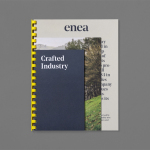
Enea by Clase bcn
Enea is a contemporary furniture manufacturer with a site in the Basque Country. Collaborating with designers Josep Lluscá, Gabriel Teixidó and the trio Lievore Alhterr Molina, Enea has developed a catalogue of versatile, comfortable, durable and functional products for the private and commercial markets. Seeking to differentiate itself from its competitors and with a desire to avoid cliches of the...
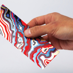
Arjowiggins Curious Matter x FIAC by The Bakery
FIAC is an annual contemporary arts fair where galleries from across the world gather and present work by the emerging artists they represent. The fair takes place at the Grand Palais in Paris and runs for four days during October. Paper merchant Arjowiggins, a longstanding partner, continued to support the event by providing material for FIAC’s catalogue and event guides. This year, these featured a distinctive bookmark...
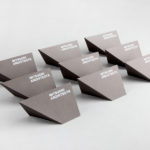
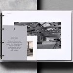
Mitsuori Architects by Hunt &Co.
Mitsuori Architects is an architectural design studio that creates high quality structures and spaces that merge aesthetic beauty with careful planning and thoughtful detailing. Their large scale project experience is combined with the flexibility of a smaller practice allowing them to provide big clients with a personalised service. Mitsuori’s visual identity, designed by Melbourne based Hunt & Co. and informed by a name that translates from Japanese as...