Neon Sign Design
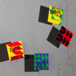
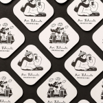
Brutal Burrito by Tres Tipos Gráficos
In 1984, the death of the wrestler Rodolfo Guzmán Huerta – commonly known as El Santo – sent shockwaves through Mexico. Over the course of five decades and 15,000 matches, the legendary fighter had captivated audiences, helping to fuel the growth of Lucha Libre around the world. Through his appearances in film, comic books and cartoons, he established himself as...
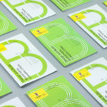
UNSW Built Environment by Toko
UNSW Built Environment (BE) intends to develop global leaders in architecture, planning and construction, and help shape resilient, connected, smart and inclusive future cities through its undergraduate, postgraduate and postgraduate research courses. As part of this, the faculty also runs an annual programme of events for students, academics, industry professionals and the general public. These serve as a platform to find out...
Sardine by Here Design
Sardine is a restaurant, located on London’s Micawber Street, with a simple menu of rustic, Southern French and Mediterranean-inspired dishes cooked over a wood fire. It features an interior design of bent wood chairs, open kitchen, steel and light wood table tops and a brand identity created by Here Design. This adds a touch of a mediterranean colour to interior through menus and tile detail, while also linking other assets such...
YO! by Paul Belford Ltd
London-based graphic design studio Paul Belford Ltd. worked with UK restaurant chain YO! Sushi, now Yo!, to rebrand, as it expands into the US, the Middle East and further into Europe. This included an updated logo together with an extensive 200 page brand book, presented in a bespoke Japanese bento box, that covered a variety of new assets. The brand book covers menus, packaging,...
Sauvage by Triboro
Sauvage is a Brooklyn-based cafe and cocktail bar from Joshua Boissy and Krystof Zizka, the duo behind Maison Premiere. It is described as being reflective of the staple establishments of New York and Paris, and has a menu of French-accented American dishes. This is also reflected throughout its interior design, a mix of mosaic flooring, brass rimmed circular tables, bent wood furniture,...
Moi Helsinki by Bond
Moi Helsinki welcomes visitors to the Finnish city of Helsinki, and offers a place to relax after a long journey, with an extensive menu of beers and snacks from its location in the arrivals lobby at Helsinki-Vantaa Airport. The bar features an interior design of light wood and bright neon signage, alongside dark walls, furniture and tiles. Where there are...
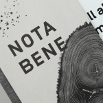
Nota Bene by Blok
Nota Bene is a restaurant, located on Toronto’s Queen Street West, with a menu made from locally-sourced and seasonal ingredients. It was opened by chef David Lee and business partners Yannick Bigourdan and Franco Prevedello in 2008, and was awarded “Best New Restaurant” by Toronto Life and enRoute Magazine soon after. To coincide with the restaurant’s 2016 relaunch—which saw David Lee take...
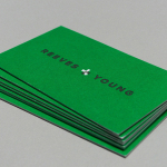
Reeves & Young by Matchstic
Reeves & Young is an Atlanta based construction and sub-contracting business that was formed in 2015 following the merger of Reeves Contracting Company and Potts Construction. To coincide with this merger, Reeves & Young worked with American graphic design studio Matchstic to develop a new brand identity that would convey the combined strength of the two businesses but would also be sensitive to...

Haydn & Rollett by Richards Partners
Haydn & Rollett is an Auckland based construction company that has been in business since 1946. To coincide with its 70th birthday and in acknowledgement of the broadening of its services beyond just construction, the company worked with graphic design studio Richards Partners to develop a new brand identity that would better communicate who they are today whilst not abandoning their past. This...
Bord 13 by Snask
Bord 13 is a restaurant, located on Malmö’s Engelbrektsgatan, with a menu that steers clear of the overfished, the modified and unnatural. It is a collaboration between chefs Robert Jacobson and Besnik Gashi, a former Souschef and a Head Sommelier from world-renowned Noma, and features a brand identity and interior design by Scandinavian studio Snask. This extended to material, lighting and furniture...
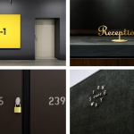
BP&O Collections – Signs & Wayfinding
A continually updated collection of signage and way finding designed for museums, galleries, shops and bars, as part of a new brand identity, and published on BP&O. Between them, these how a mix structure, type and iconography, material choice, surface finishes, colour and contrast can stand out, communicate and direct. This selection features window decals, illuminated panels, neon tubes, standalone and wall mounted...

The Factory by Ghost
The Factory is an Oklahoma based fashion retailer, inspired by the energy and attitude of the people of Manhattan, Los Angeles and Tokyo, that mixes streetware with high fashion garments, shoes and accessories. Think ripped jeans, vintage purse and Louboutins. American graphic design studio Ghost worked with The Factory to develop a brand identity concept, which went on to include logotype and...