BP&O Voices
Packaging:
Some Names Just Sound Thick
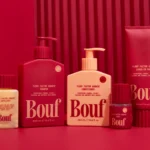
Packaging expert Lisa Cain reviews Willow & Blake’s visual identity and packaging design for postpartum hair loss brand Bouf....
Pentagram New York’s surprisingly joyful brand identity for Mozilla editorial platform Nothing Personal
If you’ve heard of Mozilla, it’s probably thanks to Firefox, the search engine perhaps most famous for its dedication to the more utopian ideals of the internet – things like remaining an independent company, making its software open source; and its promises to block trackers, offer a built-in VPN, put its users in control of AI, and never sell their...
Logo
Outlier Space by Studio South, 2026
It’s insane that we now have so many new commercial space companies beyond the national and state-backed institutions. In some ways, designers have been dabbling in this ‘space’ creatively for science fiction, but now it’s IRL. We have New Orbit, Vast and Katalyst to name a few. I’d love to say that there’s some new emerging aesthetics around this, and...
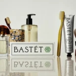
Wedge’s Bastét toothpaste brand design makes absolutely no sense for its category – and perhaps that’s what makes it so utterly gorgeous
“Nano-hydroxyapatite” isn’t exactly memorable – it takes a few tries to even attempt to figure out how to say it, and I’d wager that there aren’t too many people who can tell you what on earth it is, beyond “some sort of chemical, probably?” One thing that is memorable, however, is the brand identity for Bastét – a new oral...
Logo
The Heist by Young Jerks, 2026
The Heist is an animation and live action studio helmed by people fully into the craft. At a critical time for all things design and motion, that dedication is invaluable and a delineating factor in the face of AI. Just as we’re seeing a resurgence of ‘made marks’ and ‘intentional rudimentary’ (think Jolene and the likes) Young Jerks crafted an...
BP&O Voices
Packaging:
Design That Stirs
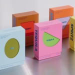
Packaging expert Lisa Cain reviews A Friend Of Mine’s work for The Cocktail Cabinet’s recipe card packs for home bars and cocktail lovers....
Mother Design gives psychic platform Keen a 90s New Age sensibility for the digital age – and it works beautifully
Arguably, we’re approaching a time that could be seen to be ‘post-woo-woo’ – as in, those things that have long been dismissed as daft; the preserve of silly women and charlatans and people whose lives revolve around cats and an unmistakable whiff of Nag Champa – are becoming increasingly acceptable. With the concept of ‘wellness’ now well and truly established...
Logo
Vegan Society by TBC, 2026
I hate this. I also disliked the one that came before it too, although the story behind the change is interesting. From September 2026, new EU regulations will restrict third-party certifiers from using imagery that features botanicals, animals or colours such as green, in an effort to protect consumers from greenwashing. Having been raised by a vegan mother, the sunflower...
Logo
Ytri by Bielke&Yang, 2026
I love this logo so much. What struck me first was the tension between the regular and irregular: the formal, geometric arrangement of three triangles and the finer detail of their ragged edges. Conceptually, it feels incredibly thoughtful and visually well-balanced, expressing the relationship between the hotel, its architecture and the rugged mountains that surround it. Notions of inner balance...
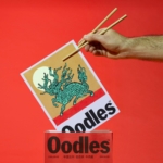
Studio South merges rigour and ridiculousness in the best way possible in its superb identity for noodle joint Oodles
There’s so much to love about this identity – not least that it manages to make a noodle joint look like a perennially hip skate brand (yes, I am obviously talking about Supreme – all no-nonsense stocky black lettering on postbox red backgrounds). The identity in question is that for the delectably named Oodles – more on that moniker shortly...
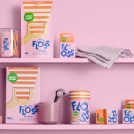
BP&O Voices
Packaging:
Oral Care Shelves…Where Good Design Usually Goes To Die
Packaging expert Lisa Cain shares her opinion on oral hygiene brand Smart Life...
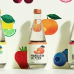
Mucca makes New York supermarket company Fairway’s everyday essentials anything but basic
Founded in 1933, Fairway Market is an independent regional supermarket chain with stores across New York. The grocery retailer sells food and household goods, and over the past eight decades or so has built its reputation on an unusually broad selection of hard-to-find products and a distinctly New York character. As well as selling a number of different brands, Fairway...