Frank Penny by Bedow
Frank Penny is a consultancy specialising in AML – anti-money laundering. Knowing next to nothing about financial matters, I had no idea such companies existed. But like pretty much any other business, to succeed and stand out against their competitors, at some point or another anti-AML consultants need to think about their brand identity. Stockholm studio Bedow was recently tasked...

Murray’s Cheese by Base Design
The ‘shoppy shop’ trend shows no sign of abating. For those not in the know, the term – popularised by New York Magazine’s Grub Street – indicates those small-to-medium businesses selling upmarket ‘provisions’ (charcuterie, legumes, sauces, tinned goods) with a veneer of heritage, authenticity, and (seemingly) innovative ingredients, as if they were the modern ‘general stores’ of olden days. On...
Logo
Kikin by Koto, 2023
Kikin is a new digital finance platform ‘financing the future’ – more specifically, helping businesses to make environmentally conscious decisions ‘that are good for people and planet’. Channeling the great outdoors into their visual identity, the suggestion is of a environmentally pioneering spirit and kick-started cash injections. The logo, the ‘K’ from the logotype spun 90 degrees clockwise to form...
Kikin by Koto
When you think about the world of financial investments, an image of woven Scouts’ patches isn’t typically the first thing that springs to mind. Other contemporary brands (like Monzo, Chip, and Plum) aim for visual simplicity over complex personality development or extended world-building. But while a rugged outdoor theme might feel incongruous in the fin-tech space, Koto has skilfully capitalised...
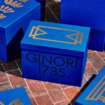
Ginori 1735 by AUGE
Florentine design studio AUGE has created a sumptuous range of packaging for Italian luxury homeware brand Ginori, which was founded in 1735 as the Manifattura di Doccia by Marquis Carlo Ginori on the grounds of his villa at Doccia. Nearly three hundred years later, the venerable brand finds itself owned by Gucci, following a merger with Società Richard (and subsequent...

Toundra by LG2
There’s always something intriguing about niche, singular companies, stores and brands. When I was growing up, I distinctly remember a shop that sold only various things made out of wicker, for instance. It both intrigued and baffled me then, before I understood the concept of a ‘front’, a la (or so rumour has it) the numerous shops that once lined...

BP&O Voices
Rich Baird on Design History:
HSBC by Henry Steiner, 1983
The story of Henry Steiner’s 1983 logo for HSBC....

Pamipe by Omni Design
In recent years we’ve seen some radical shifts to the ever-booming pet care sector. That’s thanks in no small part to the Covid 19 lockdowns that saw many of us seeking solace and company in domestic animals, taking advantage of the WFH policies that, once upon a time, felt endless and unwavering. Another catalyst, perhaps, is that in an increasingly...
Upgrade to
BP&O Plus
Read more
Logo
Zelman Meats by Sam Lachlan, 2018
Zelman Meats describes itself as being the best steak sharing restaurant in London. A bold claim, but the reviews have been rolling in supporting this. Matching these great reviews is a great logo, designed by Sam Lachlan. Sure, liberties are taken on the steak knife silhouette, but this is more than made up for by the discovery of the Z...
Logo
Pachama by How&How, 2024
Pachama uses the power of satellite images and LiDAR technology to generate accurate readings on real-time carbon removal. By connecting nature, technology and community Pachama can accurately report on where carbon credits are being used and what is being done to enhance sequestration efforts. This symbiosis of nature, technology and community is at the heart of the organisation’s new visual identity...
Barnardo’s by The Clearing
Barnardo’s is the UK’s largest children’s charity, and it undoubtedly does much good in the world. However, its history up to this point is also littered with uncomfortable controversies. Certainly, the most outlandish transgressions are concentrated in the late-19th and early-20th centuries. Founder Thomas John Barnardo was taken to court 88 times for kidnapping children (or ‘philanthropic abductions’, as old...