Project Send by Foreign Policy
Since their advent, kinetic and variable type have become a familiar part of the lexicon of brand design. It’s little surprise really: they offer a way to make an identity consistent yet dynamic; uniform but multifarious; endlessly flexible with countless opportunities to modify mood, tone, and messaging. But few projects seem to use kinetic type as a way to visually...
Double Diamond by Alec Tear
Our seemingly indefatigable fetishisation of the ghosts of branding past (i.e. why the design world is still talking about JKR’s Burger King rebrand nearly half a decade on) is perhaps little surprise: whether we’re consciously doing so or not, and to whatever extent we’re even aware we’re looking at something archival, returning to an amorphous yesteryear — real or imagined,...
Norrin by Bond
What exactly is a ‘Norrin’? A cursory search reveals that it’s a word that means very different things to different people. For the Marvel-heads, Norrin Radd is an alias of the Silver Surfer character, described as “an honorable Zenn-Lavian who became the Herald of Galactus to spare his home planet Zenn-La and his beloved Shalla-Bal from Galactus’ hunger”. Of course!...
Philadelphia Art Museum by Gretel
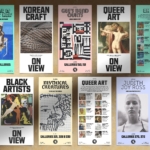
Creating museum and gallery identities must be both a dream brief and an intimidating prospect for brand designers; a poisoned chalice of sorts. We hear the same challenges time and again when agencies discuss such projects: creating a brand that’s both strong and ownable but which lets the artefacts/art take centre stage; an identity that takes an institution into the...
Forest Carbon by Design Bridge Singapore
Despite the perennially frustrating widespread perception that the definition of branding is a logo (maybe a wordmark, at a push, a colour a la Cadbury’s purple or EasyJet orange ), it’s more obvious than ever as we settle into the screen-centric Digital Age that ‘brand’ is a vast and expansive thing – it’s verbal and visual and sonic, it moves...
Fhirst by Mother Design
We’ve arrived at a point where the idea of ‘y2k’ as an aesthetic has stretched beyond ‘trend’ or ‘cycle’ and morphed into an entity almost entirely devoid of the temporal placemarker its name suggests. Having been repeated ad nauseum, ‘y2k’ is no longer about a visual/cultural moment and/or collection of moments around 25 years back. Instead, it’s become a Burroughs...
IAAC by Mucho
The IAAC (Institute for Advanced Architecture of Catalonia) is an organisation which boasts a remit that feels both nigh-on impossibly wide but also hyperspecific. Based in Barcelona and founded in 2001 as a hub for innovation in architecture and design, IAAC describes itself as ‘a platform for producing knowledge to shape the future of cities, buildings and society’. The long...
Hank’s Bagelry by Studio Ongarato
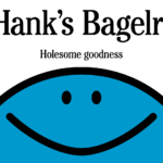
Sometimes, a brand identity can be deeply strategic, have a rich heritage or an involving narrative. Other times, it can be simply eye catching and cool. Suites of custom designed icons, art directed photography, tone of voice, motion behaviours, programmatic graphic elements and bespoke in-house content generating tools…. not every brand needs these. They’re colours to paint with. I call...
Society De La Rassi by Blurr Bureau
Ideas around the ‘new codes of luxury’ have come up a lot lately; an updated, contemporary take on what makes something look special, valuable, covetable, and ultimately, expensive. The long and short of it is that it’s out with the old – lavish foils, gold everywhere, bling and ornamentation and ostentation – and in with a quieter, more subtle aesthetic...
Pinky Swear by The Working Assembly
I could be totally wrong, but it really does look like New York-based branding agency The Working Assembly had a lot of fun working on the branding for Pinky Swear. A restaurant and cocktail lounge on Chrystie St on Manhattan’s Lower East Side, Pinky Swear opened earlier this year as a fascinating concept unlike anything we’ve really encountered before: yes,...
Monica Rich Kosann by Here
There’s been a fair bit of chatter in recent times in the brand design world about the ‘new codes of luxury’ – how today’s hip young well-to-dos are eschewing the signifiers of yesteryear (ostentation, gold, bling, anything remotely showy) for a more understated aesthetic. Being fabulously rich today, then, is perhaps a little like the whole ‘no makeup’ thing: anyone...
Phoenix Organics by Marx Design
It’s a tale as old as time: a once beloved brand – a pioneering brand even, the first of its kind or category – that gets rather lost over the years, muddled in a confusion of sub-brands and spin-offs. Such brands often fall victim to a sort of design by committee – and rarely intentionally: as companies grow and expand...