Logo
National Centre for Writing by The Click, 2018
Bold and fine, positive and negative, the pictographic and the typographic are woven together by The Click. While the pencil and pen are common and recurring motifs in the design for the literary and arts worlds there remains a powerful immediacy and inclusivity to these that invites all, and is well-suited to a literature development agency based in Norwich (the...
Logo
The Drum by NB Studio, 2018
NB Studio employs a striking balance of positive and negative space, and the use of illusory contours to effectively brings to the mind a drum rendered with the most elementary of shapes and managing to derive distinction and immediacy with the minimum of means....
Autex Acoustics by Marx Design
With manufacturing and sales teams throughout Australia, UK and the USA, Autex has grown to become the market leader in interior acoustic products in New Zealand, and the go to choice for leading architects aspiring to reduce the amount of atmospheric noise within cutting-edge residential and commercial spaces. Their products are innovative, produced in a variety of forms and colours,...
Logo
Piedmont Art Walk by Mucho, 2021
Mucho’s logo for Art Walk delivers a playful and smart smile-in-the-mind moment for a family charity event. This is furthered by its use in motion online–humorous and art-related–and through its context walking across various materials combine to form the art trail through Piedmont. Seem more of this project here....
Logo
CIRCA5000 by Ragged Edge, 2022
CIRCA5000 is leading the charge towards a sustainable future through responsible investment. This is beautifully articulated through a logo with a dynamic upward trajectory. Ragged Edge convey speed and momentum through dynamic lines, propelling upward and forward a globe....
Omaka by Stockholm Design Lab
According to Sweden’s travel and tourism website, craft beer enthusiasts will discover a ‘smorgasbord’ of artisanal, eco-friendly and organic things to drink there, with more microbreweries per capita than any other country (apart from the UK). Omaka joined the scene in September 2020, at the height of the pandemic, and with a slogan to match its fearless attitude: ‘taste before...
Logo
Mitsubishi UFJ Financial Group by Kazumasa Nagai, Nippon Design Center, 2005
Mitsubishi UFJ Financial Group was formed in January 2006 from a merger of Mitsubishi Tokyo Financial Group and UFJ Group. The theme of coming together is symbolized by its logo, an abstract expression of two people holding hands, a gesture of customers and the company working collaboratively for a better life. The circle, typically depicated in red, becomes a focal...
Upgrade to
BP&O Plus
Read more

Think Packaging by Seachange
Cutting and creasing since 2010, Think is a design-driven structural packaging agency with an over-arching emphasis on form: ‘the neat bevels, the tight creases, the perfect fit’. The team of cardboard engineers has an international reputation thanks to its portfolio of award-winning work for global studios and brands, from startups to industry leaders, including Marx and Supply (New Zealand), OMSE...
Logo
Heyerdahl by Mission Design, 2008
Mission Design’s assembly of three sizes of one shape travels the line between simplicity and detail, and offers a distinctive and striking graphic rendition of the light-catching facets of cut stones. The balance of positive and negative space with a star at the centre, as well as the individual shapes and total form appear precise and appropriate....
Logo
Fotografiska by BankerWessel, 2010
An explosive monogram derived from the initials of what was to be known as Fotografiska Museum, but shortened to Fotografiska, and existing somewhere between a flash of a camera light and star (and reference to those in front of and behind the camera). Bankerwessel have created a logo that is a striking form, simple in its initial impression as a...
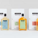
Kininvie by Here Design
The Kininvie distillery was established in 1990 as a third home for William Grant & Sons – it was initially built to relieve pressure on stock at neighbouring sites in Dufftown. Kininvie Works is a more recent development, created as an innovation arm to develop new recipes and processes. As such it is liberated from the rules and regulations that...