Logo
Malwarebytes by Redscout, 2026
Malwarebytes has built a legacy of protection, becoming THE malware scanner and cleaner for a ‘deeply technical audience’. Where the category often leans into the fear that surrounds malicious activity online, Malwarebytes favoured a more convivial approach rooted in superhero iconography. This can be seen in the logo, a sharp ‘M’, one that could be emblazoned on the front of...
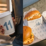
Makebardo’s charming illustrations for Cairo cafe/music venue E11VN just about rescue a rather hideous brand name
It’s never fun being negative about a project – it’s far more gratifying to show really great work, genuinely exciting or useful brands and organisations – and get under the skin of what makes them so. Obviously, a fair bit of this comes down to subjective taste; taking our own experiences and interpretations and cultural backgrounds and personalities and all...
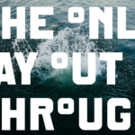
Industrial, conceptual, and starkly beautiful: DutchScot’s branding for SF sauna and cold plunge, Fjord
Fjord is a new floating sauna and cold-water plunge experience moored in San Francisco Bay’s Sausalito area. Rather than being exclusively positioned as a wellness-type experience, instead it looks to float, as it were, somewhere between architecture, hospitality and outdoor recreation. It’s a very modern take on the centuries-old tradition of saunas and how they’re used – the shift between...
BP&O Voices
Packaging:
Shelf Life
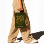
Packaging expert Lisa Cain shares her opinion on reusable packaging....

Pentagram’s designs for male health brand Rugiet are unabashedly phallic, but they work
One of the more hilariously on the, er, nose identities I’ve seen in recent times here in the form of Pentagram New York’s work for Rugiet, a men’s health brand offering personalised, clinically-backed treatments sold exclusively online. Formerly better known as Rugiet Health, Rugiet was founded in Austin, Texas, in 2020 as a telehealth company. Back then, the company was...
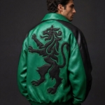
JKR overhauls football club Sporting CP by doing what it does best : plundering heritage to build a robustly simple, contemporary brand identity
JKR is perhaps – in recent-ish years at least – best known for its work with Burger King, undoubtedly one of the most oft-cited rebrands of the last decade in design circles. Then it did KFC; before that, the RSPCA, alongside a raft of other household name entities which aren’t acronyms – Uber, Boddingtons, Yahoo, Billington’s sugar. In short, hugely...
BP&O Voices
Packaging:
The Art of Subtle Persuasion
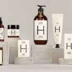
Packaging expert Lisa Cain shares her opinion on LG2’s branding and packaging for Health Hut....
Studio Blackburn’s branding for Ellis Butchers is unflinchingly carcass-centric, yet somehow so full of warmth
As a vegan of two decades, and a squeamish one at that, the thought alone of a “whole-carcass butcher business” makes me feel rather queasy – so it’s a testament to Studio Blackburn’s incredible skill that despite my personal nonsense, I absolutely adore this branding project. And I love it not in spite of things like the utterly unflinching, raw-flesh-laden...
Logo
Boligkontoret Danmark by RE-Public, 2026
Boligkontoret Danmark is one of Denmark’s largest non-profit and member-owned housing administrators. Supporting local housing associations and communities with administrative, financial and technical services, they help create well-functioning homes and thriving neighbourhoods across more than 35,000 homes throughout the country, including senior and care housing. Central to the identity is a new logo. This references the Danish national flag but...
BP&O Voices
Packaging:
The Extraction Economy
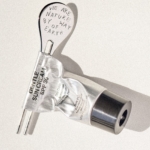
Packaging expert Lisa Cain shares her opinion on tube keys and skincare products....
Exemplary brand collabs don’t compromise: the joyful designs for Midnight Hotdog ‘dog fur mist’ by SMLXL
Back in February, we covered a project that was so delightful I still think of it often (not least thanks to its utterly ridiculous, ingenuously earwormish jingle): HotDog, with its branding by SMLXL. There was, and is, so much to love about this identity: there’s the logo formed of two dogs, one sniffing the other’s bum, reduced to its most...
Logo
Bio by Si Maclennan Studio, 2022
Bio Protocol is a decentralised network accelerating biotech innovation through blockchain infrastructure, AI and community-driven funding. It seeks to codify, coordinate and accelerate scientific discovery. Bio’s new logo, designed by Si Maclennan Studio, expresses these ideas through the suggestion of an organic form but one that is ordered in its geometry and symmetry. The studio go a bit further, describing...