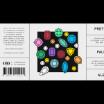
O/O Brewing by Lundgren+Lindqvist
O/O Brewing is a high-end craft brewery, set up in 2011 by Olle Andersson & Olof Andersson, with premises in the Swedish city of Gothenburg. O/O worked with Scandinavian graphic design studio Lundgren+Lindqvist, who had created labels for a variety of other O/O beer, to develop new packaging for their brews. The studio revised and simplified the design system from earlier releases but continued to...
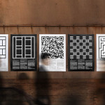
Edouard Malingue Gallery by Lundgren+Lindqvist
Edouard Malingue Gallery exhibits work by emerging and established artists from around the world across its 6000 sq ft space in central Hong Kong. Through collaborations with international curators, and its own publications, alongside solo exhibitions, the gallery looks to introduce art into public spaces and to stimulate public discourse. The gallery features an interior that juxtaposes the white unblemished walls and plinths you might...
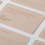
The Doctor’s Studio by A Friend Of Mine
The Doctor’s Studio provides non-invasive dermatological treatments and skin care procedures from its clinic in the Australian city of Melbourne. It has a philosophy that avoids feeding on insecurities and intends to facilitate positive change and foster a sense of well-being. The Doctor’s Studio worked with graphic design studio A Friend Of Mine to develop an interior and brand identity concept that would avoid the negative...
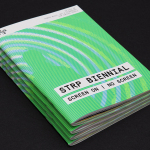
STRP Biennial 2015 by Raw Color
STRP brings together art, technology and experimental pop culture, and connects these to a broad audience, and through its light art, interactive art and robotic performances, lectures, workshops, music and film events, offers a glimpse into the future. This culminates with the STRP Biennial, an indoor art and technology festival that provides visitors with an opportunity to experience the extent to...
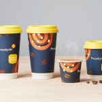
Pressbyrån by Bold
Pressbyrån is a Swedish convenience store with over 300 locations nationwide, and one of the country’s most recognised brands. It retails fresh pastry, sweets, coffee and hotdogs, alongside groceries, public transport tickets, magazines and papers, amongst a few other things. Stockholm based graphic design studio Bold worked with the store to create new packaging for its range of consumable products with the...
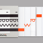
Bubu by Bob Design
Buchbinderei Burkhardt, now shortened to Bubu, is a family-owned binding specialist established in 1941. It is now run by third-generation family members and has locations in the Swiss cities of Zürich and Mönchaltorf. Bubu provides consultancy and prototyping services, curates an extensive binding library of over 2000 books, and offers a wide variety of soft and hardcover binding techniques. These include the familiar and utilitarian...

Torafuku by Brief
Torafuku has a simple yet adventurous menu that reinterprets pan asian flavours as modern shared dishes. These are made from good quality and locally sourced ingredients, which are complimented by a variety of contemporary cocktails, a carefully curated wine list and local craft beers. Torafuku is located on the border of Vancouver‘s historic Chinatown and features an open and reductive urban interior space of leather upholstered benches, light...
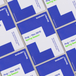
Basement Theatre by Studio Alexander
Basement Theatre is an independent, underground, community theatre located on Auckland’s Lower Greys Avenue. It was established in 2008 as a place to showcase new voices, fresh perspectives and emerging young talent, and to provide these with the space to develop their performances. The theatre has played host to dancers, visual artists, poets, musicians, comedians and everything in between. Taking their...
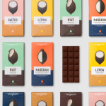
Loving Earth by Round
Loving Earth is an Australian business, established in 2007 by Scott Fry and Martha Butler, that produces a variety of chocolates, snacks, cereals, butters and spreads. All of Loving Earth’s products are made from high quality, organic and fairtrade ingredients, and include ranges that are gluten, grain, dairy and sugar-free. Although taking advantage of a growing multi-million dollar industry, Loving Earth’s values are...
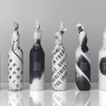
Iron Grill by End Of Work
Iron Grill is fast food outlet preparing healthy, flame grilled wraps and burgers, to order, from its kitchen and counter at the Optus headquarters at Macquarie Park, Australia. The food court at Optus is a competitive environment with a large captive audience of over 6,500 people and a number of other food outlets competing for business but serving familiar, unhealthy favourites. To help define and convey...
Upgrade to
BP&O Plus
Read more
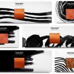
Springs’ Smokery by Distil Studio
Springs’ Smokery has been producing high quality smoked salmon for three generations from its location in South Downs, UK, using Sussex oak and a traditional dry-salting process which has remained unchanged for 50 years. Springs’ recently worked with graphic design studio Distil to develop a new visual identity and package design. Distil’s treatment is an exercise in aesthetic impact derived from colour...