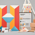
Hemslöjden by Snask
Hemslöjden is a non-profit organisation promoting craft across Sweden through courses, talks and activities. Set up as a response to the advance of industrialisation, Hemslöjden has a significant 100 year history, fostering strong relationships between culture and industry to ensure the survival and development of handicraft. It is also a publisher, events organiser and acts as an umbrella for Sweden’s handicraft societies with the understanding that these, and their activities, contribute...
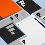
Estampaciones Fuerte by Hey, Spain
Estampaciones Fuerte is a Spanish cold metal stamping and pressing business with over forty years experience producing a variety of components for the automotive, domestic appliance and construction industries, as well as providing welding, finishing, threading and set assembling services. This year Hey worked with Estampaciones Fuerte to develop a new contemporary brand identity that would better reflect their industrial experience and professionalism....
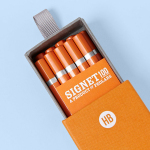
Signet 100 HB Pencils by Well Made Studio
Signet is a new pencil range developed by British home, outdoor and lifestyle retailer Pedlars, who applied their expertise to an own-brand product line following a lengthy international search for the perfect pencil. 100, the first of the Signet range and launched in November this year, is made from American basswood, finished in orange with a silver foil detail and crafted by a long-established family-run business...
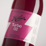
Mother Cold Pressed Juice by Mucho
Mother creates fresh cold pressed juices, milks, smoothies, cereal bars, snacks and detox systems from its location at the centre of Barcelona. Mother recently commissioned design studio Mucho to develop a name, visual identity and packaging treatment that would help express the love and care they put into crafting their range and the technological and industrial processes required to produce them....
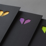
Minke by Atipo
Minke is a Spanish print production studio that favours ‘analogue splendour’ over mass manufacture, providing its clients with a variety of small-scale, mechanical and handcrafted processes and print finishes. Their visual identity, developed by multidisciplinary design studio Atipo, reflects this philosophy and service through a mix of traditional and contemporary detail split across type, colour, material texture, print finish, pattern and die cut...
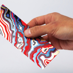
Arjowiggins Curious Matter x FIAC by The Bakery
FIAC is an annual contemporary arts fair where galleries from across the world gather and present work by the emerging artists they represent. The fair takes place at the Grand Palais in Paris and runs for four days during October. Paper merchant Arjowiggins, a longstanding partner, continued to support the event by providing material for FIAC’s catalogue and event guides. This year, these featured a distinctive bookmark...
Upgrade to
BP&O Plus
Read more
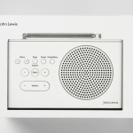
John Lewis Spectrum by Pentagram
Spectrum is a recently redesigned consumer electronics range created by and sold through British department store John Lewis. The range includes DAB radios, alarm clocks, speakers and iPad covers. These are bound by a cohesive aesthetic of soft plastic, geometric forms, bright colours and a packaging treatment created by international design studio Pentagram, led by partner Harry Pearce....
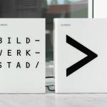
Bildmuseet by Stockholm Design Lab
Bildmuseet is a centre for visual culture and a museum dedicated to the exhibition of modern international art, architecture, design and photography, as well as retrospectives, and is described as a place for experiences, reflection and discussion. Opened in 2012, Bildmuseet is part of the arts campus at Umeå University, Stockholm, and housed within a distinctive building designed by Henning Larsen Architects...
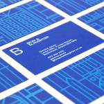
Bray & Slaughter by Mytton Williams
Bray & Slaughter is a UK based regional contractor with over 100 years of experience in the construction industry and an extensive understanding of the education, healthcare, commercial, heritage, conservation and residential sectors. Following industry and company changes, Bray & Slaughter commissioned design studio Mytton Williams to create a new visual identity that would better reflect their growth and move from ‘local builder’ to ‘regional...
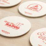
Melt by Can I Play
Melt is a Australian takeaway and restaurant franchise with a philosophy that looks to honour the 200 year old Napoli history of pizza making and its origins as a fast and nutritious meal by mixing high quality ingredients and recipe authenticity with the speed, price-point and openness that today’s consumers have come to expect. These values are also reflected through an absence of oil, fat or sugar...
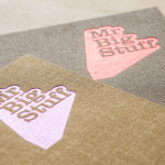
Mr Big Stuff by Can I Play
Mr Big Stuff is a Melbourne-based Southern American soul food restaurant and cocktail bar with a unique and distinctive interior designed by Technē Architecture and influenced by the music and film culture of the 1970’s and 80’s. The restaurant features an exposed concrete floor, timber and acoustic foam walls, neon signage and utilitarian furniture, as well as interior graphics and a brand identity treatment...