Brewdog Menus by O Street, United Kingdom
Posted: | Author: Richard Baird | Filed under: Cafes, Bars and Restaurants, Graphic Design Reviews | Tags: Branding Blog, Brewdog, British Design, Coloured Paper, Creative Packaging, Design Opinion, Design Reviews, Designed by O Street, Emboss Detail, Fedrigoni Papers & Boards, Foil Blocking, From Europe, From the United Kingdom, Graphic Design, Graphic Design Blog, Logo Design & Branding Blog, Material Thinking, Mixed Fibre Materials, Restaurant & Cafe Menu Designs, The Very Best of 2016, Typography, Uncoated Papers & Cards | Comments Off on Brewdog Menus by O Street, United KingdomOpinion by Richard Baird.
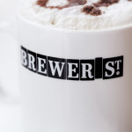
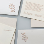
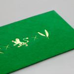
O Street worked with craft brewery Brewdog; best known for their beers and big attitude but also a growing hospitality presence throughout the United Kingdom, to create a distinctive menu design and system for over fifty of their bars. This included both a full menu which features a handmade backboard, and a Daily Drafts menu, individually finished at each location.
Earls.67 by Glasfurd & Walker, Canada
Posted: | Author: Richard Baird | Filed under: Cafes, Bars and Restaurants, Graphic Design Reviews, Logo Reviews | Tags: Bar Logos and Brand Identities, Blue Block Foil, Brand Identity, Brand Identity Reviews, Branding, Branding Agency, Branding Blog, Branding Reviews, Cafe Logos, Canadian Design, Colour in Use: Blue, Design For Print, Design News, Design Opinion, Design Reviews, Designed by Glasfurd & Walker, Designed in Vancouver, Graphic Design, Graphic Design Blog, Lettering, Logo Design & Branding Blog, Logo Design Inspiration, Logo Design Resource, Logo Designs, Logo Opinion, Logotypes, Restaurant & Cafe Menu Designs, Restaurant Logos, Sans-serif Typography, Typography | Comments Off on Earls.67 by Glasfurd & Walker, CanadaOpinion by Richard Baird.
Earls is a family-owned premium but casual restaurant chain with 66 locations throughout Canada and the United States and a thirty year history. The hospitality sector has seen a lot of change in this time. It continues to be highly competitive and often demands innovation and adaptability to remain relevant. With this in mind, Earls commissioned Canadian graphic design studio Glasfurd & Walker and interior design studio Ste Marie to reimagine the Earls brand as a one-off canteen and bar. Earls.67 is the result of this collaboration.
Earls.67 is a prototype, located at Bankers Hall in downtown Calgary, developed to test collaborations and new ideas. It is inspired by Earls 30 year history of burgers and bustling bars, food with an international twist, experimentation, energy and a focus on customer service. This is reflected in its menu, interior design and throughout a brand identity design that draws on Earls’ heritage and, in the words of Glasfurd & Walker, refocuses this through a contemporary lens. Brand identity runs across a variety of assets, these include, but are not limited to, logo and logotype, menus, interior graphics, business cards, wallpaper, gift cards, growlers and napkins.
Little Italy by Here Design, United Kingdom
Posted: | Author: Richard Baird | Filed under: Cafes, Bars and Restaurants, Graphic Design Reviews, Logo Reviews | Tags: Brand Identity, Brand Identity Reviews, Branding, Branding Agency, Branding Blog, Branding Reviews, British Design, Cafe Logos, Design For Print, Design News, Design Opinion, Design Reviews, Graphic Design, Graphic Design Blog, Here Design, Italian Restaurant, Lettering, Logo Design & Branding Blog, Logo Design Inspiration, Logo Design Resource, Logo Designs, Logo Opinion, Logotypes, Pizza Box Design, Pizzeria, Restaurant & Cafe Menu Designs, Restaurant Logos, Sans-serif Typography, Script Logotypes, Script Typography, Typography, Unbleached Materials, Wordmark Design | Comments Off on Little Italy by Here Design, United KingdomOpinion by Richard Baird.
Little Italy is a restaurant, gelateria and pizzeria located in the Jordanian capital of Amman. The restaurant features a distinctive, period and European-inspired interior of stained wood, glossy white tiles, concrete floor, vintage glass light shades, wood panelling and exposed I beams, brought together with a modern balance and lovely sense of form and contrast. This continues through to the restaurant’s brand identity, developed by London based Here Design, in its mix of type and illustration. This links menus, interior graphics, signage, packaging and business cards.