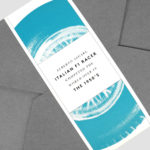
Ascari by Blok Design
Ascari is an Italian restaurant which two locations, one on Queens Street East and another newly opened establishment on King St West. Toronto, Canada. It is named after the proprietor’s hero, Formula 1 legend, Alberto Ascari, (who was also known for his love of food). To reflect both the passion for good simple food and racing, design studio Blok developed an identity that brings together...
Old Elephant House by Studio South
Old Elephant House is a new brasserie and courtyard bar in the former elephant enclosure at Auckland Zoo. It offers an à la carte menu and set three-course meals made up of light and elegant dishes. It is a building that is distinct in its proportions and location, with tall doors and windows from which to hear the distant calling siamang...

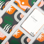
GoGo Daddy by Studio South & Egle Zvirblyte
New Zealand based Studio South worked with Lithuanian illustrator Egle Zvirblyte to build a graphic identity up of colourful characters for Mark Wallbank and Che Barrington’s new Thai canteen Gogo Daddy which is located in Ponsonby Central, Auckland. GoGo Daddy’s menu is inspired by Mark and Che’s extensive travels, and is a take on the rustic Thai street food they experienced throughout Thailand;...
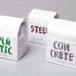
Daechung Park Cafe by Studio fnt
Daechung Park / 대충유원지 is a cafe located in the South Korean capital of Seoul. It features a distinctive interior of wood and stepped brick walls developed by FHHH Friends, furniture and objects by studio COM and a graphic identity designed Studio fnt. Graphic identity is expressed through menus, coasters, packaging and framed calligraphic posters, but also through small details within the interior...
Spanjorskan by Lobby Design
Spanjorskan is a Spanish restaurant located at Nybrogatan 42, Stockholm. It features a distinctive interior of warm and traditional detailing, a mix of wood, tiling and comfortable upholstery, and modern elements of exposed utilities, solid blocks of colour and feature lighting. Spanjorskan also has a distinctive menu with a sense of the theatrical and celebratory to it in colour, presentation and serving,...
Jackalope Hotels by Fabio Ongarato Design
Jackalope Hotels is a luxury hospitality experience developed by Melbourne-based Louis Li, a hotelier described as having a penchant for the avant-garde. The first Jackalope Hotel is situated in the heart of the Mornington Peninsula, Victoria, Australia. It is unique in its location, surrounded by the hotel’s vineyard, in its architecture and interior by Carr Design, and in its visual...

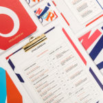
Raw Wine by The Counter Press
Raw Wine is an international two-day wine fair that takes place in the cities of LA, London, Berlin and New York. It was founded by Deborah Lambert and Isabelle Legeron MW, France’s only female master of wine, and provides an opportunity for growers, makers and buyers to get together. Raw Wine is also a celebration of the best organic, biodynamic and...
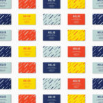
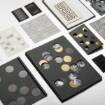
Helio by Bedow
Helio is a flexible co-working space and meeting venue with 8 different locations in and around the Swedish capital of Stockholm. It is made up of spaces with large desks for groups, small quiet areas for individuals, private meeting rooms and places to mix. These share an interior design language of modern utility and high quality handcrafted surfaces, upholstery and finishes. Helio...
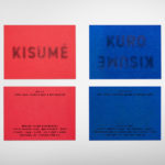
Kisumé by Fabio Ongarato Design
Kisumé is a Japanese restaurant located on Melbourne’s Flinders Lane. It is described by Fabio Ongarato Design, the studio behind its visual identity, as an unconventional, slightly twisted and artfully executed experience. The restaurant intends to immerse guests in an intriguing view of Japanese traditions, and fuses these with the owner’s obsession with beauty and sensuality. This is expressed by a “brutally sophisticated and...
High Street Wine Co. by Conductor
High Street Wine Co. is a wine bar and shop located in the Pearl neighbourhood of San Antonio, Texas. UK-based graphic design studio Conductor, working closely with architects Dado Group, created a visual identity that expresses something of the cheerful personality of its hosts, the ambience and community of a busy bar and its distinctive interior design. Drawing on the name for...
Omakase Room by Tatsu by Savvy
Omakase Room by Tatsu is a unique sushi dining experience located on New York’s Christopher Street. The concept is rooted in the centuries-old family traditions of Japanese Executive Chef and host Tatsu Sekiguchi and the celebration of the individual and personal. This can be experienced in the restaurant’s unique and intimate setting, one that seats only eight, and a menu...

June’s by Föda
June’s is a cafe and bar located on the corner of South Congress Avenue, Austin, Texas. It offers breakfast, brunch, and grab-and-go pastries and coffee throughout the morning, and has an all day bistro menu that is served late into the evenings. The bistro menu is complemented by a changing wine and bar program managed by Master Sommelier June Rodil. June’s...