
Tigre by Triboro
LES Tigre – not to be confused with seminal electroclash/riot grrrl combo Le Tigre – is a cocktail lounge in Manhattan’s Lower East Side area, which opened at the end of last year and apparently combines ‘sophistication and refinement in drink, sound and ambiance’ with an entrance that boasts ‘an original graffiti-worn door’. So far, so hip, amirite? It all...
Dirty Vegan by Jens Nilsson
Having been a vegan for almost 20 years now, various tropes have come and gone. In the early days, for the health conscious it was pretty much all about brown paper packaged Holland and Barrett goods, and references to the Young Ones cooking lentils. For the not so health conscious (hello!) it was ketchup sandwiches. Gradually the Quorn contingent came...
WEEKEND by FCKLCK
Who doesn’t love a cheeky cocktail, especially one designed to grab and go? According to WEEKEND drinks, its cocktails are eight times faster to serve than it would take to make the same mix from scratch. With ready-made drinks – that’s ‘RTD’ in marketing slang – becoming increasingly popular, WEEKEND aims to ‘cut through the noise’ with a ‘laid back...
Bacàn by Pentagram
We’ve covered no shortage of work by Pentagram in the past, most recently Cohere but spanning projects for London Fashion Week, NYC Parks, National History Museum and more. This is the first time, however, that we’ve looked at a project by new-ish New York office partner Andrea Trabucco-Campos and his team – and it’s safe to say, we’re impressed. Graphic...

Antara 128 by Mucho
GT Alpina is described by type foundry and BP&O regular GrilliType as a workhorse serif that also delights in playing with the very meaning of concept, reaching into the ‘grab bag of typographic history to resurrect shapes some may falsely see as too expressive’. This feels an apt description for Antara 128, and the visual identity created by Mucho that...
Knahia by Requena Office
Estepona is a Spanish resort town on the Costa del Sol. It surveys the azure waves of the Mediterranean from the apex of a bight that traces a gentle South-Westerly arc from Marbella to Gibraltar. Strewn as it is on this notoriously idyllic coastline, Estepona largely conforms to the stereotypically cheerful charm of the Spanish resort town, pandering to the...
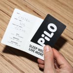
Pilo by 5.5
Youth hostels aren’t exactly associated with luxury – nor great branding. For the most part, they’re deemed the cheap and cheerful option; a trip where home comforts are sacrificed for socially minded living, affordability, and a more adventurous sensibility than the average Travelodge. They’re the sorts of places where creaky bunk beds, shower queues, pillows so thin they’re barely more...
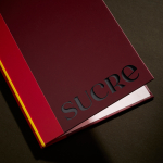
Sucre by DutchScot
It’s always satisfying to see smart, bold new identity designs for a household name brand, often by one of the big name studios: things like the still-hyped 2021 JKR Burger King rebrand; Collins’ Girl Scouts revamp in 2022; Springetts’ fresh look for Ryvita that same year, which makes the much-maligned crispbread seem a lot more palatable. And while such projects...

La Oficina del Parque by Studio Ingrid Picanyol
Last month @designershumour shared a meme titled, ‘When I ask my client to send their logo in vector format’. The god-tier client supplies logo.ai, from which point there’s a sliding scale of disgust and incredulity from logo.psd to logo.jpg and logo.doc. The punchline is logo.xls. The joke resonated, attracting over 30k knowing likes (or eyerolls). At one point or another,...
Sitko Pizza Co. by Werklig
Pizza making is a lot like brand identity design. It has many potential configurations: it can be generic or wildly individual, but fundamentally, it’s systematic, a framework of organised elements. It is a base that holds a variety of communicative assets and techniques (the toppings, if you will). Appeal is determined by how well this is orchestrated, and how well...
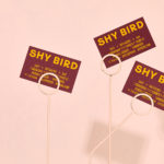
Shy Bird by Perky Bros
Shy Bird is a all-day café, rotisserie and bar in Cambridge, Massachusetts. Its core mission is to elevate chicken, and the experience of eating chicken into the realms of the exceptional through gastronomic know-how, a beautiful interior and a visual identity designed by American studio Perky Bros. Drawing their inspiration from the red junglefowl, the “original chicken” and descendant of the domestic chicken, and...
Vessel Floats by Order
In the Brooklyn neighbourhood of Greenpoint sits Vessel Floats, a new flotation and deprivation therapy spa that draws on the continuing interest in concepts such as mindful living and wellness. Through considered interior design and visual identity, the latter developed by New York-based studio Order, Vessel Floats intends to further develop and bring to modernity an experience that has been around...