
Disrepute by Two Times Elliott
Disrepute is a members-only bar, located in London’s Soho, described by Two Times Elliott, the design studio behind its brand identity, as having a heritage of “establishment and scandal”. The bar features a rich interior design of high quality material detail that elegantly plays with shape, pattern and symmetry, solid colour and texture, the geometric and the organic. There is...

Mere by Bibliothèque
Mere–pronounced Mary–is a modern two-storey restaurant and bar, located in London’s Fitzrovia, developed by chef Monica Galetti and sommelier David Galetti, working in collaboration with Westbury Street Holdings. The restaurant has a menu of simple dishes made from seasonal produce using classic techniques, and influenced by the French and South Pacific heritage of David and Monica, respectively. It also features a warm interior of...
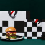
Orson Burger Kitchen by Anagrama
Taking inspiration from the work of artist Edward Hopper, and the style of the American diners of the 1920s and 1930s, Mexican design studio Anagrama developed an interior and visual identity design for Orson, a restaurant in the city of San Pedro pairing burgers with a wide selection of wines and milkshakes. The project, alongside a distinctive interior design of material detail,...
Yumn by Filthymedia
Yumn is a casual luxury restaurant located within Croydon’s Boxpark, a pop-up mall for independent and global fashion and lifestyle stores, cafes and restaurants, housed within converted shipping containers. Yumn is a smaller and more intimate version of Yumn Brasserie with a similar approach to interior in its mix of blue pinned leather upholstered seating and high quality finishes, but shares...

Pontus In The Air by Bold
Pontus In The Air is located at Sweden’s Arlanda Airport and was developed with the intention of being Europe’s leading airport restaurant in its blend of high quality, affordable prices and fast service. It features three distinct areas, The Brasserie, a classic bistro with table service inspired by the golden days of aviation, The Market, a self-service canteen with a more utilitarian finish, and...

On Rye by Pentagram
On Rye is a fast-casual sandwich shop, with a space in the US capital of Washington DC, inspired by the Jewish deli. It has a menu of unexpected recipes that dial down the salt and bumps up the veggies, uses natural and wholesome ingredients, and gives traditional dishes a modern twist. On Rye has an interior that brings a contemporary finesse to retrospective detailing and...

Chez Olivier by Swear Words
Chez Olivier is an authentic French bistro located in the centre of Greville St village, Melbourne, that intends to share its passion for French food, wine and culture with the community. It features an intimate European-style interior design of stained woods, classic furniture, photography and period advertising. It also has a unique bar of padlocks, inspired by Pont des Arts, engraved with messages of love...

Culprit by Studio South
Culprit is a bar and restaurant located on Auckland’s Wyndham Street. It has a menu made from ingredients supplied by local New Zealand producers, growers and farmers, and is inspired founder’s Kyle Street & Jordan MacDonald’s travels across the United States and Europe. Culprit has a modern interior design in a converted loft space created by Kirsty Mitchell. This is characterised by large exposed beams and brick...

Roster Bar & Restaurant by Bond
Roster is a bar and restaurant on the corner of Pohjoisesplanadi and Unioninkatu in the Tori Quarters of Helsinki. It features an impressive interior made up of custom furniture with a vintage twist, raw and refined materials and hand-picked design objects. Although sophisticated in its design, Roster is a casual rather than formal dinning experience. The eclectic but cohesive style that proliferates interior, its high-quality food...

Sardine by Here Design
Sardine is a restaurant, located on London’s Micawber Street, with a simple menu of rustic, Southern French and Mediterranean-inspired dishes cooked over a wood fire. It features an interior design of bent wood chairs, open kitchen, steel and light wood table tops and a brand identity created by Here Design. This adds a touch of a mediterranean colour to interior through menus and tile detail, while also linking other assets such...

Brewdog Menus by O Street
O Street worked with craft brewery Brewdog; best known for their beers and big attitude but also a growing hospitality presence throughout the United Kingdom, to create a distinctive menu design and system for over fifty of their bars. This included both a full menu which features a handmade backboard, and a Daily Drafts menu, individually finished at each location....
Earls.67 by Glasfurd & Walker
Earls is a family-owned premium but casual restaurant chain with 66 locations throughout Canada and the United States and a thirty year history. The hospitality sector has seen a lot of change in this time. It continues to be highly competitive and often demands innovation and adaptability to remain relevant. With this in mind, Earls commissioned Canadian graphic design studio Glasfurd & Walker and interior...