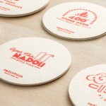
Melt by Can I Play
Melt is a Australian takeaway and restaurant franchise with a philosophy that looks to honour the 200 year old Napoli history of pizza making and its origins as a fast and nutritious meal by mixing high quality ingredients and recipe authenticity with the speed, price-point and openness that today’s consumers have come to expect. These values are also reflected through an absence of oil, fat or sugar...
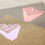
Mr Big Stuff by Can I Play
Mr Big Stuff is a Melbourne-based Southern American soul food restaurant and cocktail bar with a unique and distinctive interior designed by Technē Architecture and influenced by the music and film culture of the 1970’s and 80’s. The restaurant features an exposed concrete floor, timber and acoustic foam walls, neon signage and utilitarian furniture, as well as interior graphics and a brand identity treatment...
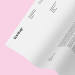
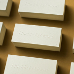
Korshags by Kurppa Hosk
Korshags is a family-owned seafood company located in Falkenberg on the Swedish west coast. Previously named Falkenbergs Lax (Falkenberg’s Salmon), Korshags has grown from a small local company specialising in smoked salmon, into an international player with a variety of products. With this in mind the company commissioned Stockholm-based Kurppa Hosk to establish a new name and brand identity that would better position...
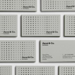
Ascui & Co. Architects by Grosz Co. Lab
Ascui & Co. Architects is an Melbourne-based studio with a rich history, depth of experience and a vision they describe as being a true perspective rather than one founded on intuition. Their projects are considered smart and environmentally sustainable, unexpected yet grounded by purpose, and range from residential additions to multimillion-dollar commercial developments. Anchored in the concept of Process & Possibility — a maxim that refers...
Café Royal by Pentagram
Once recognised as having the greatest wine cellar in the world and understood to have introduced French gourmet food to London, Café Royal, located on Regent Street, has been described as being the place for the avante garde to meet and dine for over a century. This year, to coincide with its reopening and reposition as a luxury five-star hotel...
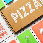
PizzaLuxe by The Touch Agency
PizzaLuxe began in 2011 as a single restaurant located on London’s Brick Lane hand making good-value, freshly baked pizzas using locally sourced, ‘deluxe’ ingredients. To coincide with an expansion into the Stratford’s Westfield Centre, the brand approached Edinburgh-based design studio The Touch Agency in 2013 to develop a new visual identity that would communicate their core values within a more ‘polished’ environment. In 2014, The Touch Agency continued...
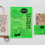
Streat Helsinki by Kokoro & Moi
Streat Helsinki is a festival that looks to explore and question what street food can and should be. It began this year with three events — a series of talks, opportunities to eat and time to party — held at different venues across the city. Eats, the largest of the three, was held in the Tori Quarters and included 40 food...
The Counter Press by The Counter Press
The Counter Press is a letterpress studio and workshop located in an old chocolate factory in the East End of London. They work exclusively with hand set wood and hot metal type on antique presses to create contemporary typographic design, artwork and limited edition prints. While taking on small outside projects, founders David Marshall and Elizabeth Ellis are keen to stress they are not...
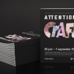
Attention: Craft by Snask
Attention: Craft was an exhibition of innovative and experimental art created by eleven leading Swedish and Norwegian artists, and part of an annual programme run by and held at Stockholm’s Liljevalchs, the first independent public museum for contemporary art in Sweden. The exhibition took place between June and September this year and featured artists such as Karin Bengtson, Linus Ersson and Hanne Friis....
Huckle & Goose by Cast Iron
Huckle & Goose is an online food service that delivers weekly seasonal recipes to subscribers with the intention of making it simple and easy for the conscientious home cook to plan meals according to what’s in season at the local farmers’ market. Colorado-based Cast Iron Design were appointed to bring Huckle & Goose to life, developing a brand identity which included a...
Reachin’ by Karoshi
Reachin’ is a regular charity event established in 2012 to engage with a younger demographic and raise awareness and funds for Myeloma UK, an organisation dedicated to finding a cure for Myeloma, a rare cancer of the bone marrow. Money made from each event is complemented by the online sale of branded t-shirts, vests and tote bags. Designed by Karoshi, Reachin’s brand...
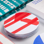
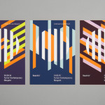
Rendez-vous des Créateurs by Marks
Rendez-vous des créateurs 2014 was an event that took place in September at experimental meeting, performance and exhibit space Flux Laboratory in the Swiss town of Carouge. The exhibition was an opportunity for those servicing the graphic design chain to show off finishes, materials and techniques under the title “onomatopoeia of printing”. Participants included silk screen printer Atelier Fuerm, binder Bubu, hot stamper...