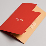
Skovin by Heydays
Skovin is Norwegian, high-end, solid wood floor specialist that combines ancient craftsmanship with modern technologies. By mixing a wood veneer business card and a traditional name drawn from the old word Skøyen, the area in Oslo where the company was founded, with geometric shapes and die cuts, panels of flat colour and sans-serif typography, Skovin’s identity, designed by Heydays, intends to...
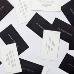
Shaun Ford & Co. by Savvy
Shaun Ford & Co. is a Canadian bespoke furniture an interiors business that creates tailored environments for the sophisticated, style conscious consumer, and whose work revolves around a timeless approach to space. Each piece of furniture is designed with careful consideration given to the years that it will have to coexist within a particular environment and with the intention that each acquires further...
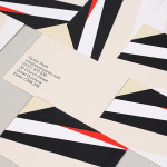
Studio Aves by Build
Studio Aves is a soon to launch UK design practice that will specialise in typeface and typographic design. Its visual identity, based around a high contrast colour palette drawn from the markings of British birds — a reflection of the name and inspired by blue tits, goldfinches, magpies, robins plus many more — was recently created by Build. The identity runs...
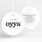
Oyya by Skinn
Oyya is an ice bar located in the Belgium city of Bruges that retails a variety of frozen yoghurts, yoghurt drinks, waffles and 28 ice creams — the most in the city. Its brand identity, which included logotype, print, signage, uniforms and interior design created by local studio Skinn, while largely logo-centric and having a strict consistency across stickers, tubs,...
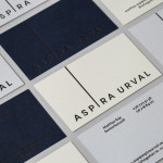
Aspira Urval by BVD
Aspira Urval is a banking, finance and insurance recruitment specialist with offices in the Swedish city of Stockholm. Its new brand identity, designed by BVD, draws its inspiration from the name and the themes of ‘elevated ambitions’ and ‘reaching new heights’. These are visualised as a generously spaced, uppercase, sans-serif logotype with an adaptive ascender that changes depending on its context. It is...
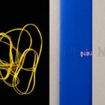
Neometro & Nine Smith Street by Studio Hi Ho
Nine Smith Street is the latest residential property project from Neometro, a company that describes itself as having a reputation as Melbourne’s most design-focused development group and recognised as one of the first holistic design and construction businesses in Australia. Neometro are dedicated to creating architectural buildings that are beautiful, functional and timeless, and have a sense of place and belonging. Neometro’s brand...
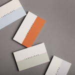
Tamarindo by La Tortillería
Tamarindo is a kitchen and bar with an international menu due to open in October 2014. Located in Ourense, Spain, Tamarindo was created as a refreshing alternative for local walkers who are used to traditional bars and restaurants, and is described as a place with two distinct moods and spaces, the casa cocina or house/kitchen, a place for coffee and...
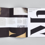
Mauritshuis by Studio Dumbar
Mauritshuis is an art museum and state-owned building constructed in the 17th century and located in The Hague. The building is described as being a fine example of Dutch Classicist architecture. It was formerly the residence of count John Maurice of Nassau and has been home to the Royal Picture Gallery since 1822. Today, it houses a plethora of Golden...
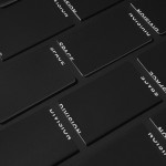
Space Division by Inhouse
Space Division is an architectural studio established in 2010 with an office in Auckland, New Zealand. It looks to contribute to and positively impact on the lives and environments of its clients and the communities it serves by producing simple and succinct spaces. The studio describe their projects as being inclusive and client-focused with physical constraints, budgets, time frames and compliance being...
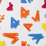
Making: by Garbett
Making: is the Australian Institute of Architects’ 2014 conference. Working in collaboration with creative directors Sam Crawford, Adam Haddow and Helen Norrie, Sydney based design studio Garbett developed a brand identity for the conference, which included logo, lanyard, merchandise and print design, that explores the role of the architect as maker of environments and connections that extend beyond the bounds of traditional practise. This was expressed...
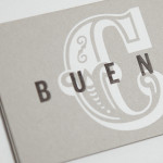
Buena C by Tres Tipos Gráficos
Buena C is an event planning agency, founded by Carolina Arjones, with offices in Madrid and Alicante. The agency provides both individuals and businesses with exclusive, individualised and detail orientated event consultation and organisation services that include, but are not limited to, sourcing locations, photographers, catering, stationery, transportation and accommodation for presentations, conventions and weddings. Alongside event planning the agency...
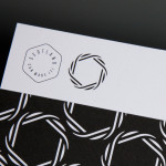
Scotland Can Make It! by Graphical House
Scotland Can Make It! is a limited edition collection of souvenirs, created by leading Scottish designers and artists in collaboration with manufacturers from across the country, for the Glasgow 2014 Commonwealth Games. The souvenirs are described by Graphical House, the design studio behind the collection’s brand identity and website, as being part of a programme of events that celebrate ‘Scotland’s cultural heritage, creative...