Helsinki City Museum by Werklig
Helsinki City Museum, through its collection of objects and images, provides visitors with historical insight into the everyday lives and personal experiences of the people of Helsinki. It is free to enter and features 2400 sqm of exhibitions and public spaces, a cafe, inner courtyard, areas to relax and conference rooms. To coincide with a move to a new space;...
Tangent GC Soap by Carl Nas Associates
Tangent GC is a Scandinavian organic garment and shoe care company developing products that intend to ensure longevity. The company’s brand identity, a simple utilitarian typographical expression, designed by Essen International, delivered a sense of informational immediacy through the absence of superfluous stylistic detail and colour, dividing content in the arrangement, orientation and typesetting of Akkurat Mono. Venturing into organic personal skincare, Tangent GC worked with...
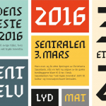
Sentralen by Metric Design
The former building of Norway’s first savings bank, which began as a social initiative to serve the working class people of Oslo, now houses Sentralen, a mixed-use cultural centre. Sentralen continues in the traditions of the bank, functioning as a hub for innovators concerned with and looking to address present day societal issues. The centre houses over 350 tenants working...
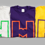
Moi Helsinki by Bond
Moi Helsinki welcomes visitors to the Finnish city of Helsinki, and offers a place to relax after a long journey, with an extensive menu of beers and snacks from its location in the arrivals lobby at Helsinki-Vantaa Airport. The bar features an interior design of light wood and bright neon signage, alongside dark walls, furniture and tiles. Where there are...

Mathias Dahlgren Edition by Essen International
Mathias Dahlgren Edition is a set of contemporary kitchen appliances which are the product of a collaboration between the Grand Hôtel Stockholm, its renowned Swedish Michelin starred chef Mathias Dahlgren, and kitchenware retailer Dafra. Scandinavian graphic design studio Essen International worked with the trio to translate the culinary vision and creativity of Mathias Dahlgren into a modern graphic expression and packaging solution...
Terri Timely by Bedow
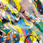
Terri Timely is a Californian directing duo creating short films, music videos and commercials. Although they collaborate with a variety of clients; these include Mitsubishi, Amazon and Comcast, much of the duo’s work share a quirky and humorous visual style. This is expressed by their new brand identity, developed by Swedish graphic design studio Bedow, through a simple but playful visual style and animation...

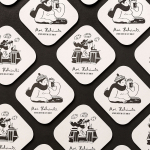
Gretas by 25AH
Gretas is a café set within the Haymarket, a hotel located at the heart of Stockholm, Sweden. The building was formerly home to a famous department store that dates back to the early 20th century and was the place where actress Greta Garbo was discovered while working at one of the concessions. 25AH, the Scandinavian graphic design studio behind Haymarket’s own brand identity, as well as Paul’s, a restaurant also situated...
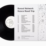
Boreal Network, Itasca Road Trip by Bedow
Nicole Johnson is a Seattle-based Minnesotan creating what Miles Bowe of Fact Magazine describes as “sun-drenched, foggily nostalgic electronica” under the name Boreal Network. Itasca Road Trip is a limited edition vinyl rerelease and trimmed down version of an earlier album by Boreal Network, distributed by More Than Human Records and featuring artwork by Swedish graphic design studio Bedow. Where the album takes an aural tour...
Paul’s at Haymarket by 25AH
Paul’s is a restaurant located in the Haymarket hotel which is situated at the heart of the Swedish capital of Stockholm. The restaurant is named after Paul U. Bergström, founder of a well-known department store that previously occupied the building, and features a distinctive period interior of bent wood chairs, white tiles, leather banquette seating, marble surfaces and art deco-inspired flourishes. This...
Erik Penser Bank by Bedow
Erik Penser Bank provides its clients with independent financial advice and a high-level of personal service. While large banks do provide similar services, Erik Penser Bank is Sweden’s only dedicated private banking business. Professionalism, experience and an individualised service practice are expressed by the bank’s new brand identity, created by Stockholm-based graphic design studio Bedow, through the personable and less corporate qualities of a monogram, which...
Solrug by Bielke & Yang
Solrug is a high-quality, ready-cut, Finnish sourdough rye bread created for the Norwegian market by Magnus Högnäs, a Finnish expat living in Norway, and in response to the county’s poor wholemeal choice. The bread is dense with a strong flavour, low in sugar and salt but high in fibre and protein, and produced by Finnish bakery Leipomo Rosten Oy using only...
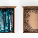
Biggans Böcklingpastej by Bedow
Böcklingpastej is a smoked herring fish paste from Biggans, a small family owned company creating products for the Swedish market since 1952. The company recently worked with Stockholm-based graphic design studio Bedow, who had previously helped them with the packaging for their range of sauces, to develop product packaging and POS for Böcklingpastej. This replaces a heavily branded logo-centric design with one of...