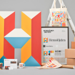
Hemslöjden by Snask
Hemslöjden is a non-profit organisation promoting craft across Sweden through courses, talks and activities. Set up as a response to the advance of industrialisation, Hemslöjden has a significant 100 year history, fostering strong relationships between culture and industry to ensure the survival and development of handicraft. It is also a publisher, events organiser and acts as an umbrella for Sweden’s handicraft societies with the understanding that these, and their activities, contribute...
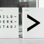
Bildmuseet by Stockholm Design Lab
Bildmuseet is a centre for visual culture and a museum dedicated to the exhibition of modern international art, architecture, design and photography, as well as retrospectives, and is described as a place for experiences, reflection and discussion. Opened in 2012, Bildmuseet is part of the arts campus at Umeå University, Stockholm, and housed within a distinctive building designed by Henning Larsen Architects...

Korshags by Kurppa Hosk
Korshags is a family-owned seafood company located in Falkenberg on the Swedish west coast. Previously named Falkenbergs Lax (Falkenberg’s Salmon), Korshags has grown from a small local company specialising in smoked salmon, into an international player with a variety of products. With this in mind the company commissioned Stockholm-based Kurppa Hosk to establish a new name and brand identity that would better position...

Ninjaplast by Kurppa Hosk
Ninjaplast is a Swedish plastic food wrap product with a unique packaging solution that addresses the difficulties often associated with cutting similar products effectively from a roll. Rather than a serrated card bar, Ninjaplast comes with a built-in and safe to use cutting blade that makes wrapping food a “fumble free” experience. The close relationship between product and packaging is enhanced by,...
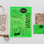
Streat Helsinki by Kokoro & Moi
Streat Helsinki is a festival that looks to explore and question what street food can and should be. It began this year with three events — a series of talks, opportunities to eat and time to party — held at different venues across the city. Eats, the largest of the three, was held in the Tori Quarters and included 40 food...
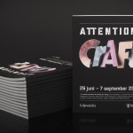
Attention: Craft by Snask
Attention: Craft was an exhibition of innovative and experimental art created by eleven leading Swedish and Norwegian artists, and part of an annual programme run by and held at Stockholm’s Liljevalchs, the first independent public museum for contemporary art in Sweden. The exhibition took place between June and September this year and featured artists such as Karin Bengtson, Linus Ersson and Hanne Friis....
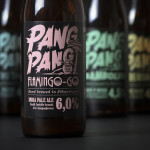
PangPang Summer Beer by Snask
PangPang is a Stockholm based microbrewery that was established by oddball Fredrik Tunedal in 2011. Fredrik, only 23 at the time, tattooed PangPang across his knuckles to celebrate the founding of what he believes to be Sweden’s first microbrewery. These knuckles now form the basis of the brewery’s logotype. Swedish design studio Snask were commissioned to develop a strategy for PangPang’s 2014 summer series...
Yksi elämä by Tsto
Yksi elämä is a Finnish project set-up with the intention of encouraging people to become more interested in their own well-being and to improve public health care on both a professional and organisational level, as well as society in general. The project is a collaborative endeavour between the Brain Association, Diabetes Association and Heart Association of Finland. Design studio Tsto were asked...

SSU by Snask
The Swedish Social Democratic Youth League, abbreviated to SSU, is a branch of the Swedish Social Democratic Party, associated with the Swedish Trade Union Confederation, and one of the largest youth leagues in the country with a membership of over 10,000. In response to an upcoming general election, which took place on September 14th, the SSU looked to readdress its visual identity which had...

Taidehalli by Tsto
Taidehalli is an art gallery, also know as Helsinki Kunsthalle, with a significant 86-year history. It is set within the walls of a distinctive building created by Jarl Eklund and Hilding Ekelund, and during its lengthy residency has secured its place as a key space within Finland for the exhibition of contemporary artworks. Taidehalli’s new brand identity, recently redesigned by Helsinki and New York based design...
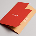
Skovin by Heydays
Skovin is Norwegian, high-end, solid wood floor specialist that combines ancient craftsmanship with modern technologies. By mixing a wood veneer business card and a traditional name drawn from the old word Skøyen, the area in Oslo where the company was founded, with geometric shapes and die cuts, panels of flat colour and sans-serif typography, Skovin’s identity, designed by Heydays, intends to...
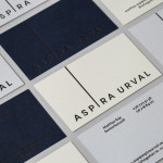
Aspira Urval by BVD
Aspira Urval is a banking, finance and insurance recruitment specialist with offices in the Swedish city of Stockholm. Its new brand identity, designed by BVD, draws its inspiration from the name and the themes of ‘elevated ambitions’ and ‘reaching new heights’. These are visualised as a generously spaced, uppercase, sans-serif logotype with an adaptive ascender that changes depending on its context. It is...