Norwegian Academy of Music by Neue
Located in the Majorstuen district of Oslo The Norwegian Academy of Music is Norway’s largest music academy. It offers both undergraduate and post-graduate courses, has educated some of Norway’s most prolific musicians, and, according to Wikipedia, ‘attempts to lay the foundation for research within the various fields of music’. Based around the concept of an ‘endless visual pulse’, design agency Neue developed a new generative...

Minna Palmqvist by Bedow
Minna Palmqvist is described by Bedow, the studio behind her new visual identity as a “critical, Swedish fashion designer”. Following the completion of a masters degree at Stockholm’s Konstfack College of Arts in 2009 Minna launched her own label to further develop her ‘Intimately Social’ series, “an evolving constant challenging the traditional fashion seasons and exploring the obsession with the female body, by merging social...
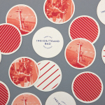
Ingierstrand Bad by Uniform
Ingierstrand Bad is a newly refurbished restaurant located on the shore of Norway’s Oslofjord that balances the area’s history as a 1930’s summer retreat with a contemporary dining experience. Oslo based design agency Uniform recently captured this juxtaposition of past and present through a new brand identity solution for the restaurant that mixes vintage photography, cream substrates, geometric forms, two inks...

Pikseli by Werklig
Originally built in the 1980’s by wireless pioneer Digita Oy, Pikseli is a building, located in the Vallila district of Finland’s capital city Helsinki, that provides office space to companies working within the digital industries. Design agency Werklig, commissioned to develop a new visual identity for Pikseli to attract new tenants, created a solution that takes the tiny universal screen unit of a pixel and...

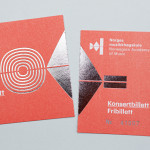
Yay Festival by Snask
YAY Festival is a Stockholm based design event, created Swedish by design studio Snask working in collaboration with ‘brand experience agency’ Grandins Flying Circus, that was launched in 2012 with guest speakers that included Aaron James Draplin and Jennifer Cirpici who replaced Jessica Hisch. The identity for the 2012 event, recently published by Snask on their website, juxtaposes traditional and fine illustrative...
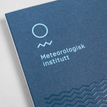
Meteorologisk Institutt by Neue
Meteorologisk Institutt provides meteorological data to Norway’s military, civil services and the general public with the intention of safe guarding life, property and the environment. Design agency Neue developed a new visual identity solution for the institute that mixes geometric shapes, material and print choices and the humanistic and environmental detail of photography to achieve communicative and aesthetic contrast and capture the data drawn from...

Creagent by Bond
Creagent is a Finnish ‘design broker’ that provides a “unique pool of talented designers from all fields and a wide range of expertise to match various business needs.” Creagent’s new brand identity and website, developed by multidisciplinary design studio Bond – currently on a roll with new work for Allsorts and the University of the Arts Helsinki – utilises a bold, brightly coloured set of pictograms and...

University of the Arts Helsinki by Bond
“The Finnish Academy of Fine Arts, Sibelius Academy and Theatre Academy Helsinki merged in the beginning of 2013 into the University of the Arts Helsinki. Bond created the complete branding solution for the new university. The strategy for the identity was to create a distinctive set of logotypes based on a common design language, and to introduce an anchor symbol...
Food Studio by Bielke&Yang
Food Studio is a group of food professionals, designers and photographers that come together to create unique and unconventional shared, natural and Nordic food experiences, table talks and workshops where “food becomes conceptualized through physical and mental experiments”. Design agency Bielke&Yang, who have been part of Food Studio from the beginning, recently worked with a team of copywriters, film producers and photographers to...
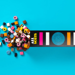
Allsorts by Bond
Lovely new packaging design by Helsinki based studio Bond for liquorish confectionery brand Allsorts that brings the “distinctive shapes and colours of the liquorice into the forefront of the design” with simple, iconic geometric illustrative detail and a bright colour palette, enhanced by the black background of a card box structural solution. An approach described by Bond as resulting in a “bold...

Kontoret by Werklig
Created by consultant Ray Lindberg with the intention of setting new standards for flexible work environments, Kontoret provides low-cost office space by the hour, with wireless internet, printers and coffee, to freelancers, chief executives, local businesses and international travellers in the centre of Helsinki. Inspired by the “essence and basic needs of office work and the aesthetics of the classic office...

More Than Human by Bedow
More Than Human is a Vancouver-based record label, established by Gareth Moses, that specialises in the release of limited edition vinyl from electronic musicians such as the Passenger, Plays:Four and Kemper Norton, who’s latest EP is described as “political, weird, epic, moving, captivating, disturbing, haunting and deep”. The label’s logo and record sleeves were developed by Swedish graphic and product...