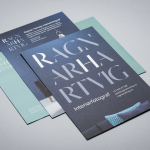
Ragnar Hartvig by Commando Group
Ragnar Hartvig is a renowned Norwegian photographer with over 20 years experience and a strong network of collaborators. Clients have included leading furniture manufacturers, magazines and books, as well as interior and product designers. Ragnar Hartvig worked with Oslo based graphic design studio Commando Group to develop a new brand identity that would convey some of his personality, skillset and experience...
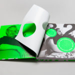
Eero Aarnio by Bond
Eero Aarnio is a Finnish designer and one of the great innovators of modern furniture design. He is perhaps best know for his Ball, Bubble and Puppy toy, and his pioneering use of plastics and fibreglass during the 60’s. 2016 saw the release of a book that celebrates much of Eero Aarnio’s work, selected from a portfolio that spans several decades,...
Innovation Properties by 25AH
Innovation Properties is a Scandinavian developer creating modern, functional and timeless homes in and around Stockholm. The developer recently worked with graphic design studio 25AH to create a new brand identity that would run across business cards, stationery and project brochures, and in conjunction with a new website, also designed by 25AH....
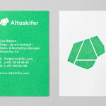
Altaskifer by Neue
Alta Quartzite is a natural building material quarried from the mountains of Norway’s Alta region with a unique green/grey colour, fine texture and hard wearing non-slip properties. These make it a good choice for both interior and exterior applications, from roofing, paving and staircases, to roads and walkways. Although it is material with a long history of use it is...
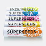
Superseeds by B&B Studio
Superseeds is a range of flavoured seeds available in five varieties, all of which are 100% organic, gluten and dairy free. These include Chili Smoke, Maca Caramel and Japanese Tamari. It is the first product from UK health food business Punch Foods, which looks to balance artisanal practice with optimal nutrition and punchy flavour. Taking their inspirations from the origins of each variety, and the...
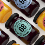
Danish Selection by Kontrapunkt
Danish Selection is a new range of high-quality fruit spreads cut with alcohol. The range includes blackcurrant infused with Jamaican rum, orange with cognac and a wild blueberry variety with Scotch whiskey. Orkla, the company behind Danish Selection, worked with Copenhagen based graphic design studio Kontrapunkt to develop a packaging treatment that would clearly communicate this new concept to consumers. Kontrapunkt’s solution is...
Hegel Music Systems by Neue
Hegel is a Norwegian amplifier, pre-amplifier and multi-media player business with a proprietary Error Correction System that limits harmonic distortion without compromising other parameters. Established in the early 1990’s, Hegel has grown to become a well-established supplier of high-end hi-fi products, nationally and internationally, and is committed to sound reproduction that adds nothing (or as little as possible). This is the foundation of their new packaging...

Coffee & Co. by Bond
Coffee & Co. is a new cafeteria and coffee shop concept onboard the Finnish cruise ship the MS Silja Serenade. It offers freshly prepared sweet and savoury snacks, has a light interior design of tiles and wood, and features a visual identity of hand lettering and sans-serif typography created by graphic design studio Bond. This runs throughout the cafe, linking signage, packaging, interior communication and graphics....
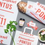
Tidningshuset by Pontus by Bold
Tidningshuset by Pontus is a 1000 m2 lunch restaurant, deli and bakery committed to sustainability, simplicity and quality, and was developed by famous Swedish chef and restauranteur Pontus Frithiof with the intention of challenging industry conventions. The restaurant is on the ground floor of a building owned by Dagens Nyheter, Sweden’s largest daily newspaper, which is situated in the newspaper district of Stockholm....

Swedish Forest Industries Federation by BVD
With the intention of better communicating the endless possibilities of the forest, the concept of Bioeconomy and a commitment to a sustainable future, Skogsindustrierna, the representative of the Swedish pulp, paper and woodworking industries, worked with Scandinavian design studio BVD to help move them away from a complicated tonality and give their communication a clarity, focus and accessibility. With this in mind,...
Österlånggatan 17 by Lobby Design
Bockholmengruppen is a Stockholm based restaurant group and owners of both Nytorget 6 and Nybrogatan 38. The group recently expanded, taking over Le Bar and opening Österlånggatan 17 in its place, a modern local restaurant with a menu of home cooked dishes with a twist, located at the centre of Stockholm and attracting locals and tourists alike. Scandinavian design studio Lobby Design worked with the Bockholmengruppen to create a visual identity...
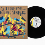
The Hope Singers by Bedow
Scandinavian graphic design studio Bedow have recently completed work on the record sleeves for The Hope Singers debut album It’s Time For…, which will be released on the Sing a Song Fighter label as a limited edition LP. Bedow mix a well-illustrated approach with loose hand drawn typography, and applied these using a four colour screen print process across uncoated and unbleached board. The result is...