
Casa Virginia by Savvy
Casa Virginia is a restaurant and culinary project in Mexico City, created by chef Mónica Patiño, that mixes the highest quality cuisine and meticulous processes with the familiarity of eating at home. This fusion of restaurant quality and easiness is perhaps most acutely manifested throughout its interior design, a space that juxtaposes the modesty and simplicity of wooden and basketweaved furniture...
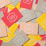
Simone Handbag Museum by Charlie Smith Design
Simone Handbag Museum is dedicated to the history of handbags with ‘international significance’ and provides its visitors with a curated, contemporary and historical collection to explore over two floors at the centre of the South Korean city of Seoul. London based Charlie Smith Design were recently commissioned to develop a brand identity for the museum that would resonate with and unite its diverse collection across...
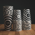
Mary Wong by Fork
Mary Wong is a fast-food chain, with locations throughout the Russian city of Rostov-on-Don, that prepares Chinese noodles with both Asian and American influences. Mary Wong’s brand identity, a combination of bilingual typography, logotype, black noodle boxes with bright spot coloured stickers, t-shirts, environmental design and signage developed by Moscow based studio Fork, was inspired by Tokyo and New York nightscapes and...
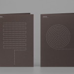
Coma by Mucho
Coma is an independent analysis, strategy and executive coaching business located in Spain. It provides support to individuals, businesses and institutions with the aim of fostering talent and leadership. Coma’s philosophy is focused on forward momentum and progress. This philosophy is expressed by the firm’s new brand identity, developed by global design studio Mucho, through illustrative paths that finish on a comma. These link...
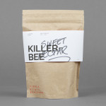
Single Origin Roasters by Maud
Single Origin is a Sydney-based coffee specialist with a roast works in Botany and a cafe in Surrey Hills. Single Origin approached Maud to create a brand identity solution—which included logo design, stationery and packaging—that would reflect the low-key nature of the brand, the founders’ desire to avoid any notion of commercialism and help them expand into new markets. In a ‘category rife...
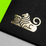
Anthem by Anagrama
Anthem will be a scouting and transfer business within the professional football market working predominantly across Spain, Switzerland and Mexico. Anthem will also be responsible for organising and promoting a variety of sporting events. Design agency Anagrama were recently commissioned to develop a new brand identity for the company—which included a logo, logotype and stationery set—that would communicate the prestige,...
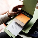
Puebla 109 by Savvy
Puebla 109 is a three floor 20th century townhouse, located in the Roma Norte colonia of Mexico City, “where art, design and gastronomy converge” in the form of an evolving space utilised as a place to work in the morning, as a restaurant to eat lunch in the afternoon and as a bar to have cocktails in the evening. Puebla 109’s new brand identity—which includes...
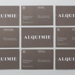
Alquimie by Thought Assembly
“Released quarterly as a printed magazine, Alquimie is a written emulsion of alcoholic and non-alcoholic drinks. Covering wine, beer, spirits, bitters, coffees and other solutions of interest; Alquimie explores the liquids themselves — their origins and stories. Working with photographer James Morgan, the inaugural edition of Alquimie included over 160 images across 152 pages.” – Alquimie Melbourne based graphic design and visual communications...
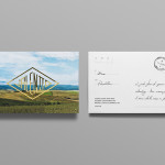
Valentto Olive Oil by Anagrama
Valentto is a Mexican cold-pressed virgin olive oil produced by Olivarera Italo-Mexicana – a Mexican Italian collaboration – created for commercial kitchen and restaurant use. Multidisciplinary design agency Anagrama recently developed a new brand identity and packaging solution for Valentto that juxtaposes the natural detail of Italian landscapes alongside the industrial utility of a square tin structural choice, described by Anagrama as being...
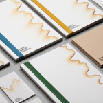
Jeremy Maxwell Wintrebert by Hey
Jeremy Maxwell Wintrebert is a glassware designer and manufacturer currently working in France with a free hand glass blowing philosophy mastered while traveling internationally across the US and Europe. Spanish design agency Hey recently developed a new visual identity solution for Jeremy that captures the heat, craft and art of glass blowing through a smart combination of colour and laser...
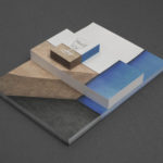
Cocktails & Bitters by Bureau Collective
Cocktails & Bitter is the identity of professional Swiss bartender Philipp Grob whose service is described by Bureau Collective, the design agency behind his new visual identity, as a “special and individual bar experience” “for gourmets, connoisseurs and explorers.”...
Olive Gold by Anagrama
Olive Gold is described by Anagrama, the multidisciplinary design agency behind its new packaging and visual identity, as an ‘ultra premium’ cold-pressed, extra virgin olive oil from Olivarera Italo-Mexicana that “targets the global high-end section of its category, is marketed through word-of-mouth, luxury communication channels and is only available in a few upscale gourmet stores and luxury-chic hotels.”...