Technology
Cute, curious and cuddly
Fitness and health tracking apps are not generally known for their sense of fun. The likes of MyFitnessPal, while great in terms of functionality, for the most part, keep the design stuff resolutely serious, no-nonsense, and perfunctory. Meanwhile the likes of Strava elicit joy through very few things, the main one being when people decide to run in a shape...

Free your mouth
You don’t really hear the word ‘quip’ all that often – it feels somewhat antiquanted in a way, a little eccentric, somehow very English. The sort of thing gracing the cover of the sort of book someone bought as a gift for someone they don’t really know very well, nor particularly care about – maybe 101 of Oscar Wilde’s Wittiest...

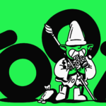
Gaming Goes Goblin-mode
Remember the heady days of 2022, as we emerged blinking into the light in a cautious post-pandemic haze – confused, slightly heavier, wondering whether we should cancel Disney+ now that going out was sort-of-possible? It was then that The Oxford Languages Word of the Year (well, two words if we’re being pedantic, which is surely an approach the famous dictionary-pedlars...

Dating Apps Go Full Cerca
It wasn’t too long ago that we were deluged by think pieces bemoaning the state of dating apps; detailing their fall-from-favour in data that showed in cold hard numbers that their popularity had long since boomed. The swipe-laden online dating world, it seems, was drastically waning. All sorts of theories flew around: maybe Gen Z – frequently (bafflingly, implausibly) lauded...
Fello by Bold Scandinavia
When it comes to brand design, of all the sectors, mobile networks seem to play it pretty safe: functional, practical, all in all, pretty dry – or at the very least, unadventurous. Some are better than others, of course: I for one think that Giff Gaff’s wordmark is actually alright – I’m far from opposed to the quirk in joining...
So Energy by Studio Blackburn
I’ve said it before and I’ll say it again: it’s all well and good making some striking, retina-toastingly fluoro, brave as hell design work for, say, a kombucha startup or CBD lube or a record sleeve or an art book. These things are by dint of their very existence, context, and audience, already sort of cool. But the real creative...
Blueberry by Studio NARI
“Mind. Blown”, as someone in Gen Alpha might have said a long time ago, maybe while performing some flossing at a velocity so rapid as to be barely perceptible to the naked Millennial eye. But they probably wouldn’t say that any more, such is the rapacious speed at which all things ‘young person’ change. Gen Alpha inhabits a world so...
Norrin by Bond
What exactly is a ‘Norrin’? A cursory search reveals that it’s a word that means very different things to different people. For the Marvel-heads, Norrin Radd is an alias of the Silver Surfer character, described as “an honorable Zenn-Lavian who became the Herald of Galactus to spare his home planet Zenn-La and his beloved Shalla-Bal from Galactus’ hunger”. Of course!...
Uniqode by Koto
If we wanted to be poetic about it, we could describe QR codes as the inhabitants of the pixel-thin gap between our physical and digital realities; the conduit between IRL and URL. Once a novelty, perennially often a bit of a pain in the arse, they really came into their own during the pandemic when suddenly things like handling paper...
TwelveLabs by Pentagram
Remember when the conversation around gradients was about making ‘bad’ design look ‘better’? When RGB colours were frowned upon because you couldn’t print them? Yeah, those ideas feel a bit outdated now. HP Indigo can now run fluorescents affordably, and business card mock-ups (in RGB) are more about selling than printing. Technology marches on, expectations and standards evolve, and everything...
Reveri by Mother
There’s no denying the proliferation of all things that the more curmudgeonly crowds might deem ‘woowoo’ over recent years. Crystals, gong baths, singing bowls, silent retreats, tarot et al were once firmly languishing on the fringes of society, and are now de rigeur among the Stoke Newington set and TikTok classes alike. This rise in self-help-led esotericism has run concurrently...

Mr Yum by Re Design
Sometimes a project comes along that doesn’t just make you think about how nice its typography is, or ponder if millennial pink is making a comeback (or indeed,, if it ever went away), or why suddenly a branded bucket hat seems to be a key facet of any company/product/concept’s ‘swag’. Sometimes, it makes you think about what ‘branding’ even means,...