The Best Brand Identities of 2019

Atlantic Theater 2019 – ’20 Season by Pentagram
Atlantic Theater Company was founded in 1985 by playwright David Mamet and actor William H. Macy and, since then, has established itself as an influential Off-Broadway theatre group. It is also known for having a bold and original voice, producing groundbreaking new works by both emerging and established playwrights. This bold and original voice was central to the design of the theatre’s...
We Compost by Seachange
When organic waste breaks down in landfill, methane, a potent greenhouse gas, is released. This has been identified as a significant contributor to climate change. Through composting, this organic waste can be repurposed as a soil nutrient which can then play a role in developing local and sustainable methods of regional food production. The challenge of turning this into a...
Supertrash by Seachange
Supertrash is a family-run New Zealand-based refuse collection service that helps to divert waste from landfill by employing circular solutions; these are typically recycling, reusing or repurposing. Although small they have big ambitions and are innovative and disruptive in their approach and ideology. Since 2012 Supertrash has diverted almost 6m kg of waste away from landfill. It is a challenge posed...
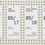
PLATF9RM by Studio Makgill
PLATF9RM is a co-working and office space in Brighton and Hove. It features an interior design by We Like Today that blends the utilitarian with moments of bright warm colour. Studio Makgill, working closely with PLAT9RM Founder, Seb Royle and Creative Director, Emilie Lashmar, designed a graphic identity for the space that would capture and express a spirited approach to...

Salbini by Studio Brave
Salbini, formerly Fesal, is an online retailer of premium European furniture and appliances based in southern Italy and shipping internationally. It deals in both one-off purchases and tailoring for large commercial projects, offering both local and global brands. Fesal comissioned Studio Brave to rename and refresh its brand and overhaul its online store. While the project features revisions to type...

Åhléns by Happy FB
Åhléns began in 1899 as a small mail-order business. Aside from it being one of the oldest it has also grown to become one of the largest retail chains in Sweden. By carefully collating a variety of items across brands and price categories, the retailer maintains its relevance today, understanding and responding to the many ways in which its customers...

The Architect’s Bookshop by Garbett
The Architect’s Bookshop is a new design-focused retailer, located in Sydney’s Surrey Hills, devoted to the books of architecture and interior design, landscaping and urban development. The space was conceptualised as being more than a bookshop but a place to take time out to browse, a chance to engage with the material and form of the books, and as a place...
WeWork by Gretel
Founded in 2010 and headquartered in New York, WeWork began as a workspace provider and has grown to offer a broader infrastructure of community management and support, event programming and virtual network management for small and large businesses, entrepreneurs and freelancers. With significant and rapid growth WeWork worked with Gretel to align its visual identity with its purpose. “Framework”, a graphic route that...

Aurlands by Heydays
Aurlands is the oldest running workshop for handcrafted shoes in Norway. It was founded in 1907 by shoemaker Nils G. Tveranger who, following time in America training as a shoemaker, went on to create the world’s first Penny Loafer in 1926. This, subsequently, became an enduring unisex fashion icon across Europe and America. Aurlands continues to build on this legacy,...

Old Elephant House by Studio South
Old Elephant House is a new brasserie and courtyard bar in the former elephant enclosure at Auckland Zoo. It offers an à la carte menu and set three-course meals made up of light and elegant dishes. It is a building that is distinct in its proportions and location, with tall doors and windows from which to hear the distant calling siamang...

Varnom Ross by Bibliothèque
Varnom Ross is a London-based specialist recruitment agency carefully pairing property professionals with private and public sector clients operating throughout the UK. Their specialism emerges from a single-minded focus on searching for and discovering the perfect synergy between individual character and collective corporate culture, professional skill set and task. This is achieved through personal conversation rather than the impersonal algorithmic governance...