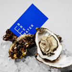
Breakwater by Lundgren+Lindqvist
Breakwater is a Swedish logistics company that services the marine cargo sector. Their visual identity and stationery, created by Gothemburg-based studio Lundgren+Lindqvist, brings together the themes of open sea, systems and cargo through the vertical and horizontal intersection of a geometric sans serif, simple grid-based layout, plenty of space and a vivid blue and icy white colour palette....

Brewer St by Designers Anonymous
Brewer St. is a new fair-trade coffee range developed by UK based hospitality brand Fuller’s to take advantage of continued coffee market growth and build on the day-time custom of their pubs, bars and hotels. London based graphic design studio Designers Anonymous, following their successful rebranding of Fuller’s flagship King’s Cross pub The Parcel Yard, developed a visual identity solution for the brand based around...
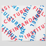
The Finnish Cultural Institute by Kokoro & Moi
The Finnish Cultural Institute for the Benelux (Fins Cultureel Instituut, Institut Culturel Finlandais) is a non-profit organisation that promotes Finnish arts and culture to the Benelux countries of the Netherlands, France and Belgium, with the intention of fostering collaborative opportunities for artists and organisations within the fields of music, literature, design, cinema and the performing and visual arts. The institute’s visual identity,...
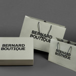
Bernard Boutique by Bunch
Bernard Boutique is an award-winning fashion store with a thirty year history that mixes the latest collections from established brands such as Givenchy, Alexander McQueen and Stella McCartney with the work of new upcoming designers. The boutique’s new visual identity, recently developed by creative design agency Bunch and extended across signage, bags, boxes, tags and other in-store collateral, contrasts a bold and masculine...
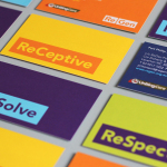
ReGen by Studio Brave
ReGen, formerly known as Uniting Care Moreland Hall, is a not-for-profit drug and alcohol treatment and education agency established in 1970 for the Victoria and Tasmanian regions of Australia. Following the recent name change Studio Brave developed a new visual identity that would better reflect the ReGen’s evidence based practices and the positive, practical outcomes it achieves, through a combination of...
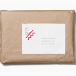
Askeroths Trappor Och Räcken by Bedow
Stockholm based graphic and product design studio Bedow recently developed a new visual identity and stationery solution for Askeroths Trappor och Räcken, a small Swedish manufacturer of specialist staircases. Based around a simple but identifiable abstraction, the logo-mark captures the elemental, functionality and practicality of staircases and the solid technical abilities of the craftsmen through the combination of a single, consistent line weight, basic geometry...
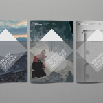
New Zealand Antarctic Research Institute by Richards Partners
Established in 1996 The New Zealand Antarctic Research Institute is the body responsible for developing and managing New Zealand’s scientific research and conservation activities in Antarctica, Southern Ocean and Ross Sea region while also raising ‘public awareness of the international significance of the continent’. The institute’s new identity, which replaces an illustrative fern and penguin mark, was designed by Auckland-based...
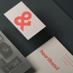
Heart & Soul Interiors by Band
Heart & Soul is an Australian interior decoration firm, specialising in residential properties, with a holistic, adaptable and flexible philosophy. Adelaide-based design studio Band were commissioned by the firm to update their brand identity so that it would better reflect their contemporary approach. Based around the duality of a heart/ampersand marque, a sans-serif logotype and print that juxtaposes a modern bright red...
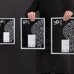
Simplified Sending by Designworks
Simplified Sending is a complete package and post solution from New Zealand’s postal authority that simplifies the process of sending parcels to anywhere in the country. Created by Designworks the result is an interesting mix of utilitarian functionality, contrasting illustrative flourish and a monochromatic colour palette that takes the expected black on white print treatment and confidently inverts it....
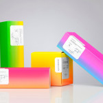
Bermellón by Anagrama
Bermellón is a Mexican confectionery shop that specialises in the premiumisation of traditional spicy treats typically sold on street markets. The shop’s identity and packaging, designed by Anagrama, fuses a bold and intense fluorescent colour palette with the fine detail and craft qualities of an adhesive label....
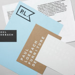
Paul Loebach by Studio Lin
Paul Loebach is a Brooklyn based three dimensional designer who specialises in product, furniture and emerging manufacturing technologies. His new identity, developed by Studio Lin, is a wonderful union of craft, structure, space and geometry that neatly reflects his use of both traditional materials and contemporary processes....
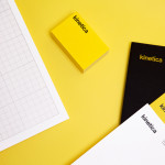
Kinetica by Face
Kinetica is an international industrial design studio located in Santa Catarina, Mexico, that specialises in non-standard architectural projects. Their new visual identity, created by ‘supermodernist’ design agency Face, utilises a bold black and yellow colour palette, a straightforward sans-serif logo-type, plenty of space and a grid based collateral layout to establish a restrained and contemporary interpretation of heavy industry infused with subtle architectural cues....