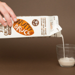
Bruce Juice by Marx Design
Bruce Juice is a 100% raw, cold pressed, fruit juice and plant milk brand new to the Australian market. It launched this year with five juice and vegetable blends, Red, Redder, Orange, Greener, Golden and Nutter, an almond milk, and a packaging and visual identity treatment by New Zealand based graphic design studio Marx Design. Using a mix of illustration and texture, loose hand drawn logotype and custom typography, bright...
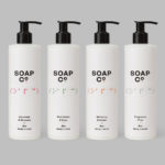
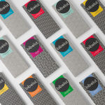
Soap Co. by Paul Belford Ltd
Soap Co. is a UK based social enterprise, luxury soap manufacturer and brand, that provides employment to people who are blind, disabled or disadvantaged. These individuals make up 70% of their team. All profits go back into the business to create and fund further job opportunities. Soap Co. recently launched a range of luxury handmade soaps, hand washes and hand lotions,...
O/O Brewing by Lundgren+Lindqvist
O/O Brewing is a high-end craft brewery, set up in 2011 by Olle Andersson & Olof Andersson, with premises in the Swedish city of Gothenburg. O/O worked with Scandinavian graphic design studio Lundgren+Lindqvist, who had created labels for a variety of other O/O beer, to develop new packaging for their brews. The studio revised and simplified the design system from earlier releases but continued to...
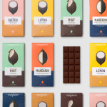
Loving Earth by Round
Loving Earth is an Australian business, established in 2007 by Scott Fry and Martha Butler, that produces a variety of chocolates, snacks, cereals, butters and spreads. All of Loving Earth’s products are made from high quality, organic and fairtrade ingredients, and include ranges that are gluten, grain, dairy and sugar-free. Although taking advantage of a growing multi-million dollar industry, Loving Earth’s values are...
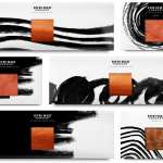
Springs’ Smokery by Distil Studio
Springs’ Smokery has been producing high quality smoked salmon for three generations from its location in South Downs, UK, using Sussex oak and a traditional dry-salting process which has remained unchanged for 50 years. Springs’ recently worked with graphic design studio Distil to develop a new visual identity and package design. Distil’s treatment is an exercise in aesthetic impact derived from colour...
Bibelot by A Friend Of Mine
Bibelot is a luxury European-inspired dessert boutique in Melbourne with a coffee bar, chocolate shop, high tea salon, gelaterie and artisinal patisserie. It features an interior of long marble counters, a light spotted stone floor, spot lighting, cornicing, black and white walls, as well as bronze and tiled detailing. Informed by the sense of place and the permanence that underpins Bibelot’s...
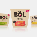
BOL by B&B Studio
BOL is a range of vegetable pots made from fresh natural ingredients using recipes inspired by local chefs and street market stalls from a variety of international destinations, packed and presented with a modern on-the-go convenience in mind. BOL was created by Paul Brown, the former general manager of Innocent’s food division, following the company’s exit from the category, and features...
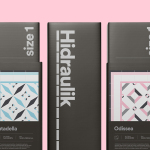
Hidraulik by Huaman
Hidraulik is a Barcelona based business producing rugs for contemporary spaces. These are inspired by cement panels hydraulically pressed, rather than fired, with a layer of coloured pigment. Hydraulic panels originated in the 1850’s and experienced a resurgence in the mid 20th century, these would often feature brightly coloured and detailed patterns, and were popular during an era of personalisation and interior expression....
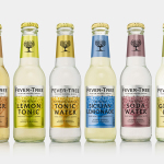
Fever-Tree by B&B Studio
Responding to the continued and widespread use of preservatives, artificial sweeteners and cheap aromatics, Charles Rolls and Tim Warrillow combined their experience of the beverage and luxury food industries to develop a tonic made from natural high quality ingredients. Since its launch in 2005, under the brand Fever-Tree—the colloquial name for the cinchona tree, source of quinine, a key ingredient in tonic—the range has grown year...
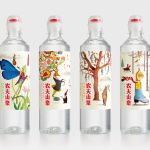
Nongfu Spring Mineral Water by Horse
Nongfu Spring is a bottled mineral water brand and a leading Chinese beverage business. Nongfu worked with British design studio Horse to develop a new package design treatment that, using labels illustrated by designer Brett Ryder and a distinctive structural design with a slim profile and proprietary leak-free sports cap, would engage the youth market....
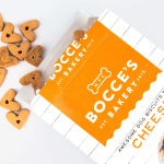
Bocce’s Bakery by Robot Food
Bocce’s Bakery creates nutritious handcrafted dog treats from natural, nutritious, locally sourced and seasonal ingredients from its premises in the New York borough of Brooklyn. Each of the bakery’s treats are batch-produced from four or less ingredients, brought together using simple wheat-free recipes, and born of a passion for conscientious organic cookery and inspired by Bocce, a biscuit loving dog who was carrying a few extra pounds. Bocce’s reached out...
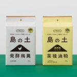
Organic Fertilizer of Awaji Island by UMA
島の土 / Island of Soil is an organic fertiliser created to help develop good quality soil and draw out and compliment the natural power of the land. The range is made using livestock feces and processed vegetable scraps from animals raised and produce grown on the Japanese island of Awaji. It comes in two varieties, a poultry manure and sawdust mix, and a rapeseed...