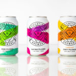
Vocation Brewery by Robot Food
Vocation is a UK microbrewery, established and run by John Hickling, with a range of craft beers that have distinctive and punchy flavour profiles, and a visual identity, packaging design and naming convention created by Leeds-based studio Robot Food. This draws on the tropical, fruity, floral and hoppy characteristic of the range, and the brewery’s fearless, daring and renegade attitude. This post was updated March...
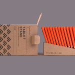
Finchtail by Believe in
Finchtail is dedicated to the design and manufacture of simple, useful and sustainable solutions to everyday problems. Its first product, a low-cost, flat-packed card tablet and mobile phone stand, features a distinctive brand identity and packaging design treatment developed by UK based graphic design studio Believe in. Monospaced type and corrugated card sit alongside die cut detail, white ink, a bold pattern...
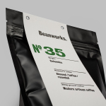
Beanworks by Paul Belford Ltd
Beanworks is a UK wholesale coffee roaster and supplier, coffee machine specialist and barista training school. It prepares its beans using a customised vintage Italian drum roasting machine that allow it to digitally monitor process, and produces a range of single and multi-origin coffee varieties. Although the roaster embraces contemporary artisanal coffee culture, when it comes to naming conventions it favours the utility of numbers,...
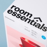
Room Essentials by Collins
Room Essentials is a line of modernist home furnishings created and sold by American retailer Target. The range covers over 2,000 products across 60 categories, and includes items such as blankets, lighting, chairs, tables and tableware. While securing significant revenue for the retailer, the range has, over the last five years, experienced a downturn in sales generated by its Millennial...
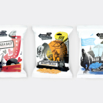
The London Crisp Co. by B&B Studio
The London Crisp Co. is a new hand cooked British crisp range, now available in local pubs throughout London, with a packaging treatment developed by B&B Studio. Absent the story you might expect from a small artisan crisp brand and avoiding the current favour for reduction, B&B Studio’s approach goes all in for provenance and visual impact, embracing a rich...
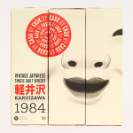
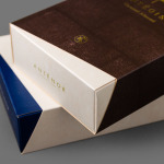
Karuizawa 1984 by The Metric System
Karuizawa 1984 is a vintage Japanese single malt and single cask whisky imported and bottled exclusively for the Norwegian market. The first batch, a run of 577 bottles, sold out immediately. Karuizawa’s packaging, created by Scandinavian graphic design studio Metric Design, effectively conveys the age and provenance of the whisky, is sensitive to the Western market, and aware of and largely...
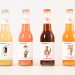
StrangeLove by Marx Design
StrangeLove is an Australian energy drink creator with a four flavour range made up of Ginger Beer, Blood Orange & Chilli, Smoked Cola and Bitter Grapefruit. Although mass-produced, each variety has been crafted to taste homemade using high quality organic ingredients, and developed in response to other energy drink brands who have failed to live up to their premium positioning. Keen to avoid...
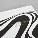
Belle Epoque by Mind Design
Belle Epoque is a French patisserie, located on Islington’s Upper Street, crafting cakes, chocolates, breads, viennoseries, tarts and quiches from high-quality ingredients in a kitchen designed to complement the unrivalled expertise of their chef. Originally commissioned to develop Belle Epoque’s website, Mind Design managed to expand the scope of the project into a full brand identity exercise that went on to include still life...
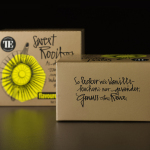
Teahouse Exclusives by Peter Schmidt Group
Teahouse Exclusives is a German company with a portfolio of high-quality black, green, fruit, and herbal teas, a philosophy that revolves around sophistication, quality and modern lifestyle values, and describes itself online as being trend-conscious. Based around the concept of individuality and strong character, integrated brand consulting business Peter Schmidt Group worked with Teahouse Exclusives to develop a new packaging treatment for its...
Antéoise by UMA
Antéoise is a creme dacquoise range from Anténor, a Japanese patisserie established in 1966 that creates French style cakes, cookies, tarts and variety of other confectionery. Antéoise’s brand identity and packaging treatment, developed by Osaka based graphic design studio UMA, draws on the range’s flagship positioning, high quality ingredients and the craft employed in its creation, the heritage and experience of Anténor, the streets of Kobe, and the...
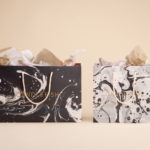
Candlefish by Fuzzco
Candlefish is a Charleston, South Carolina, store that stocks a carefully curated collection of scented candles from an assortment of brands including Rewined and Produce, and also plays host to a variety of workshops. The store takes its name from the Eulachon, better known as the Candlefish. After drying, and due to its high oil content, the Candlefish burns much like a candle and...
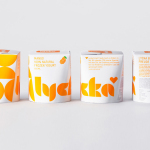
Lycka by BVD
Lycka is a 100% natural hand filled frozen yoghurt brand from Germany that donates 11 cents from each sale to Welthungerhilfe, a humanitarian aid project tackling issues such as world hunger, land grabbing in Cambodia and displacement across Syria and Iraq, amongst many other issues. Lycka’s brand identity and packaging, a mix of bright geometric forms which appears to draw some of...